The Red Dress Effect

A few months ago, I met up with a male friend for coffee, and to my surprise he seemed disproportionately distracted by the fact I was wearing red. It was just a casual jersey cotton dress (I hadn’t dressed up especially for the occasion!), a shade half way between true red and burgundy. Perhaps he’d read somewhere that when women wear red, it signals romantic interest, and I was inadvertently giving off the wrong signals. It certainly captured his attention, and his reaction in turn made me curious; when I returned home, I started googling.

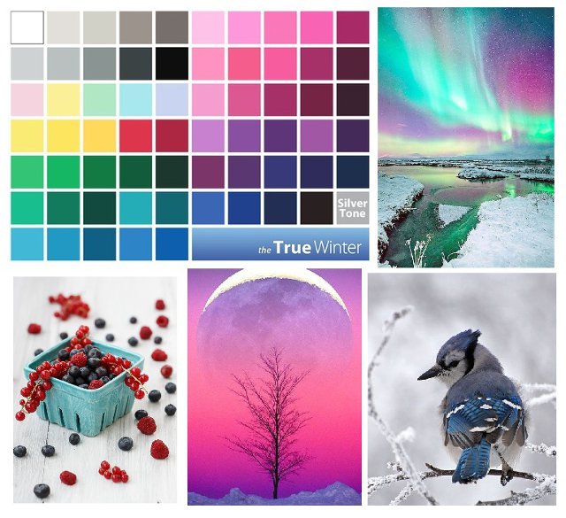
As a colour analyst, I know that colours have meaning. Red can signal danger, passion, even aggression. In China, it’s considered lucky. I also know that it’s a colour people typically tend to shy away from. In colour sessions, it’s the colour most likely to intimidate, the colour most likely to elicit comments of concern and of protest. My therapist told me that, in training, they are advised not to wear red as it’s a colour that can come over as aggressive. We know that red is a colour associated with romance, evidenced by the plethora of red hearts in shops around Valentine’s Day. What had passed me by until recently, however, is something called ‘The Red Dress Effect’.

It’s interesting to note, too, that we’re not talking about ‘the red t-shirt effect’ here – there’s something about the femininity of a dress, the way dresses are typically cut to enhance the female figure, rather than a red t-shirt and jeans (for example) that seems to enhance the effect. And a red dress, paired with a red lip, is a powerful combination. A note for the Naturals, here: if you’re like most Naturals I know, lipstick as a daytime look feels too overdone. My tip for adding colour, without looking ‘made up’, is this: apply lip liner to the inside half of your lips, and then use lip balm to smudge outwards (rather than lining your lips with it). I have found that wearing lip liner in this way makes the look more wearable while still adding colour to the face. I can also recommend tinted lip balm for this purpose. Pairing a red dress with a red lip really enhances the effect, directing attention up to our eyes.

A few weeks later, I wore a true red dress on a visit to London; my sister and I were visiting a cat café and I’ll admit I hadn’t given much thought to the colour of my dress (no more than usual, at least). Two things struck me as we navigated our way to our destination – firstly, I was acutely aware of standing out in a sea of grey and black. Secondly, men were definitely noticing me in a way they hadn’t before, and at times I was openly stared at, a fact I could only attribute to the colour I was wearing. Cue more googling on my return home, my attention officially piqued.

Scientists hypothesize that the reason this phenomenon exists could be social conditioning or evolution: red is a colour that has historically been associated with fertility, and many female primates signal their readiness to mate when oestrogen rises, causing blood vessels to dilate which results in their faces turning red. In humans, blushing can be a sign of romantic affection. Various studies have shown that, on average, men rate women who wear red as more attractive.

A friend of mine had a similar experience recently when she wore a floor-length red dress to a show in London. In her words: “This dress is weird. It’s somehow elevated me from being a fairly normal woman to someone who gets people stopping to stare at them in the street. On the walk here, I got some open compliments from women just walking past. And a few dudes just staring openly.” I will also add that she received a compliment from the legendary Joss Stone whilst at this show, proof if ever it were needed that the red dress effect is real.

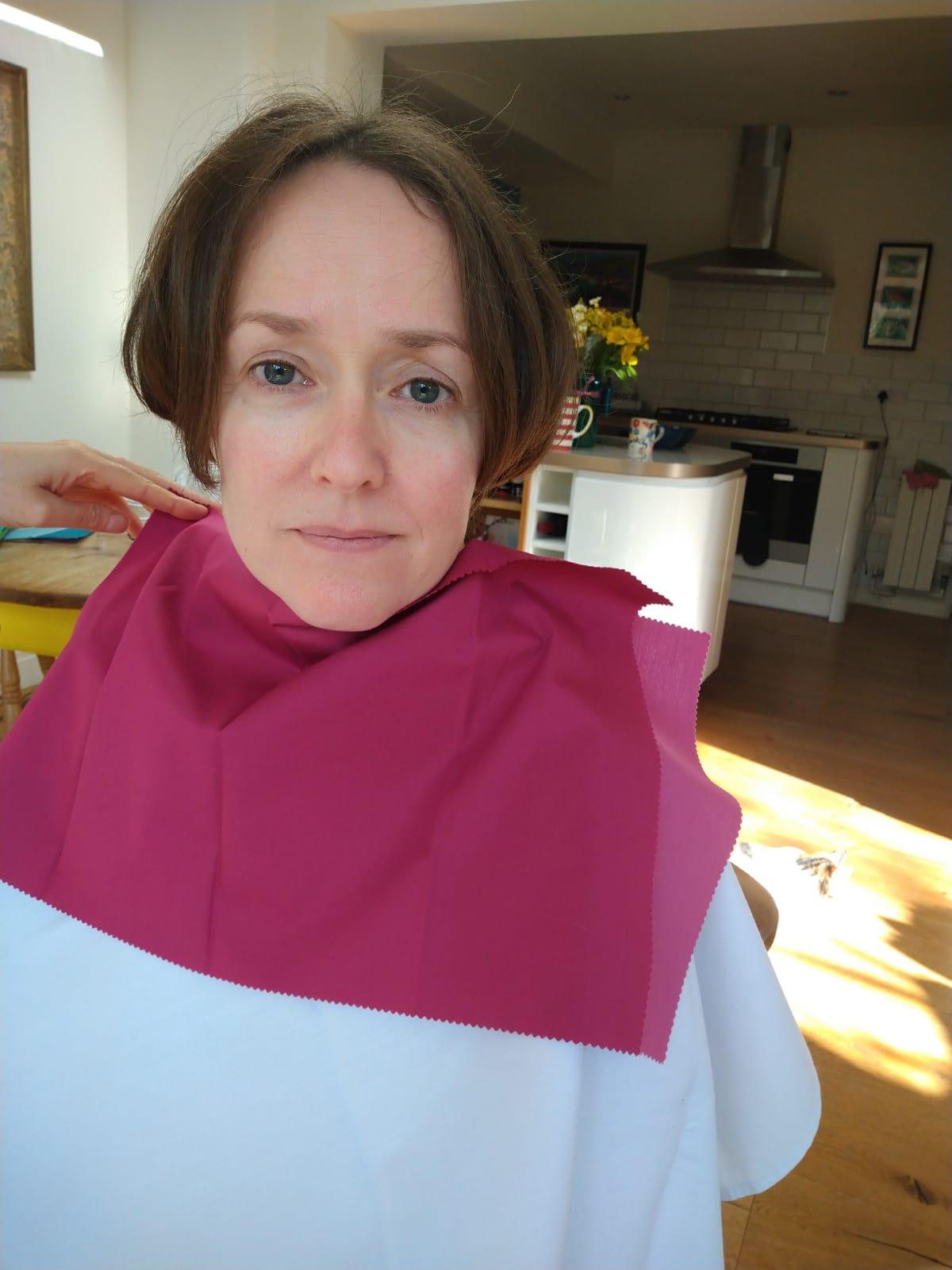
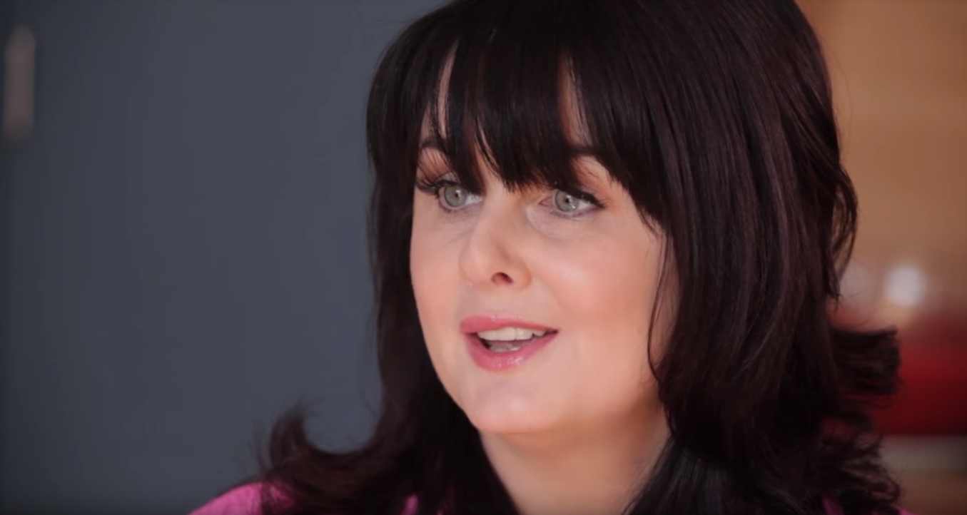
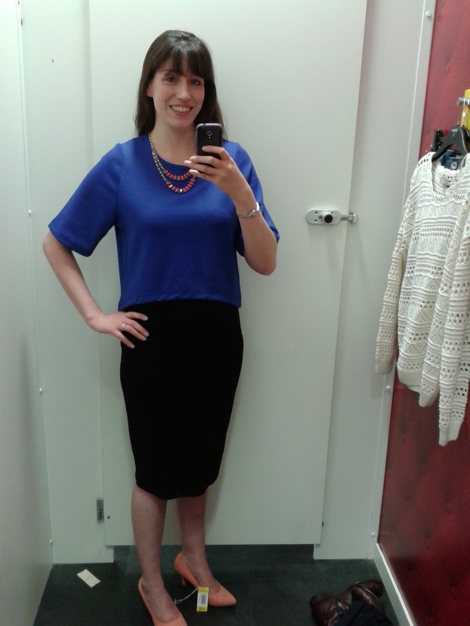
Of course, as a colour analyst, I will be the first to say: the shade of red you wear matters. I wear true red and burgundy (with caution, these days, it must be said) but when I don orangey-red (too warm for my cool undertones) I look predictably awful, as demonstrated here:

Not to say I look ‘ugly’ (whatever that means; a blog post for another day!), but what I experience when I look at this photo is a discordance that’s uncomfortable. The colour competes with me. When I pay attention to my own body language whilst looking at this, I notice I’m frowning. What I detect, when I wear the wrong (bright) colour, is that whilst people might see me, they struggle to meet my eye, distracted as they are by the colour. This was most obvious to me on the day I did my style experiment. It was, frankly, agonising.

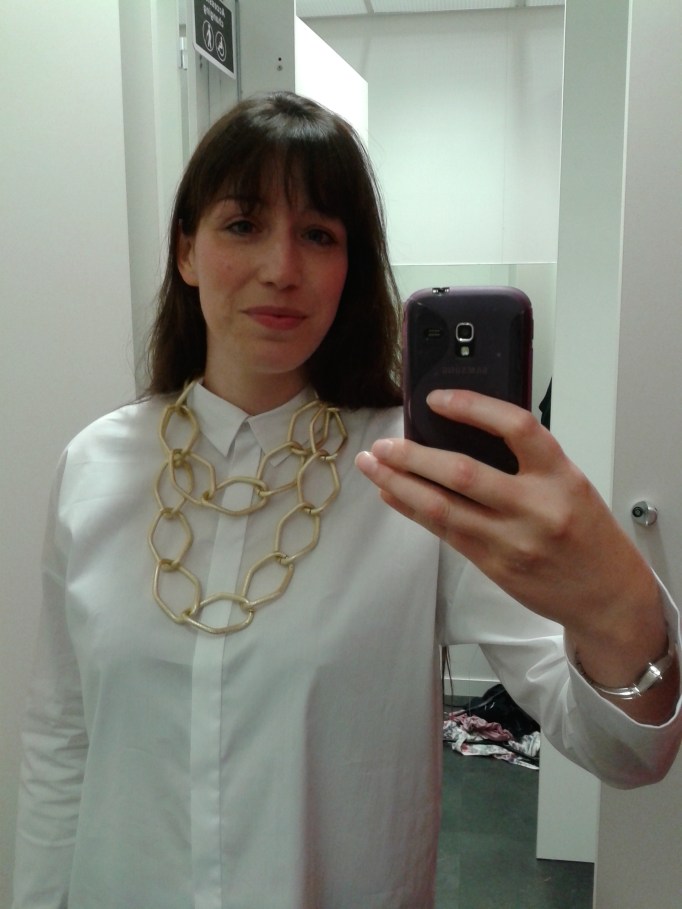
For comparison, here is me wearing the correct shade:

As you can see, there’s harmony. Yes, I’m wearing a bright red, but our attention is directed up towards my face.

I’d love to know about your experiences with red. Do you wear it? Or do you avoid it? Have you noticed the red dress effect for yourself? Are you tempted to wear red and see what happens? Drop me a line in the comments – I’d love to know!

Outfit for a Summer Natural Ingénue

I often have an overwhelming impulse to put an outfit together. Sometimes, to satisfy this urge (and so as not to end up ordering a million items that I will almost certainly return, fussy Ingénue that I am) I create something akin to a Polyvore collage (remember that site?) which does help scratch the itch somewhat.

This would be a good outfit for the summer if you are someone who doesn’t like having bare legs (like me – is this an Ingénue thing, I wonder?) The suede riding boots are gorgeous but I’ve found that pretty sandals (I have some similar to these) paired with the navy leggings work just as well and keep you cool in all but the hottest weather.

Dress: the dress is from Apricot and currently only £20 (more sizes on Next for £10 more). I own this myself and it’s lovely. Perfect for a Deep Summer and would also work for Winters as the navy is very dark. The seam under the bust is a little on the high side (especially if you are big of bust), but luckily that’s not very noticeable. The belt works well to give some waist definition (which most Ingénues will need). The pattern is just perfection.

Boots: these beautiful suede Spanish riding boots are by Rydale and work well for those with slim calves (not me, unfortunately, but I have seen these in the flesh and they are gorgeous). Whilst I’ve only worn this dress with sandals, navy ballet pumps or brown ankle boots (like these) would also work.

Bracelet: this macramé bracelet comes in a variety of colours. If you’re after something a little cheaper, then MightyMoon sell something equally beautiful for less which is what I ended up plumping for.

Leggings: I own an embarrassing number of navy FatFace leggings, but they are the best in my humble opinion (and I do consider myself practically an expert now as I live in them).

Belt: this leather plaited belt is from Next, and from the men’s section no less (but don’t let that put you off!) It’s brilliant value, too. I own it and love it.

Clutch bag: another gem from Etsy, this Moroccan leather clutch bag is an absolute bargain and if I wasn’t on a self-imposed buying ban I would absolutely treat myself.

Necklace: this sterling silver shell necklace is another item I own and adore, although when it arrived I swapped the chain for something a little less chunky for my delicate Ingénue neck 😉

Wall hanging: this delightfully bohemian macramé wall hanging is something I purchased recently for my study. I gaze adoringly at it every day.

If there are any outfits you’d like to see me put together, let me know in the comments below 🙂

P.S. By the time I had finished writing this post, I had ordered the Moroccan leather clutch bag in teal, such is my (absolute lack of) self-control.

“Getting my colours done will restrict my choices.”

Today, I’m in the mood for some myth-busting.

One of the questions I sometimes hear people ask is this:

“If I have my colours done, will that limit my choices? Will you tell me I can’t wear <insert-colour-name-here>?”

The short answer is: no. Firstly, I will never tell you not to wear something (that choice is yours and yours alone; I’m not the colour police). Secondly, if you love a colour that much, there’s a very high chance it’s one of your best. Thirdly, the sentiment I hear expressed again and again after a colour analysis session is: “I didn’t realise I could wear green / pink / yellow / red…” (the list goes on).

Most of us know of one or two colours that suit us but, prior to having our colours done, we have no idea of the sheer range of colours that suit us. Colours that have previously been considered impossible to wear suddenly become available; we just need to know the right shade.

To demonstrate my personal experience of this, I trawled through many old photos and came up with a palette that reflects the colours I used to wear.

Brown, khaki, black. I stumbled on some of the lighter Summer colours by accident: lilac, dusty blue, silver grey. I was actually surprised by how limited my wardrobe was. But, overwhelmingly, those were the colours I wore.

Regular readers of this blog will know I’m a Deep Summer; that is, the deepest colours of the Summer palette suit me. These are the colours I wear now.

My wardrobe is chock full of these deep, cool colours.

And these aren’t all the colours in the Summer palette, either. I would love to find primrose (Summer’s version of yellow), raspberry (a pinky-red that isn’t Winter’s fuchsia), plum (a mid-purple), periwinkle (a soft cornflower blue) and forest green (a deep teal that doesn’t contain too much yellow).

Each season is a veritable rainbow.

Warm seasons have shades of blue, cool seasons have shades of yellow, and all seasons have their version of black.

I’ll be totally honest with you: once you’ve had your colours done and you’ve seen how good you can look in the shades that make you shine, it’s frustrating when you can’t find them in the shops. This is the only ‘downside’, if you can call it that, to colour analysis. There’s nothing to say you can’t buy colours that aren’t in your palette, of course you can…

…but, I don’t. And, after you’ve seen how good the right colours look, you might not want to, either. So what does this mean in real terms? (I’m obviously not walking around naked half the time because I refuse to wear black.) It means I own an awful lot of navy. Which is absolutely fine; navy is one of my best colours. I would rather a wardrobe full of navy than a wardrobe full of khaki and brown which made me look sickly and emphasized my acne scars.

It’s easy for Winters to find black and grey in the shops, and easy for Autumns to find olive. Springs have it slightly harder, but can usually find their creams and greys. Navy is an easy Summer neutral to find. And, luckily for us, there is Kettlewell Colours, a company dedicated to solving this problem (this is not a sponsored post). Their styles won’t suit everyone, but the range of colours they sell is seriously impressive.

I know I hark on about scarves a lot, but for good reason; they are usually inexpensive and can be found in a huge range of colours and patterns. Especially useful now, when we’re on video calls more than ever and people are only really seeing our shoulders and above. A scarf thrown over a pyjama top can take us from oops-I-overslept to competent professional in just a second (obviously not talking from personal experience *cough cough*).

These bright, warm colours should work well for a Spring.
Fuchsia pink will make Winters shine, especially those who suit the brightest colours in the palette.
My Autumn friend has this scarf and it looks amazing on her.
I own this batik scarf myself, and I love it. Great for a Summer who suits the deeper colours.

Being a mid-teal, this colour should suit everyone.

What palette is yours? What colours can you wear that you didn’t think you could? Perhaps it’s time to find out… 🙂

When Spring becomes Winter (wait, what?)

A few weeks ago, a friend revealed that her Spring colours no longer suited her. Yesterday, I draped her to find out exactly what was going on. Helena was first analysed in her 20s and now, over a decade later, she was finding that her warm, bright colours no longer worked.

Needless to say, I was fascinated. I had been taught that people simply don’t change seasons, that undertones don’t change in the course of a lifetime. We soften and desaturate as we age, so a move from, say, True Summer to Soft Summer isn’t impossible. But to change season completely? Not possible. So I was told…

I had no idea what to expect when I arrived. What I did know was that I believed her. I wondered if, quite logically, her colouring had softened and she had moved into Autumn. I wondered if she was on the edge of Spring now.

I noticed immediately that she looked good in the white cover cape. I began to drape her. The metallic silver drape was obviously better than the metallic gold. My brain tried to argue. How could that be so?

I started to compare Winter and Spring. It quickly became clear that her skin couldn’t tolerate any warmth. A logical assumption might be that, as she’d shifted from a warm season to a cool season, she might be on the warmer end of Winter (leaning towards Spring). But no! She was a True/Cool Winter who looked best in emerald green, fuchsia pink, electric blue and, shockingly, black. I did a double-take when I put the black drape on her – it is rare that even a Winter looks so in focus in the black drape (often, charcoal is better).

Холодная-зима

I tested drapes from every other season, as I always do. Autumn made her skin look muddy, Summer made her whole face look grey. Even burgundy, a colour shared by Summer and Winter, was a bit too grey in comparison to Winter’s cool red.

WhatsApp Image 2019-11-07 at 09.03.59
Autumn’s dark olive drape; not flattering on those with cool undertones

You might think that her initial analysis can’t have been right, but that was never my belief: firstly, she was analysed by a reputable company but secondly, and most importantly, she could see that those colours were perfect for her at the time. She saw the transformation herself, lived in those colours, received the compliments, felt good. Then, years later, those compliments stopped. Looking at herself in more recent photos, she can see something isn’t right. In her words, “Why didn’t someone tell me?”

WhatsApp Image 2019-11-07 at 09.04.02
Helena in Winter’s fuschia drape; much better! Look at how sharp the edge of her irises are

As we worked through the drapes, I could see that the Spring colours were the least flattering on her. My mind was blown. She laughed: “I’ve been wearing the wrong colours for the last 10 years!” How disorientating it must be, to be so confident in your season only for it to change. But she knew something wasn’t right, even if that “wasn’t possible”.

I was told that, while our colouring might soften with age, we wouldn’t ever change season. To hop from a bright, warm season to a bright, cool season? Impossible. Looking back, I realise I should have questioned this claim. Where was the evidence? Were clients re-rated years later to see if they were indeed the same season?

WhatsApp Image 2019-11-07 at 09.03.58
Winter’s emerald green – another fantastic colour on her

Helena is slap bang in the middle of Winter. She hadn’t softened in any way, she didn’t even lean towards Deep/Dark Winter. All traces of warmth had simply disappeared from her skin. On a big, fundamental level, her undertones had changed. But she hadn’t lost saturation. Not at all.

WhatsApp Image 2019-11-07 at 09.05.18
Black has never looked this good!

Helena, used to wearing Spring’s bright colours, told me that Winter wasn’t a difficult transition. Although, as she had lived as a Spring for so many years, she was, in her words “absolutely back to square one.” She told me: “I could literally put my entire bedroom–wardrobe, drawers, makeup, jewellery–in a skip.” She told me that she found it “strangely disturbing” to realise, over the years, that her Spring colours no longer suited her. I completely understood.

This has to be the most interesting draping I’ve ever done, and the lessons from it will stay with me forever. When it comes to human colouring, anything is possible. Huge thanks to Helena for allowing me to use her photos for this post, and to Catherine for taking them.

Don’t know your season yet? I have some tips for you

You might not be at the point where you want a colour analysis session, but you have an interest in colour analysis. If you don’t know your season, what can you do? Here are six things you can try.

1. Switch up your mascara
Most people wear black mascara, and most people don’t look good in it. Try switching to navy or brown. When I say navy I don’t mean the electric blue mascara of the ’80s. Nope! Try the No7 Intense Volume navy mascara. Navy suits Winters, Summers and Springs. If you try it and don’t love it, try brown instead, which works for Springs, Autumns and the cool-neutral Summers. When I say brown I mean a proper brown, (not brown/black, which works best for Dark Winters and Dark Autumns).

If, when you apply your new mascara, you suddenly notice your eyes and not your eye makeup, you know you’re on the right track. I was astounded at how much of a difference it made to my face when I switched my black mascara to navy.

2. Embrace true red
True red suits everyone. No, really! Most people who come to me for a colour analysis session seem intimidated by red, and I do understand why. There’s no ignoring it.

true-red
A true red t-shirt by Kettlewell Colours

Absolutely everyone looks amazing in it though (I’m really not exaggerating), especially when they’re wearing true red and have on a matching true red lippy. Buy an inexpensive true red scarf if you’re nervous, and whilst wearing it try a matching lippy when you’re next near a make-up counter. And, if you do that, send me a photo! I’d love to see how amazing you look. True red is my favourite colour because everyone looks good in it.

Why does true red suit everyone? Because it doesn’t contain blue or yellow, the two colours that, when added to a colour, change its temperature.

3. Fall in love with teal
Teal is another colour that suits everyone because it has (nigh on) equal amounts of yellow and blue in it. When I say teal, this is the colour I mean…

mallard-cascade-wrap.png
The mid-cascade wrap in ‘Mallard’ by Kettlewell Colours

Kettlewell Colours call it ‘Mallard’. Buying a scarf in this colour would be a cheap way of trying it out. You can’t go wrong with teal. If you fancy being a bit daring, try a teal eyeliner (and report back ;-))!

4. Avoid black
I know it’s hard, I do. Black is everywhere. Having said that, navy is almost as easy to get hold of. Swapping black for navy will be a dramatic improvement for the vast majority of people.

5. Love your natural hair colour
If you don’t love your natural hair colour then you’re wearing the wrong colours. Even the most ‘mousy’ of hair will look beautiful when you’re getting your colours right.

If you’ve dyed your hair, notice how it makes your face look. Does the jet black hair make you look pale and washed out? Do you look a bit sickly in a warm, brassy blonde? Is it time to consider dying it back to your natural colour? Once you know your season, you can afford to be bold.

6. Wear your favourite colours
This one might surprise you, but here’s the thing: often, when people show up to a colour analysis session they say to me ‘Please don’t tell me I can’t wear X’. With the exception of black (which people generally love because it’s easy and considered sophisticated), when someone turns up with a favourite colour that they don’t want to be parted from, it ends up being in their palette, and one of their best colours, too. Our instincts are surprisingly good.

What doesn’t work
Trying to figure out whether you have cool or warm undertones from your foundation is almost certainly doomed to fail. Reading into your jewellery colour preference is too risky. I know plenty of Winters who love gold jewellery, and even more women who are wearing the wrong foundation colour.


Author Marian Keyes, a gorgeous Bright Winter

I’ve been a fan of Marian Keyes for the longest time, since the days of Watermelon and Lucy Sullivan is Getting Married. I recently read her latest book, The Break, and was struck by the main character Amy’s love of fashion. Throughout the book, references were made to the kinds of makeup and clothes that the character felt suited her (very consistent with someone who was a Winter, I couldn’t help but notice) and there was even a reference to colour analysis.

With this in mind, I looked up Marian Keyes on YouTube and this is what I found. Take a look at this stunning creature:

marian-keyes.PNG

Clearly a Winter like her character, Amy. Her hair colour makes her skin look so clear and smooth (clearly, this lady has some make-up game, too). I would be shocked if Marian hadn’t had her colours done (if only I could ask her!)

This was the interview I watched. Take a look at her house, too, and Marian’s top. The dark hair really suits her, and those eyes! The remarkable pale grey/blue/green of a Bright Winter.

I suspect the interviewer (Sam Baker) is an Autumn. She’s much more muted than Marian, and her hair looks to be a muted russet. I bet she’d look great in an antique teal or a dark olive (I always get such Autumn envy whenever I think about the palette).

Having done a bit of Instagram stalking, I am convinced Marian is a Romantic of some description. She loves her fabulous shoes and her animal prints; there’s a brilliant pic of her in a leopard print dress (all Winter colours).

Both Marian and her character Amy love the Serbian artist Dusanka Petrovic, another ‘Winter clue’. Take a look at the really bright, cool colours:

dp_48
‘At the brook’ by Dusanka Petrovic

I enjoyed the book all the more for its references to colour and fashion. I wasn’t at all surprised to discover that both Marian and her character Amy were Winters.

If you’re on the market for a really compelling and at times quite gritty book about marriage, relationships and families, then I can highly recommend The Break 🙂

UPDATE:
Marian confirmed on Twitter that she has had her colours done and that she’s a Winter!!!!!!!!!! (My day is made!!!!!!)

marian-tweet

The colours that get overlooked…

If you’re familiar with colour analysis and the four seasons, you probably immediately associate certain colours with certain seasons. Emerald green? That’ll be Winter. Rust? Must be Autumn. Lavender? Summer of course. Coral? Ah yes, Spring.

Each season has colours that you immediately think of when you think of that season. Even now when I look at my swatches (regardless of system; I actually have a few different Summer swatches) I see colours I’ve overlooked. As a Summer I have a lot of navy and purple and sea green in my wardrobe. I forget about the reds and the dusky pinks and I especially forget about the soft neutral sandy colour, the light rose brown and the duck egg blue. As a Deep Summer especially, it’s easy to overlook the lighter colours which can be so useful especially in patterns.

Here are (in my opinion) some of the ‘forgotten’ colours for each season, and why I think they’re useful.

Winter

The colour that always surprises me for this season when I stumble upon it in my drapes is the colour that Kettlewell Colours call ‘pebble’.

PBGR

It’s not a cool Winter silver grey as you might expect, but a pale cool stone colour. It’s actually a very interesting Winter neutral and I saw it used well in a jumper that my last Winter client turned up wearing, combined with purple and black. This obviously works well for blouses and shirts too and would be an interesting and less obvious choice for Winter accessories.

Winter’s icy pastels can get overlooked too, the icy pinks, blues and purples. They are useful for creating contrast when worn with the brighter, darker colours. This is Ice Lavender.

ICLV

The bolero worn with, say, a camisole in one of the bright cool Winter blues or purples, would look great especially if you were to add black into the mix. I could imagine a black necklace or choker working really well with that.

Summer

Brown is a colour typically associated with Autumn. It’s easy to forget that Summer has a brown too, for which I’m very grateful. I rely on it heavily for boots and handbags because I don’t really want grey or navy which are the other obvious neutrals I could use.

Summer’s cocoa brown

Summer has a very pale, cool yellow. I’ve yet to recommend it to someone as a colour they should buy an investment piece in, but actually it is very interesting and especially brilliant in a pattern.

PRIM

Autumn

Autumn has a blue, a warm one. Blues aren’t typically associated with Autumn, but they sure are useful particularly for workwear where you want / need to carry a little more authority. This is Rich Navy.

RINVY

Autumn has a very bright, vibrant orange that you might on first glance assume belongs to Spring but it’s definitely an Autumn colour. It’s like Summer’s primrose yellow in that I’ve never recommended it to someone as a head-to-toe colour but it is useful for accessories and in prints.

This kingfisher’s chest is very reminiscent of Autumn ‘orange spice’

Spring

When we think of Spring we usually think of the bright, warm, splashy tropical colours; coral, warm reds, turquoise, warm bright greens such as apple and leaf green. Spring actually has a fair few lighter and more neutral colours such as cream, peach, and warm grey. This is Salmon, a pale peach that isn’t as splashy as Spring’s usual colours.

SALM

It’s easy to forget that the bright seasons have colours that aren’t typically ‘bright’ (pastels for Spring, icy pastels for Winter). I like Spring best when neutrals are paired with the bright, splashy colours. Too many brights and it can look a little overdone.

Spring is closely associated with tan but has a very useful chocolate brown too; a very useful neutral for bags, trousers and shoes. This is Chocolate.

CHOC

More style experimentation

I visited Matalan a while back on the hunt for some more leggings (the search is endless, I swear), and couldn’t resist some more style experimentation. I took some photos… Are you ready for this? Brace yourselves…

20140531_175156
My head looks separate from my body here. Do you like the lovely coral heels that do absolutely nothing for my legs?

20140531_172156
Jessie J would rock that chain. Me? Not so much…

20140531_172149
MY EYES! There is so much wrong with this I don’t know where to start. Lily Allen would wear this outfit well I think.

20140531_171620
This isn’t how an ingénue does sexy… Nope! The black is completely dominating.

I’m sure you’ll be relieved to know that none of these outfits made it home. I showed these photos to friends recently, and their replies were not repeatable in polite company. One of my friends commented on the consistency of my style usually, so these clothes are a stark contrast to my usual Summer Ingénue Natural look. I imagine a Winter / Bright Spring Dramatic would look good in these. They are pretty much exactly what I shouldn’t be wearing; mostly Winter colours with a little Spring, Dramatic style, large scale, heels. For the sake of completeness and contrast, here’s what I usually wear if I’m going out to something that requires a smarter look…

IMG_3160
I can’t remember why I wore this now, but this is my version of ‘dressing up’.

IMG_3162
Sometimes I’ll swap the leggings and flats for navy tights and kitten heels if I need to go smarter. I do get a little bit scared sometimes when I realise I’m leaving the house dressed like a princess.

20151018_111846
Apologies for the headless shot! If I need to do “going out / clubbing” (not that I’m a big fan of clubs) then the cord hot pants come out, with a pretty blouse.

So there you have it! When I’m next out shopping, who knows, I might experiment some more 😉