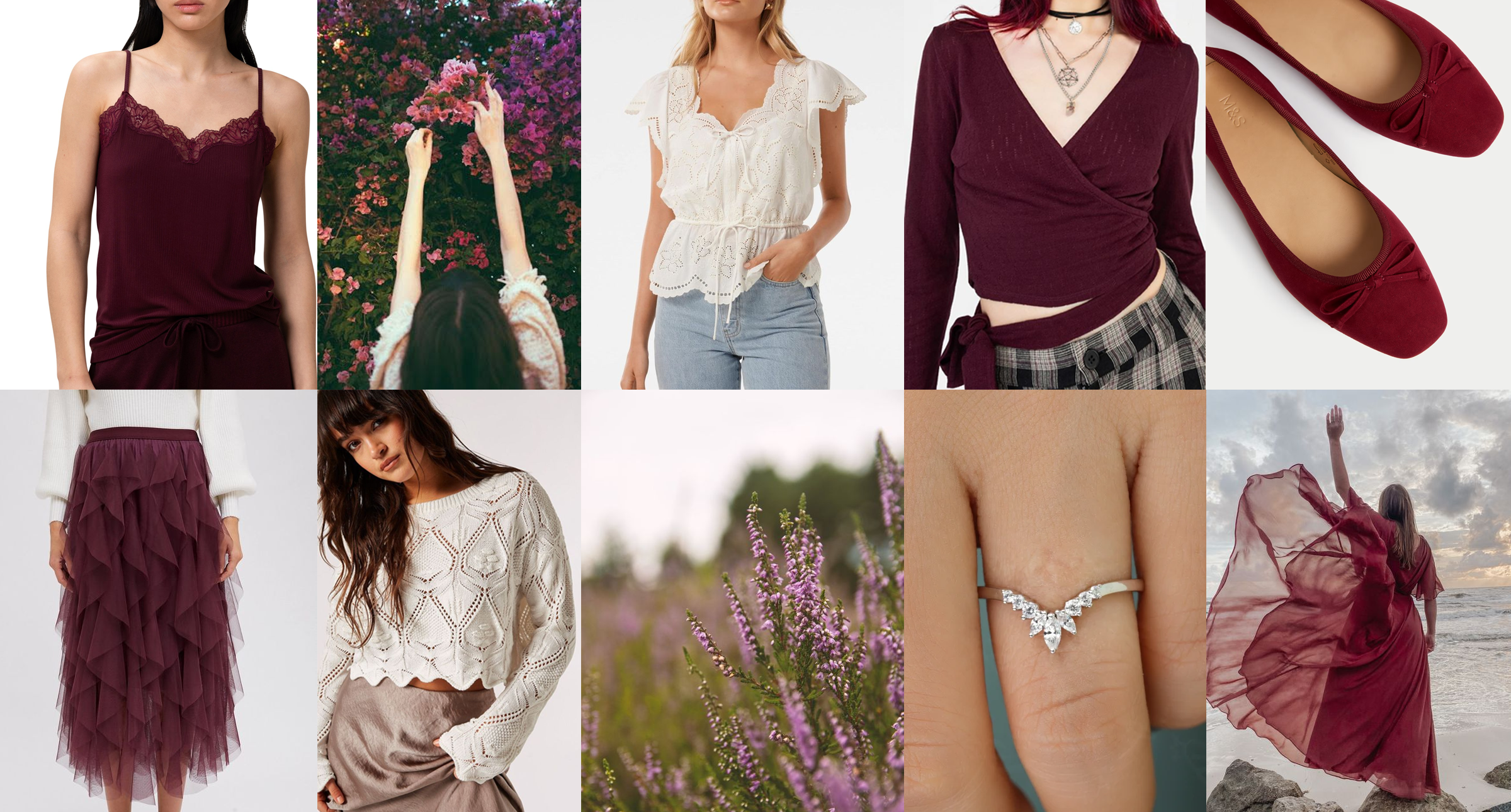
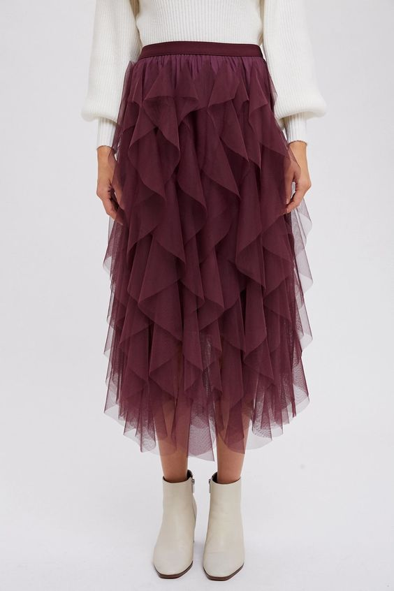
Inspiration for this outfit struck after I found an incredible plum tulle skirt in Next a few weeks back.
I immediately wanted a ballet-style wrap top to go with it, to really amp up the ballerina vibe. The wrapover top goes nicely with the burgundy lace camisole if you’re not keen on showing your mid-section.
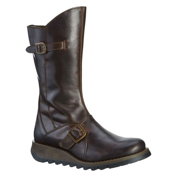
I love to wear this plum ballerina outfit with my brown Fly biker boots to add a bit of an edge. I also love the wine and purple variants of this boot.
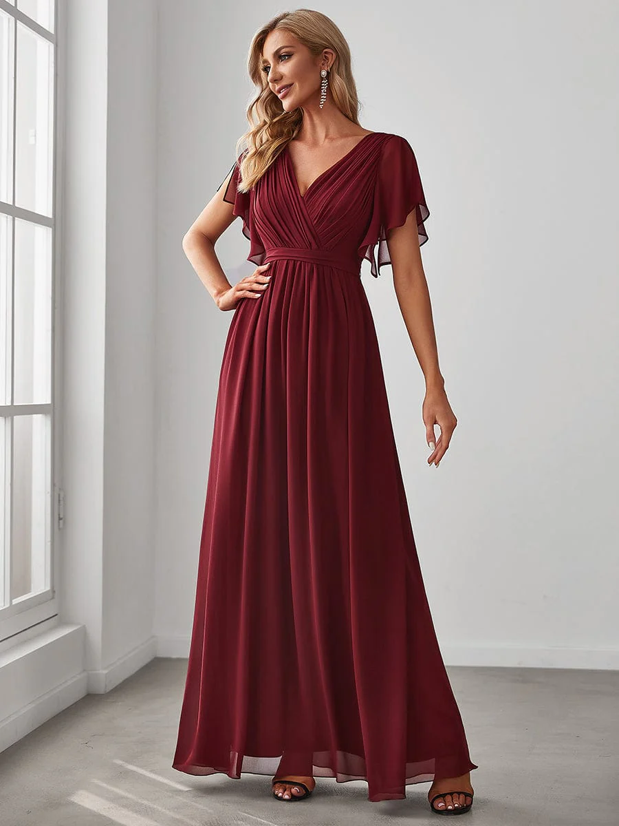
Aside from the maxi dress and ballet pumps, I own everything shown in this outfit collage (plus the Fly boots) which I hope is useful to know – I can vouch that these items go together beautifully 🙂
A few months ago, I met up with a male friend for coffee, and to my surprise he seemed disproportionately distracted by the fact I was wearing red. It was just a casual jersey cotton dress (I hadn’t dressed up especially for the occasion!), a shade half way between true red and burgundy. Perhaps he’d read somewhere that when women wear red, it signals romantic interest, and I was inadvertently giving off the wrong signals. It certainly captured his attention, and his reaction in turn made me curious; when I returned home, I started googling.
As a colour analyst, I know that colours have meaning. Red can signal danger, passion, even aggression. In China, it’s considered lucky. I also know that it’s a colour people typically tend to shy away from. In colour sessions, it’s the colour most likely to intimidate, the colour most likely to elicit comments of concern and of protest. My therapist told me that, in training, they are advised not to wear red as it’s a colour that can come over as aggressive. We know that red is a colour associated with romance, evidenced by the plethora of red hearts in shops around Valentine’s Day. What had passed me by until recently, however, is something called ‘The Red Dress Effect’.
It’s interesting to note, too, that we’re not talking about ‘the red t-shirt effect’ here – there’s something about the femininity of a dress, the way dresses are typically cut to enhance the female figure, rather than a red t-shirt and jeans (for example) that seems to enhance the effect. And a red dress, paired with a red lip, is a powerful combination. A note for the Naturals, here: if you’re like most Naturals I know, lipstick as a daytime look feels too overdone. My tip for adding colour, without looking ‘made up’, is this: apply lip liner to the inside half of your lips, and then use lip balm to smudge outwards (rather than lining your lips with it). I have found that wearing lip liner in this way makes the look more wearable while still adding colour to the face. I can also recommend tinted lip balm for this purpose. Pairing a red dress with a red lip really enhances the effect, directing attention up to our eyes.
A few weeks later, I wore a true red dress on a visit to London; my sister and I were visiting a cat café and I’ll admit I hadn’t given much thought to the colour of my dress (no more than usual, at least). Two things struck me as we navigated our way to our destination – firstly, I was acutely aware of standing out in a sea of grey and black. Secondly, men were definitely noticing me in a way they hadn’t before, and at times I was openly stared at, a fact I could only attribute to the colour I was wearing. Cue more googling on my return home, my attention officially piqued.
Scientists hypothesize that the reason this phenomenon exists could be social conditioning or evolution: red is a colour that has historically been associated with fertility, and many female primates signal their readiness to mate when oestrogen rises, causing blood vessels to dilate which results in their faces turning red. In humans, blushing can be a sign of romantic affection. Various studies have shown that, on average, men rate women who wear red as more attractive.
A friend of mine had a similar experience recently when she wore a floor-length red dress to a show in London. In her words: “This dress is weird. It’s somehow elevated me from being a fairly normal woman to someone who gets people stopping to stare at them in the street. On the walk here, I got some open compliments from women just walking past. And a few dudes just staring openly.” I will also add that she received a compliment from the legendary Joss Stone whilst at this show, proof if ever it were needed that the red dress effect is real.
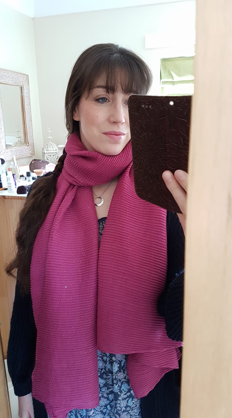
Of course, as a colour analyst, I will be the first to say: the shade of red you wear matters. I wear true red and burgundy (with caution, these days, it must be said) but when I don orangey-red (too warm for my cool undertones) I look predictably awful, as demonstrated here:
Not to say I look ‘ugly’ (whatever that means; a blog post for another day!), but what I experience when I look at this photo is a discordance that’s uncomfortable. The colour competes with me. When I pay attention to my own body language whilst looking at this, I notice I’m frowning. What I detect, when I wear the wrong (bright) colour, is that whilst people might see me, they struggle to meet my eye, distracted as they are by the colour. This was most obvious to me on the day I did my style experiment. It was, frankly, agonising.
For comparison, here is me wearing the correct shade:
As you can see, there’s harmony. Yes, I’m wearing a bright red, but our attention is directed up towards my face.
I’d love to know about your experiences with red. Do you wear it? Or do you avoid it? Have you noticed the red dress effect for yourself? Are you tempted to wear red and see what happens? Drop me a line in the comments – I’d love to know!
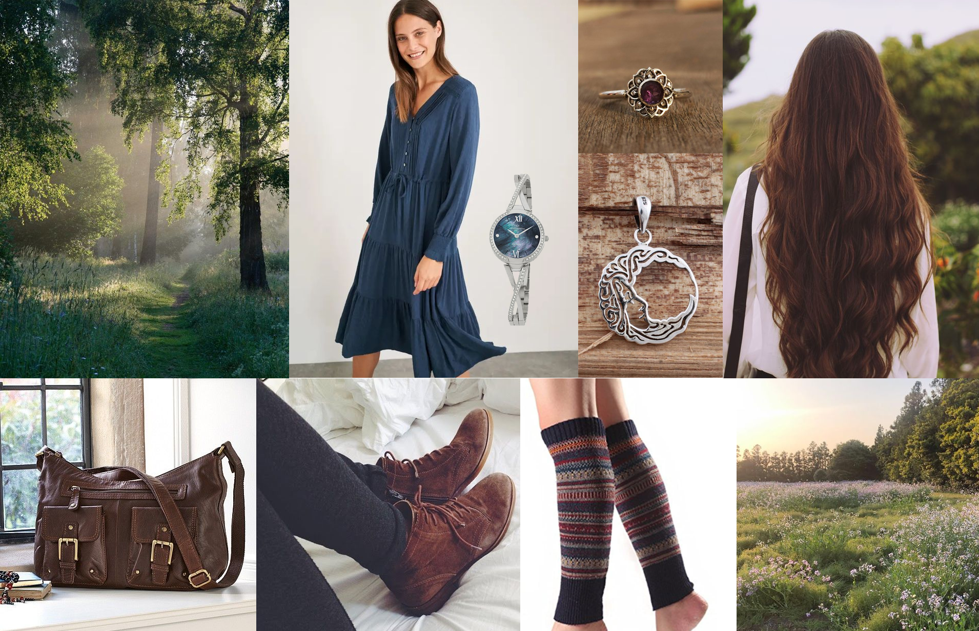
I don’t get out much these days. Since the pandemic I’ve been working from home most of the time and I spend much of my life in pyjamas or “lounge wear”. It’s no coincidence, then, that my desire to put together an outfit has grown given I rarely have an opportunity to wear “something nice” (you could argue I should be making these opportunities for myself, but I appear to have become a hermit since the pandemic – anyone else?)
I think this outfit (below) would work for both a Natural Ingénue and an Ingénue Natural. With a few tweaks, it could work for a Natural Romantic; just add some statement jewellery and some chunkier, sexier boots.
I often have an overwhelming impulse to put an outfit together. Sometimes, to satisfy this urge (and so as not to end up ordering a million items that I will almost certainly return, fussy Ingénue that I am) I create something akin to a Polyvore collage (remember that site?) which does help scratch the itch somewhat.
This would be a good outfit for the summer if you are someone who doesn’t like having bare legs (like me – is this an Ingénue thing, I wonder?) The suede riding boots are gorgeous but I’ve found that pretty sandals (I have some similar to these) paired with the navy leggings work just as well and keep you cool in all but the hottest weather.
Dress: the dress is from Apricot and currently only £20 (more sizes on Next for £10 more). I own this myself and it’s lovely. Perfect for a Deep Summer and would also work for Winters as the navy is very dark. The seam under the bust is a little on the high side (especially if you are big of bust), but luckily that’s not very noticeable. The belt works well to give some waist definition (which most Ingénues will need). The pattern is just perfection.
Leggings: I own an embarrassing number of navy FatFace leggings, but they are the best in my humble opinion (and I do consider myself practically an expert now as I live in them).
Belt: this leather plaited belt is from Next, and from the men’s section no less (but don’t let that put you off!) It’s brilliant value, too. I own it and love it.
Necklace: this sterling silver shell necklace is another item I own and adore, although when it arrived I swapped the chain for something a little less chunky for my delicate Ingénue neck 😉
Wall hanging: this delightfully bohemian macramé wall hanging is something I purchased recently for my study. I gaze adoringly at it every day.
If there are any outfits you’d like to see me put together, let me know in the comments below 🙂
P.S. By the time I had finished writing this post, I had ordered the Moroccan leather clutch bag in teal, such is my (absolute lack of) self-control.
One of the questions I sometimes hear people ask is this:
“If I have my colours done, will that limit my choices? Will you tell me I can’t wear <insert-colour-name-here>?”
The short answer is: no. Firstly, I will never tell you not to wear something (that choice is yours and yours alone; I’m not the colour police). Secondly, if you love a colour that much, there’s a very high chance it’s one of your best. Thirdly, the sentiment I hear expressed again and again after a colour analysis session is: “I didn’t realise I could wear green / pink / yellow / red…” (the list goes on).
Most of us know of one or two colours that suit us but, prior to having our colours done, we have no idea of the sheer range of colours that suit us. Colours that have previously been considered impossible to wear suddenly become available; we just need to know the right shade.
To demonstrate my personal experience of this, I trawled through many old photos and came up with a palette that reflects the colours I used to wear.
Brown, khaki, black. I stumbled on some of the lighter Summer colours by accident: lilac, dusty blue, silver grey. I was actually surprised by how limited my wardrobe was. But, overwhelmingly, those were the colours I wore.
Regular readers of this blog will know I’m a Deep Summer; that is, the deepest colours of the Summer palette suit me. These are the colours I wear now.
My wardrobe is chock full of these deep, cool colours.
And these aren’t all the colours in the Summer palette, either. I would love to find primrose (Summer’s version of yellow), raspberry (a pinky-red that isn’t Winter’s fuchsia), plum (a mid-purple), periwinkle (a soft cornflower blue) and forest green (a deep teal that doesn’t contain too much yellow).
Each season is a veritable rainbow.
Warm seasons have shades of blue, cool seasons have shades of yellow, and all seasons have their version of black.
I’ll be totally honest with you: once you’ve had your colours done and you’ve seen how good you can look in the shades that make you shine, it’s frustrating when you can’t find them in the shops. This is the only ‘downside’, if you can call it that, to colour analysis. There’s nothing to say you can’t buy colours that aren’t in your palette, of course you can…
…but, I don’t. And, after you’ve seen how good the right colours look, you might not want to, either. So what does this mean in real terms? (I’m obviously not walking around naked half the time because I refuse to wear black.) It means I own an awful lot of navy. Which is absolutely fine; navy is one of my best colours. I would rather a wardrobe full of navy than a wardrobe full of khaki and brown which made me look sickly and emphasized my acne scars.
It’s easy for Winters to find black and grey in the shops, and easy for Autumns to find olive. Springs have it slightly harder, but can usually find their creams and greys. Navy is an easy Summer neutral to find. And, luckily for us, there is Kettlewell Colours, a company dedicated to solving this problem (this is not a sponsored post). Their styles won’t suit everyone, but the range of colours they sell is seriously impressive.
I know I hark on about scarves a lot, but for good reason; they are usually inexpensive and can be found in a huge range of colours and patterns. Especially useful now, when we’re on video calls more than ever and people are only really seeing our shoulders and above. A scarf thrown over a pyjama top can take us from oops-I-overslept to competent professional in just a second (obviously not talking from personal experience *cough cough*).
These bright, warm colours should work well for a Spring.Fuchsia pink will make Winters shine, especially those who suit the brightest colours in the palette.My Autumn friend has this scarf and it looks amazing on her.I own this batik scarf myself, and I love it. Great for a Summer who suits the deeper colours.Being a mid-teal, this colour should suit everyone.
What palette is yours? What colours can you wear that you didn’t think you could? Perhaps it’s time to find out… 🙂
Just a quick post to say that I recently discovered a brilliant scarf in Accessorize in a very rare shade of rose pink. All too often, the pinks you find in the shops are warm. Not this one.
Bonus tip for all seasons: Match your lipstick to the scarf to amplify the effect. Even better if that colour is one of your very best!
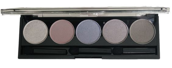
I have a rather embarrassing confession to make. As a self-confessed colour junkie, and as someone who might be mistaken for an expert, I recently invested £40 in an eyeshadow palette that didn’t work for me. By that I mean, the colours didn’t quite work on my skin. Bit embarrassing, that. We live, we learn. I know I’m always learning.
This purchase resulted in much head-scratching. It wasn’t so much that I had ‘wasted’ £40 on something that didn’t work for me (as it happens, the colours work beautifully on my Summer niece – something I’ll get to in a minute), it was more my confusion at having got it wrong. My problem-solving brain needed to know why those colours didn’t work. I had to know.
Makeup is hard to buy, especially if you’re a perfectionist. If you’ve just had your colours done and you’ve switched from, say, Autumn makeup to Summer makeup (and you are indeed a Summer) then you will likely see a marked improvement. When you’ve lived with your colour palette for eight years, buying what might be considered Soft Summer makeup when you are almost certainly a True Summer just isn’t satisfying. The reality is, I need the cool colours in my palette but I had somehow decided that the slight increase in warmth would bring out the blues in my eye. I was wrong. The bareMinerals ‘cool-neutral’ colours looked like bruises on my face.
I am a Summer, a Deep Summer in the House of Colour system. Cool, deep, soft colours suit me. The bareMineral bare sensuals palette is indeed a cool-neutral palette. I figured some colours would be warmer than others, but that most would work for me. I am aware that some colours can look deceptively warm when they actually have cool undertones.
The bareMinerals bare sensuals eyeshadow palette
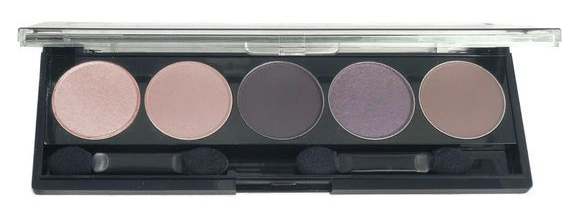
(As an aside, I think it’s interesting to know that this palette doesn’t work for my Spring friend. I wonder if my Autumn friend could wear the warmer colours here. Despite looking warm, they could actually be too cool for her.)
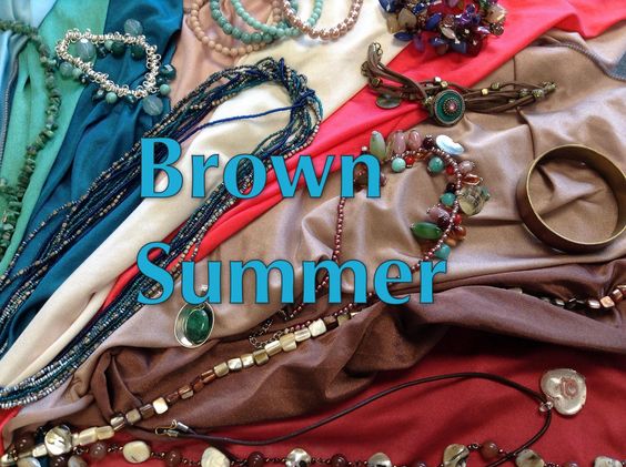
So, who is this eyeshadow palette for? I’m now reasonably confident in saying that this palette would work for Soft Summers, and probably Brown Summers in the House of Colour system. It could also work for Summers who aren’t as cool as I am. I say this with reasonable confidence as my niece is one such person. She was draped with House of Colour several years ago, and came out as a Summer who suited the mid-Summer colours; that is, not the darkest shades and not the lightest, but those that sit in the middle. I sit on the Summer/Winter border and so it makes sense that I am cooler than her. The cooler colours in the bareMinerals palette (the pinks, purples and silvers) look amazing on her. I wish I had photographic evidence. When the shades of purple from the palette were applied, I knew we’d hit her personal colour sweet spot. Her eyes looked so crisp and in focus. She became magnetic to look at – I couldn’t take my eyes off her. Her reaction, perhaps most tellingly, was brilliant. When she looked at herself in the mirror, she literally did a double-take.
Interestingly, the warmer pinks and bronzes in the palette were just a touch too warm for her – perhaps they’d work for a Brown Summer?
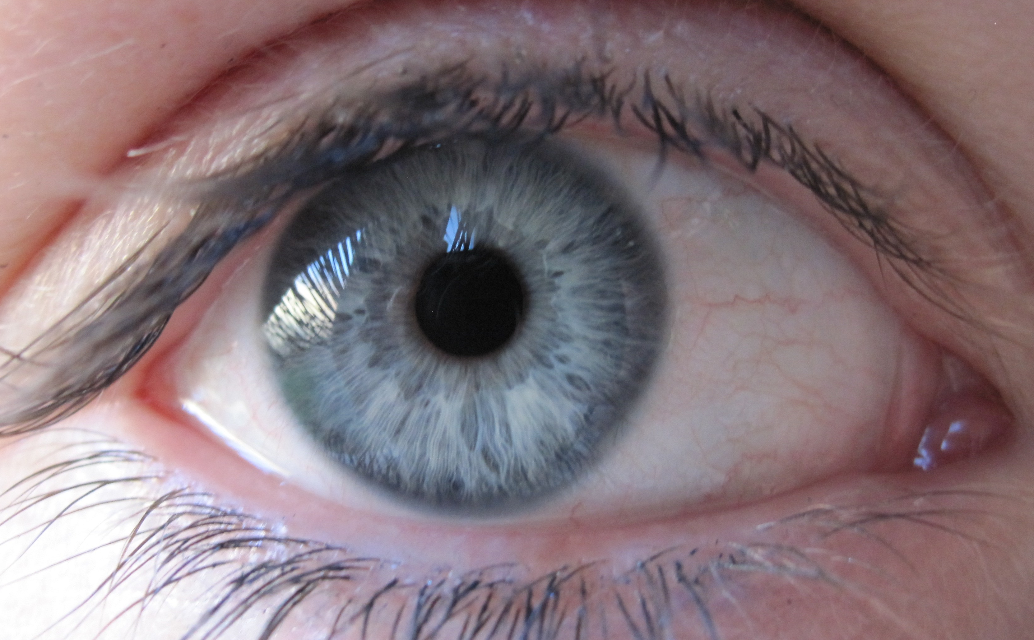
My niece has really striking eyes. Her iris outline is navy, the iris itself looks green, and the sunburst around the pupil is a gold colour, much like this eye:
You could argue, quite reasonably, that they look a touch warm.
In comparison, mine are more grey-blue and look cooler:
With all this in mind, I started to think about Brown Summers (in the House of Colour system) in relation to Soft Summers (in the Sci/Art system as favoured by Christine of 12 Blueprints). Would my niece fall into the Soft Summer category? Perhaps; this could be an avenue worth exploring. Or perhaps she’s simply just a touch warmer than me.
Is she a Brown Summer in the House of Colour system?
I don’t think so, but I wouldn’t like to put money on it.
Okay, so, I want to enhance my grey-blue eye colour and my skin, so what is it I’m looking for, then?
This, it turns out:
Eyeshadow Palette: True Summer – 12 Blueprints Store
Interestingly, Christine’s Soft Summer eyeshadow palette looks a lot like the bareMinerals cool-neutral palette (which makes sense, and also makes me wonder if my niece could be a Soft Summer):
Eyeshadow Palette: Soft Summer – 12 Blueprints Store
My niece has what I’d describe as mostly green eyes, and green sits roughly opposite purple on the colour wheel. This may well explain why the purple shades brought out the colour of her eyes so much (colours that are opposite each other on the colour wheel – complementary colours – make each other look brighter).
Seeing the True Summer eyeshadow palette, I was immediately reminded of my Cool (True) Summer fan. Whilst I’ve never been officially draped by someone trained in the Sci/Art system, I have long since suspected that I would fall into the Cool (True) Summer category.
I do believe that, when it comes to makeup, we have the least room for error here. These colours are literally on our face, on our skin; any mismatch soon becomes obvious. Within the broader seasonal palettes, some makeup colours might not work; I watched my Autumn friend some years back try out a variety of Autumn lipsticks at House of Colour. Some of those were simply not worth purchasing (she ended up going for a stunning brick red).
Buying makeup is made harder by the fact that the colours can look completely different in the palette vs on the skin. Also, makeup is as much at the mercy of fashion as clothing is, which is to say that it is often difficult to find certain colours if they are not ‘in vogue’. Warm colours have been in shops and on makeup counters for a long time – my Autumn friend never seems to struggle when it comes to buying clothes, and I am seeing so many ‘naked’ palettes at the moment which essentially consist of warm-neutral and cool-neutral colours, presumably in a bid to ‘suit everyone’ for maximum sales. But here’s the moral of this story: not everyone is neutral. Far from it. For reasons I don’t understand, I drape more Summers on the Summer/Winter border than any other season. These are Summers just like me – very cool undertones, but colouring that is too soft to be Winter. People with this colouring (and indeed Winters) are not served by these neutral colours. Neutral is not synonymous with universal. We don’t all have neutral colouring.
Looking to buy makeup yourself? I have some advice:
Swatch makeup on a tissue or white paper so you can compare the colour against your swatches. Colours on an eyeshadow palette / in a tube can look wildly different once applied to paper or your skin.
Don’t shop by eye or hair colour. That lipstick that ‘works for every blonde’ is very likely not a match for your undertone.
Take someone with you, preferably someone with some colour knowledge. Sometimes we become almost colour blind. Sometimes we are so determined to buy a burgundy lipstick that we can’t see that we’ve accidentally drifted into Winter when we are in fact a Summer (not speaking from bitter experience, honest 😉 – if you’d like to see another of my makeup purchase disasters, comment below).
Take photos. It’s remarkable just how clarifying they can be. You see yourself in a more objective way in a photo.
If you know your season, check out the 12 Blueprints Store to see what your colours look like in makeup.
Swatch makeup products on the inside of your arm. Does both the colour and your skin look better?
Try before you buy. Have the MUA at the counter apply the product so you can wear it for several hours before you return and (maybe) purchase it. Look at the product on your skin in different lighting (outside, store lighting, at home, etc).
You might not be at the point where you want a colour analysis session, but you have an interest in colour analysis. If you don’t know your season, what can you do? Here are six things you can try.
1. Switch up your mascara
Most people wear black mascara, and most people don’t look good in it. Try switching to navy or brown. When I say navy I don’t mean the electric blue mascara of the ’80s. Nope! Try the No7 Intense Volume navy mascara. Navy suits Winters, Summers and Springs. If you try it and don’t love it, try brown instead, which works for Springs, Autumns and the cool-neutral Summers. When I say brown I mean a proper brown, (not brown/black, which works best for Dark Winters and Dark Autumns).
If, when you apply your new mascara, you suddenly notice your eyes and not your eye makeup, you know you’re on the right track. I was astounded at how much of a difference it made to my face when I switched my black mascara to navy.
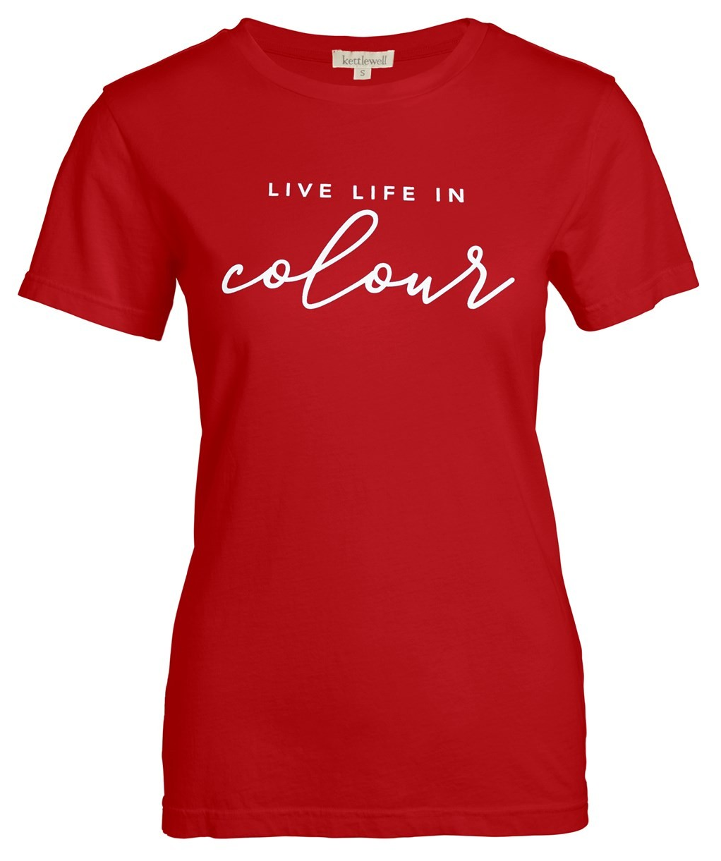
2. Embrace true red
True red suits everyone. No, really! Most people who come to me for a colour analysis session seem intimidated by red, and I do understand why. There’s no ignoring it.
A true red t-shirt by Kettlewell Colours
Absolutely everyone looks amazing in it though (I’m really not exaggerating), especially when they’re wearing true red and have on a matching true red lippy. Buy an inexpensive true red scarf if you’re nervous, and whilst wearing it try a matching lippy when you’re next near a make-up counter. And, if you do that, send me a photo! I’d love to see how amazing you look. True red is my favourite colour because everyone looks good in it.
Why does true red suit everyone? Because it doesn’t contain blue or yellow, the two colours that, when added to a colour, change its temperature.
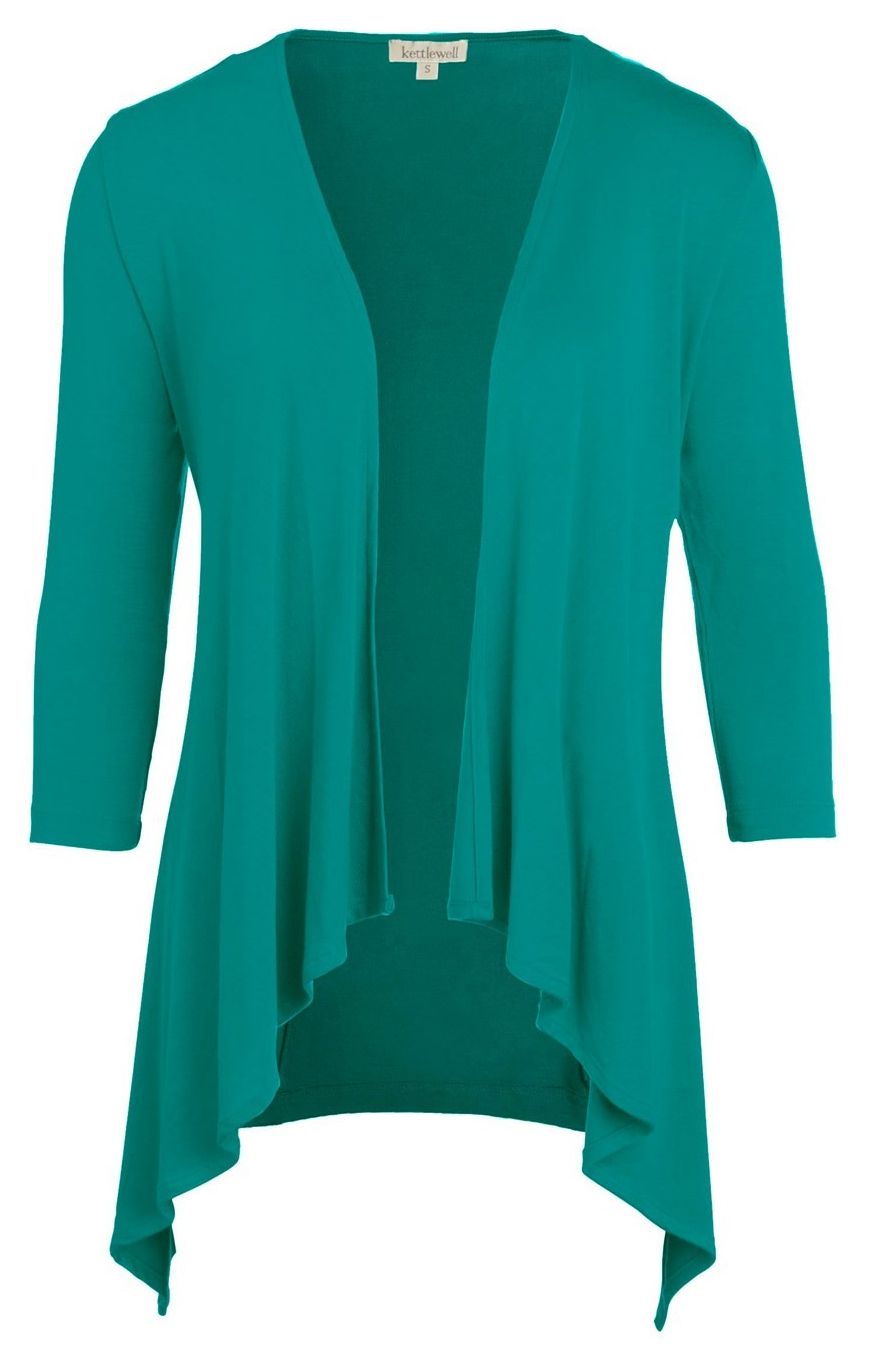
3. Fall in love with teal Teal is another colour that suits everyone because it has (nigh on) equal amounts of yellow and blue in it. When I say teal, this is the colour I mean…
The mid-cascade wrap in ‘Mallard’ by Kettlewell Colours
Kettlewell Colours call it ‘Mallard’. Buying a scarf in this colour would be a cheap way of trying it out. You can’t go wrong with teal. If you fancy being a bit daring, try a teal eyeliner (and report back ;-))!
4. Avoid black
I know it’s hard, I do. Black is everywhere. Having said that, navy is almost as easy to get hold of. Swapping black for navy will be a dramatic improvement for the vast majority of people.
5. Love your natural hair colour
If you don’t love your natural hair colour then you’re wearing the wrong colours. Even the most ‘mousy’ of hair will look beautiful when you’re getting your colours right.
If you’ve dyed your hair, notice how it makes your face look. Does the jet black hair make you look pale and washed out? Do you look a bit sickly in a warm, brassy blonde? Is it time to consider dying it back to your natural colour? Once you know your season, you can afford to be bold.
6. Wear your favourite colours
This one might surprise you, but here’s the thing: often, when people show up to a colour analysis session they say to me ‘Please don’t tell me I can’t wear X’. With the exception of black (which people generally love because it’s easy and considered sophisticated), when someone turns up with a favourite colour that they don’t want to be parted from, it ends up being in their palette, and one of their best colours, too. Our instincts are surprisingly good.
What doesn’t work Trying to figure out whether you have cool or warm undertones from your foundation is almost certainly doomed to fail. Reading into your jewellery colour preference is too risky. I know plenty of Winters who love gold jewellery, and even more women who are wearing the wrong foundation colour.
If you’re familiar with colour analysis and the four seasons, you probably immediately associate certain colours with certain seasons. Emerald green? That’ll be Winter. Rust? Must be Autumn. Lavender? Summer of course. Coral? Ah yes, Spring.
Each season has colours that you immediately think of when you think of that season. Even now when I look at my swatches (regardless of system; I actually have a few different Summer swatches) I see colours I’ve overlooked. As a Summer I have a lot of navy and purple and sea green in my wardrobe. I forget about the reds and the dusky pinks and I especially forget about the soft neutral sandy colour, the light rose brown and the duck egg blue. As a Deep Summer especially, it’s easy to overlook the lighter colours which can be so useful especially in patterns.
Here are (in my opinion) some of the ‘forgotten’ colours for each season, and why I think they’re useful.
Winter
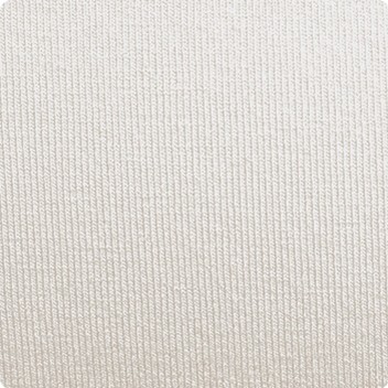
The colour that always surprises me for this season when I stumble upon it in my drapes is the colour that Kettlewell Colours call ‘pebble’.
It’s not a cool Winter silver grey as you might expect, but a pale cool stone colour. It’s actually a very interesting Winter neutral and I saw it used well in a jumper that my last Winter client turned up wearing, combined with purple and black. This obviously works well for blouses and shirts too and would be an interesting and less obvious choice for Winter accessories.
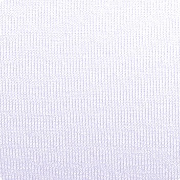
Winter’s icy pastels can get overlooked too, the icy pinks, blues and purples. They are useful for creating contrast when worn with the brighter, darker colours. This is Ice Lavender.
The bolero worn with, say, a camisole in one of the bright cool Winter blues or purples, would look great especially if you were to add black into the mix. I could imagine a black necklace or choker working really well with that.
Summer
Brown is a colour typically associated with Autumn. It’s easy to forget that Summer has a brown too, for which I’m very grateful. I rely on it heavily for boots and handbags because I don’t really want grey or navy which are the other obvious neutrals I could use.
Summer’s cocoa brown
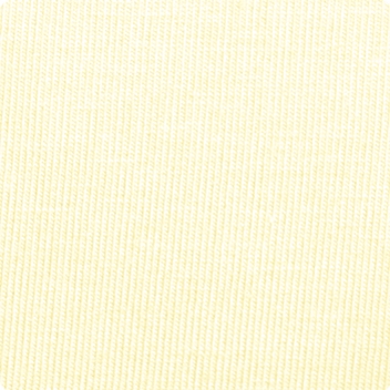
Summer has a very pale, cool yellow. I’ve yet to recommend it to someone as a colour they should buy an investment piece in, but actually it is very interesting and especially brilliant in a pattern.
Autumn
Autumn has a blue, a warm one. Blues aren’t typically associated with Autumn, but they sure are useful particularly for workwear where you want / need to carry a little more authority. This is Rich Navy.
Autumn has a very bright, vibrant orange that you might on first glance assume belongs to Spring but it’s definitely an Autumn colour. It’s like Summer’s primrose yellow in that I’ve never recommended it to someone as a head-to-toe colour but it is useful for accessories and in prints.
This kingfisher’s chest is very reminiscent of Autumn ‘orange spice’
Spring
When we think of Spring we usually think of the bright, warm, splashy tropical colours; coral, warm reds, turquoise, warm bright greens such as apple and leaf green. Spring actually has a fair few lighter and more neutral colours such as cream, peach, and warm grey. This is Salmon, a pale peach that isn’t as splashy as Spring’s usual colours.
It’s easy to forget that the bright seasons have colours that aren’t typically ‘bright’ (pastels for Spring, icy pastels for Winter). I like Spring best when neutrals are paired with the bright, splashy colours. Too many brights and it can look a little overdone.
Spring is closely associated with tan but has a very useful chocolate brown too; a very useful neutral for bags, trousers and shoes. This is Chocolate.