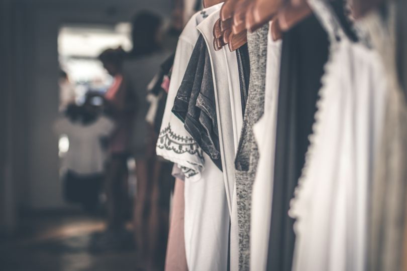
I’m embarrassed to admit it, but it’s true: this colour and style ‘expert’ hasn’t felt good in her clothes for a while. Yesterday, this realisation led to a ruthless wardrobe declutter where I was disturbed to notice just how many items in my wardrobe elicited a feeling of self-consciousness. (Rest assured, I got rid of them all.)
I’ve never found it easy to dress myself; getting my colours and style ‘done’ definitely helped and there are days now when I feel like I’ve truly nailed my look. But it can be frustrating to browse the shops and realise that most of what’s on offer simply doesn’t suit me. Before, I had the illusion of choice (even if none of it actually worked); the upside now, of course, is that shopping is much more efficient.

My recently-discovered curly hair has given me a welcome midlife boost (another post on that soon, I’m sure!) and I’m nailing my skincare right now, which is paying off. But I’ve struggled with my wardrobe – my trusty dress-and-leggings combo is feeling dated now, has become more of a uniform than thoughtful self-expression, and I’ve been contemplating how to update my look in a way that still honours the Natural, Ingenue and Ethereal elements of my clothing personality. In my experience, those who choose a uniform and stick with it end up looking dated – I was running the risk of that myself, failing as I had to keep my wardrobe current in a way that still honoured my style.
In my search for inspiration, I found myself looking at Gen Z and quickly realised many of their trends wouldn’t work for me. Being an Ethereal Ingenue Natural means I need a pretty, elegant, comfortable look. Gen Z are nailing comfortable, but they are intentionally shunning the traditionally elegant, feminine look for something edgier, comfortable and more inclusive. Us millennials have been brainwashed into believing that our clothes must be flattering above all else, and Gen Z are rightly pushing back on this, fuelled in part I believe by the body positivity movement. Gen Z get away with wearing clothes we wore as teenagers (the Y2K trend being a great example of this), doing so with an ironic detachment and nostalgic playfulness that we’d struggle to pull off; millennials attempting the same look like they’re trying to pass as younger.
In fact, as I dug into Gen Z fashion, I found myself increasingly fascinated by the unspoken politics behind their choices. Broadly speaking, many millennials – especially women – were conditioned to dress for the male gaze, while Gen Z are more likely to reject that in favour of dressing for self-expression and even the female or queer gaze. Some of their clothes are purposefully ‘ugly’ in a quiet rejection of the patriarchy; they are much more likely to be gender-fluid, challenging gender norms and embracing an androgynous look should they feel like it. Overall, they are more relaxed – focussed on their happiness, comfort and self-expression. Thank God.
Millennials came of age when there was a strong societal message that being sexy (in a very narrow, heteronormative, male-centric way) was important, even marketed as empowering. By contrast, Gen Z grew up online which allowed more niche aesthetics to flourish: cottage core, e-girl, grunge revival, goblin core, etc. And with more open conversations about feminism, gender, and queer identity, many Gen Zers are deliberately rejecting the male gaze, embracing androgyny, and dressing for themselves or for their communities. That’s not to say that Gen Z are immune to the male gaze, but the cultural default has shifted. Millennials were taught to ask, “Does this make me look hot?” whereas Gen Z are more likely to ask, “Does this feel like me?” Gen Z are more concerned with authenticity and, as a result, are pushing back against patriarchal values.
There’s a certain I-don’t-give-a-fuck to Gen Z that’s inspiring and empowering – anything goes. You want to rock up to the supermarket in crocs, a tulle skirt and vintage leather jacket? Younger generations aren’t going to bat an eye. There’s less pressure to be polished and instead we’re seeing this generation embrace natural beauty and move away from the heavily polished, straight-haired ideals of past decades. Rather than trying to tame their hair or conform to conventional beauty standards, many Gen Zers are embracing their natural textures: curly hair is seen as an expression of individuality and confidence, rather than ‘messy’ or ‘unprofessional’.
Millennials (and older generations) grew up in a society that was rife with fat phobia: the worst thing you could be was ‘fat’. The food industry created an obesogenic environment and shamed us all when we gained weight, then sold us Weight Watchers and Slimming World as the ‘solution’. But times are changing: I had a refreshing conversation with an 11-year-old recently; she’d overheard a conversation I was having with her mum, and was completely confused as to why there had ever been a pressure to be skinny.
After disappearing down an hours-long shopping rabbit hole yesterday, I deduced that I need to avoid:
- Chunky sandals and boots – I tried, but those chunky soles just aren’t for this Ingenue.
- Anything that requires me to go braless – this is an interesting trend (some say it is part of a broader shift toward body positivity, comfort and freedom of expression), but I can’t give up the comfort or modesty of a bra (and truthfully, I’ve never wanted to).
- Anything too revealing (e.g. backless, plunge cut necklines, etc).
- Satin – sadly too shiny for this True Summer; I need fabrics with a more natural finish. Chiffon works well for me, as does cotton.
- Jeans – these always look too utilitarian on me, regardless of shape; denim shorts I can manage with tights and pretty footwear, but otherwise I have to forgo denim.
- The ‘lingerie-as-outerwear’ look – on me, this simply looks like I’ve forgotten to dress.

I can do:
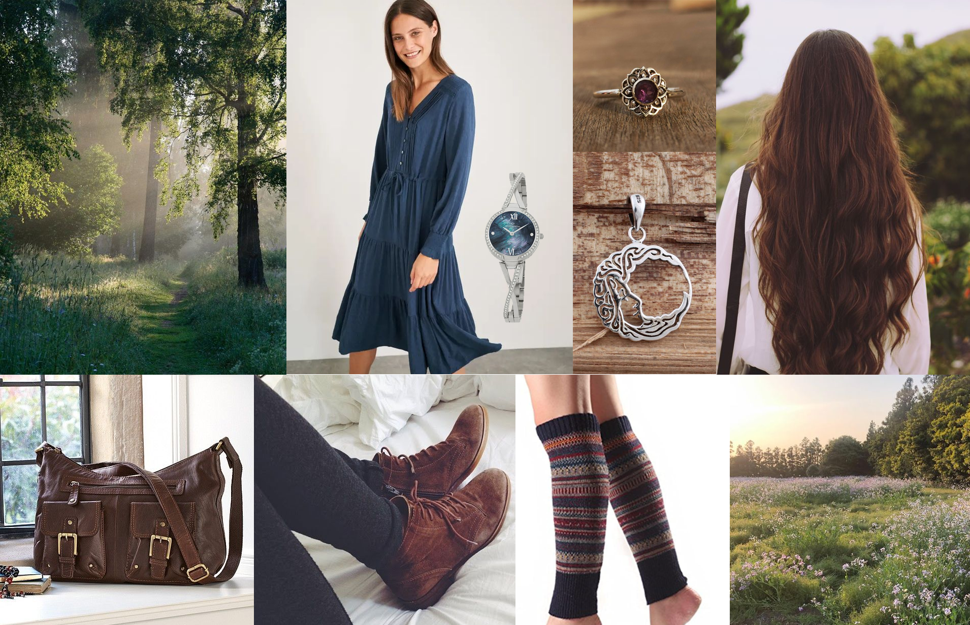
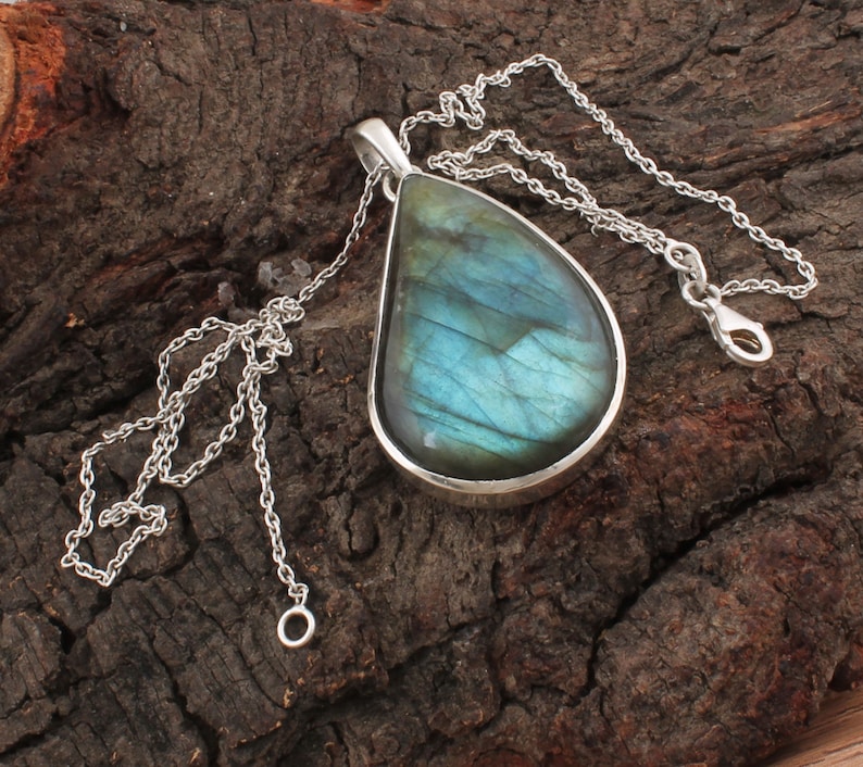
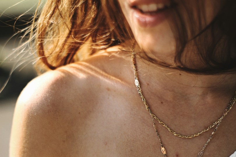
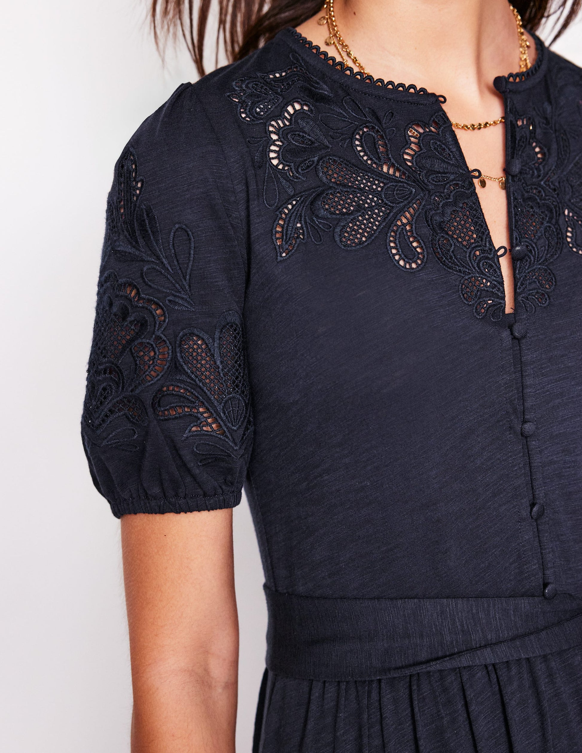
- Layered necklaces – I love the ones on Carrie Elizabeth, although price-wise I find them hard to justify, so I hunted down some dupes on Etsy and Accessorize instead.
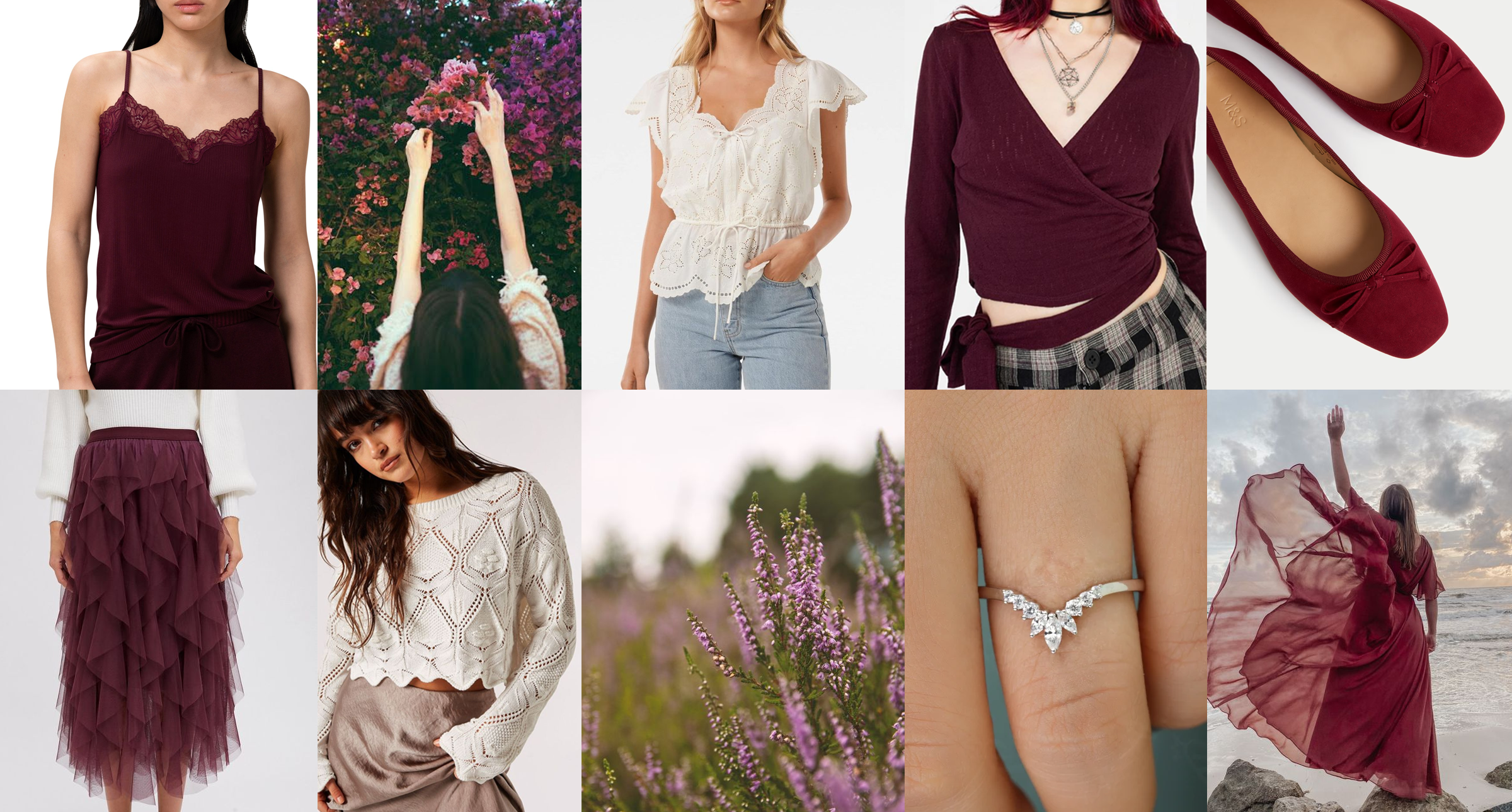
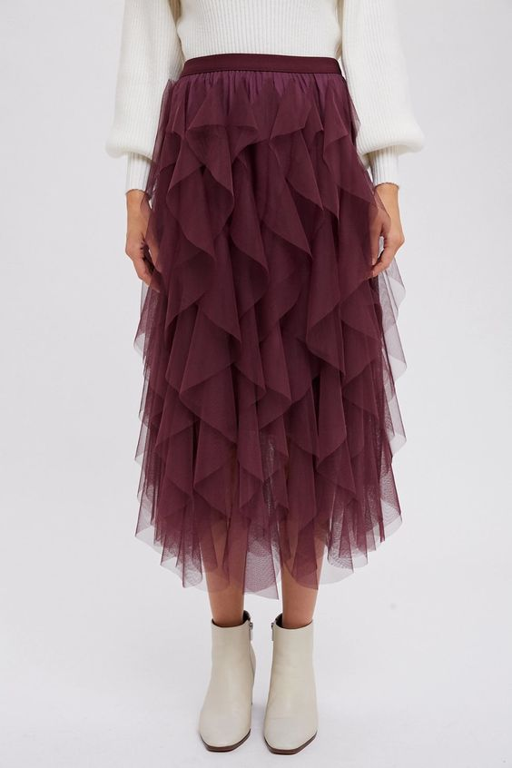
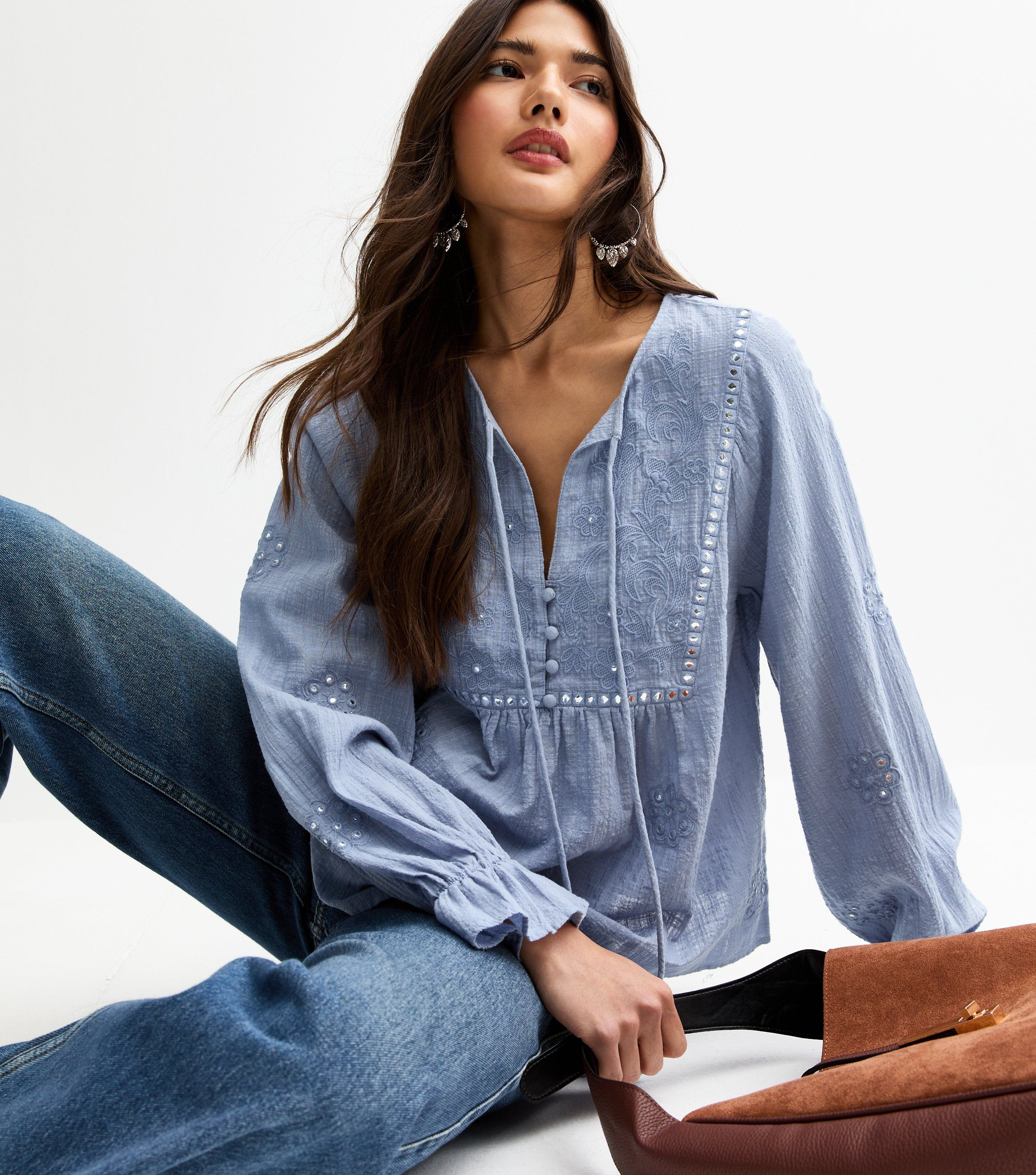
- Ruffles / tiered dresses and skirts – I’m so happy these are in right now; I’ve had the most success with New Look recently.
- Puff sleeves, as long as they’re not too big.
- Midi length is still going strong – but this only works for me with the right footwear; I need knee high boots or elegant ballet pumps, ankle boots look awkward.
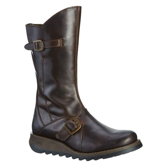
- Practical boots with a more feminine outfit (tbf, I’ve always loved this combo), but it still has to be delicate – no wedges, trainers or chunky soles.
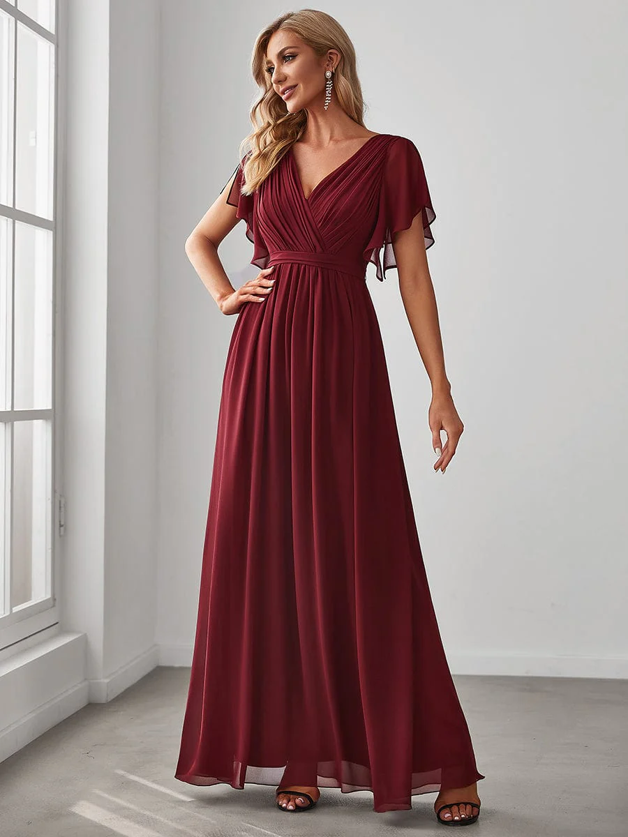
- Dresses – these will always be a staple for me since I struggle with separates, being someone who is high waisted.
I firmly believe that the answer to updating one’s look will always be thus: embrace the current trends that work for you, and let everyone else have the rest. Dramatics might enjoy the oversized clothes and chunky shoes. Naturals will be happy to live in athleisurewear. Romantics will appreciate the milkmaid dresses. Gamines will benefit from the more boyish and androgynous looks.
Though I feel as though I have a more romantic body now (I’m curvier than I was pre-pandemic), romantic styles still don’t suit. I haven’t ‘grown up’ into a Romantic, either – despite being firmly middle-aged, I am still very much an Ingenue and anything ‘older’ just ages me. I’ve made the mistake (more than once) of trying Romantic clothes, only to feel frumpy. It’s always been a challenge to find clothes delicate and pretty enough for the Ingenue element of my clothing personality, but it’s something I simply can’t afford to overlook.
To update my look, I’ve opted for:
- Layered necklaces, rather than wearing a single pendant
- Tights instead of leggings (where appropriate)
- Lace-up leather boots (to replace my slouchy biker boots)
- Wide, floaty trousers (e.g. palazzo pants)
- Clothing that’s tiered or has delicate ruffles
Against the backdrop of current trends, my non-negotiables seem to be:
- Keep it pretty, feminine and youthful
- Keep it elegant
- Keep it modest: the ‘free the nipple’ movement does not apply to me
It’s easy to forget that fashion and style aren’t just about what’s in or not – they’re supposed to be about authentic self-expression. If, like me, you find that your wardrobe needs a little reset now and then, rest assured that’s just part of the process – because our style, just like us, evolves.