A few weeks ago, a friend revealed that her Spring colours no longer suited her. Yesterday, I draped her to find out exactly what was going on. Helena was first analysed in her 20s and now, over a decade later, she was finding that her warm, bright colours no longer worked.
Needless to say, I was fascinated. I had been taught that people simply don’t change seasons, that undertones don’t change in the course of a lifetime. We soften and desaturate as we age, so a move from, say, True Summer to Soft Summer isn’t impossible. But to change season completely? Not possible. So I was told…
I had no idea what to expect when I arrived. What I did know was that I believed her. I wondered if, quite logically, her colouring had softened and she had moved into Autumn. I wondered if she was on the edge of Spring now.
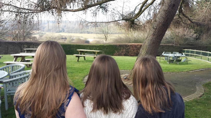
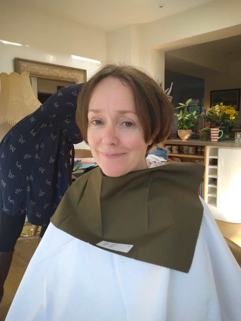
I noticed immediately that she looked good in the white cover cape. I began to drape her. The metallic silver drape was obviously better than the metallic gold. My brain tried to argue. How could that be so?
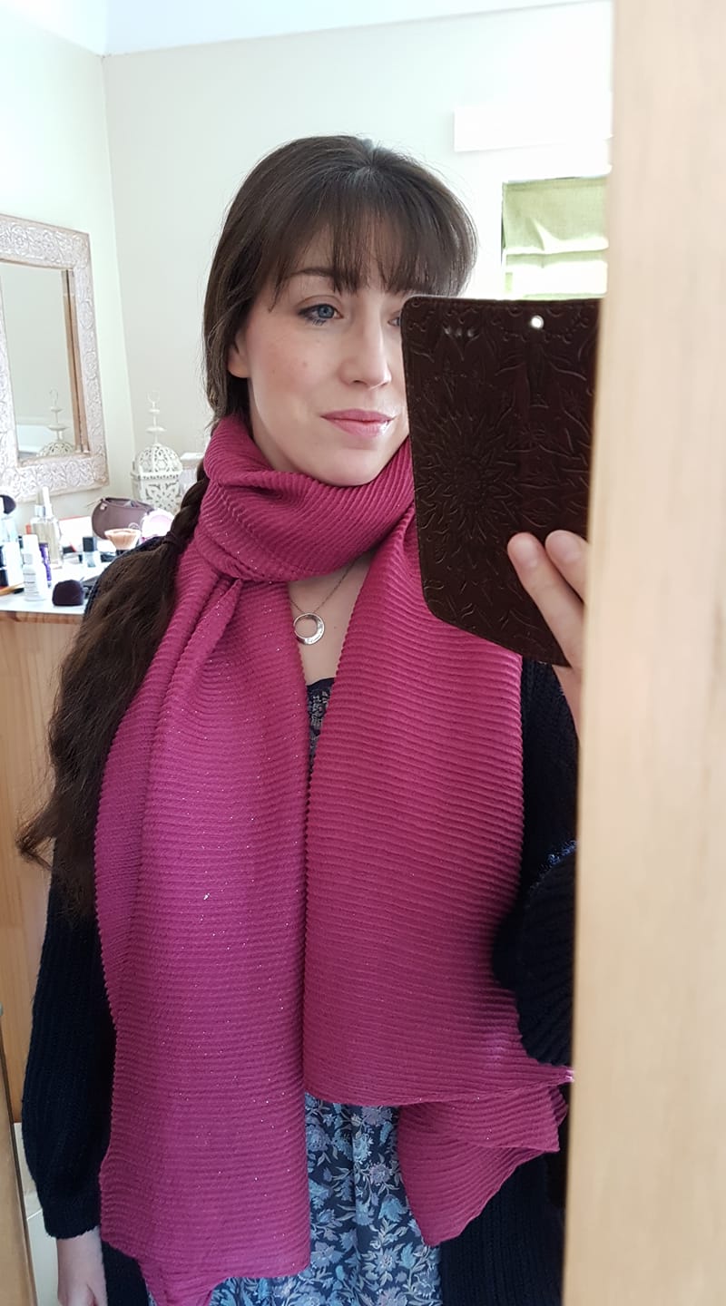
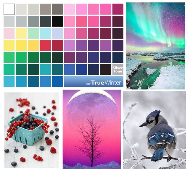
I started to compare Winter and Spring. It quickly became clear that her skin couldn’t tolerate any warmth. A logical assumption might be that, as she’d shifted from a warm season to a cool season, she might be on the warmer end of Winter (leaning towards Spring). But no! She was a True/Cool Winter who looked best in emerald green, fuchsia pink, electric blue and, shockingly, black. I did a double-take when I put the black drape on her – it is rare that even a Winter looks so in focus in the black drape (often, charcoal is better).
I tested drapes from every other season, as I always do. Autumn made her skin look muddy, Summer made her whole face look grey. Even burgundy, a colour shared by Summer and Winter, was a bit too grey in comparison to Winter’s cool red.
You might think that her initial analysis can’t have been right, but that was never my belief: firstly, she was analysed by a reputable company but secondly, and most importantly, she could see that those colours were perfect for her at the time. She saw the transformation herself, lived in those colours, received the compliments, felt good. Then, years later, those compliments stopped. Looking at herself in more recent photos, she can see something isn’t right. In her words, “Why didn’t someone tell me?”

As we worked through the drapes, I could see that the Spring colours were the least flattering on her. My mind was blown. She laughed: “I’ve been wearing the wrong colours for the last 10 years!” How disorientating it must be, to be so confident in your season only for it to change. But she knew something wasn’t right, even if that “wasn’t possible”.
I was told that, while our colouring might soften with age, we wouldn’t ever change season. To hop from a bright, warm season to a bright, cool season? Impossible. Looking back, I realise I should have questioned this claim. Where was the evidence? Were clients re-rated years later to see if they were indeed the same season?

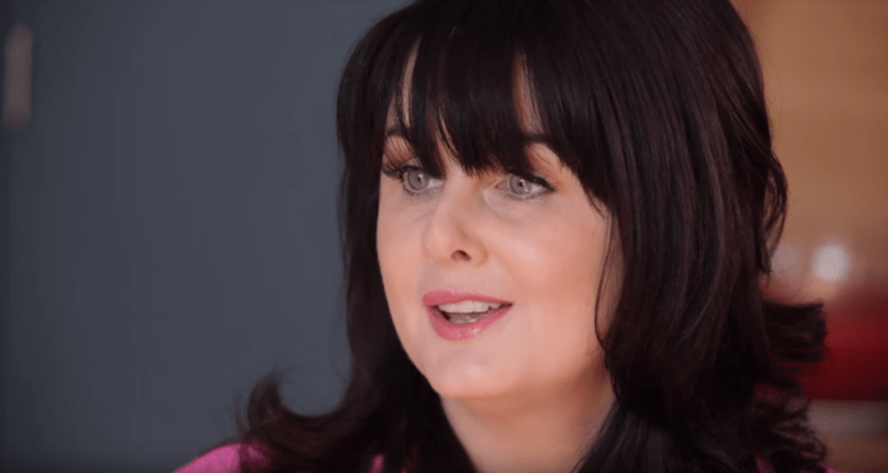
Helena is slap bang in the middle of Winter. She hadn’t softened in any way, she didn’t even lean towards Deep/Dark Winter. All traces of warmth had simply disappeared from her skin. On a big, fundamental level, her undertones had changed. But she hadn’t lost saturation. Not at all.

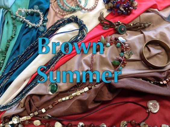
Helena, used to wearing Spring’s bright colours, told me that Winter wasn’t a difficult transition. Although, as she had lived as a Spring for so many years, she was, in her words “absolutely back to square one.” She told me: “I could literally put my entire bedroom–wardrobe, drawers, makeup, jewellery–in a skip.” She told me that she found it “strangely disturbing” to realise, over the years, that her Spring colours no longer suited her. I completely understood.
This has to be the most interesting draping I’ve ever done, and the lessons from it will stay with me forever. When it comes to human colouring, anything is possible. Huge thanks to Helena for allowing me to use her photos for this post, and to Catherine for taking them.