I’ve been a fan of Marian Keyes for the longest time, since the days of Watermelon and Lucy Sullivan is Getting Married. I recently read her latest book, The Break, and was struck by the main character Amy’s love of fashion. Throughout the book, references were made to the kinds of makeup and clothes that the character felt suited her (very consistent with someone who was a Winter, I couldn’t help but notice) and there was even a reference to colour analysis.
With this in mind, I looked up Marian Keyes on YouTube and this is what I found. Take a look at this stunning creature:
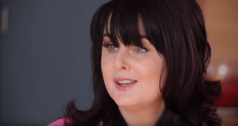
Clearly a Winter like her character, Amy. Her hair colour makes her skin look so clear and smooth (clearly, this lady has some make-up game, too). I would be shocked if Marian hadn’t had her colours done (if only I could ask her!)
This was the interview I watched. Take a look at her house, too, and Marian’s top. The dark hair really suits her, and those eyes! The remarkable pale grey/blue/green of a Bright Winter.
I suspect the interviewer (Sam Baker) is an Autumn. She’s much more muted than Marian, and her hair looks to be a muted russet. I bet she’d look great in an antique teal or a dark olive (I always get such Autumn envy whenever I think about the palette).
Having done a bit of Instagram stalking, I am convinced Marian is a Romantic of some description. She loves her fabulous shoes and her animal prints; there’s a brilliant pic of her in a leopard print dress (all Winter colours).
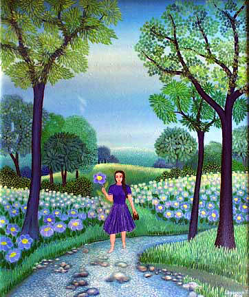
Both Marian and her character Amy love the Serbian artist Dusanka Petrovic, another ‘Winter clue’. Take a look at the really bright, cool colours:
I enjoyed the book all the more for its references to colour and fashion. I wasn’t at all surprised to discover that both Marian and her character Amy were Winters.
If you’re on the market for a really compelling and at times quite gritty book about marriage, relationships and families, then I can highly recommend The Break 🙂
UPDATE:
Marian confirmed on Twitter that she has had her colours done and that she’s a Winter!!!!!!!!!! (My day is made!!!!!!)


She is gorgeous. Could you ask her on Twitter? From what I’ve read she’s a twitter addict!
Catherine, thank you for the suggestion. As you can see, she replied!!!
Ooh how exciting that she replied! 🙂 Also how exciting that I have discovered your beautiful blog – I know what I’m going to be doing this Friday evening haha!
I am also a Winter like Marion! And you have the most beautiful & deep Summer colouring. One thing that’s puzzling me though is having gone to the ‘colour combinations’ class, coming back with ‘double star’ combinations that I would not have imagined!
I otherwise scored double stars on most of the ‘jewel’ like colours when my season was first established – royal and electric blues, carmine, lobelia, royal purple, dark emerald, burgundy, damson, black, magenta, raspberry… (100% column) and as a general rule less with the brighter/ice colours of the winter palette.
And yet the double stars I’ve come back with are the following:
Fuchsia + lobelia + ice lavender
Magenta + black + charcoal + ice pink
Cerise/Shocking pink + grey + black
Cerise/Shocking pink + ice blue + ice lavender (totally surprised by this one! Although it’s true, it did look good on the chair in the mirror with the cerise lippy and three drapes)
Cerise/Shocking pink + damson + silver
Damson + raspberry + ice pink
Scarlet + pine green + ice green
Ok so now I’m taking up the comment section but you seem so clued up and perceptive (I also just read an older post from you on the Oscars and it made SO much sense!)
Have you any idea yourself why it would be that I’ve ended up with so many ‘lighter’ colours in colour combos that look ‘best’ on me (I’m not complaining – maybe I was being too rigid anyway and thinking I need to dress like a collection of Christmas baubles with my jewels!)
The consultant also wrote down on my sheet ‘no 3 disparate colours together’ and it’s true – as a combo even if they were all 100% double star colours on me on the colour analysis day (carmine, dark emerald, black, for example), they ended up being some of my lowest marks.
I am also an Ingenue, so was wondering if maybe it’s my personality coming through here, so need a more delicate, ‘blended’ look then say a Dramatic Winter?
Would love to hear back from you. Sorry to hijack the comment section again. But intrigued!
Hi Laura, I was thrilled to read your comment – so glad you stumbled on my blog! Hello fellow Ingenue 🙂
As it happens, I do have a theory as to why you’ve ended up with lots of the Winter ‘pastels’ (a.k.a. icy pastels) in your colour combinations. Winters generally need contrast, some more than others. The brighter your ** colours, the more contrast you need (I’ve noticed that Winters who suit the deeper, darker colours don’t need as much). So in your case, it’s not just the lovely cool bright colours that are working for you, but the contrast that is created when you pair them with (much) lighter colours. You create less contrast if you were to wear, say, a selection of your purples (which works well on me, as a Summer). Doing this would create a more blended look (as would wearing carmine, dark emerald and black together). I’ve seen the same in Springs – neutrals paired with a splash of something bright seems to work best. You might find this article on combining colours interesting, written by the brilliant Christine Scaman: https://12blueprints.com/the-12-colour-equations/.
I hope that answers your question, and I hope you enjoy the rest of the blog. It was lovely to hear from you 🙂