My own colour journey

I have to confess to feeling rather shy writing a blog post essentially about myself and my own colour journey. Unfortunately (or fortunately 😉 ) I have a great many photos at my disposal and a great many mistakes to delight you with, as well as photos post-analysis which demonstrate (I hope) what one looks like ‘in focus’.

I’m very much of the belief that everyone is naturally beautiful. Chances are if someone is considered ‘more beautiful’ then it’s because they are honouring the colouring already present in them in their clothes and make-up, and they will naturally glow as a result. Someone in the wrong colours can look ill and jaundiced. Their otherwise invisible acne scars might take centre stage. Their skin might look doughy and their features lack definition. Put someone in their wrong colours and they will never look their best.

Looking through my old photos two things really struck me. Firstly, that I don’t often seem to pose in a sensible fashion, always preferring to pull a silly face probably to hide my discomfort at being in front of a camera. Secondly, the colours I seemed to wear almost exclusively were: baby blue, pale pink, lilac, off-white and grey. What’s interesting is that these are all Summer colours but were far too light to give any real impact, as my natural colouring is really rather deep. I didn’t look ill or jaundiced but the magic didn’t quite happen in the lighter Summer colours. My occasional non-compliant mistakes consisted of khaki and brown borrowed from Autumn.

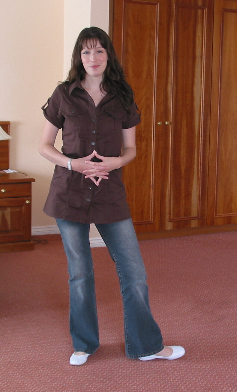
Brown. Not awful, but I certainly don’t shine in it. Interestingly my partner really likes me in brown… He’s an Autumn 😉

Not awful, but it certainly doesn't make me glow.
Not awful, but it certainly doesn’t make me glow and the white shoes seem like a very odd choice. My attention is drawn down towards them.

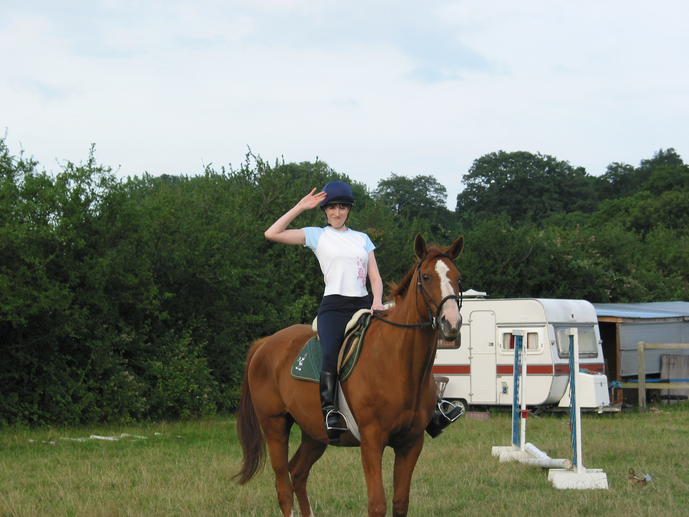
Interestingly when I used to go horse riding I wore navy jodhpurs and even went as far as to replace my traditional black velvet hat cover with a navy one. I was clearly onto something.

A surprising aytpical choice for riding - navy jodhpurs and a navy hat cover. I could see even back then that black so close to my face wasn't doing me any favours.
A surprising aytpical choice for riding – navy jodhpurs and a navy hat cover. I could see even then that black so close to my face was unkind.

Pre-analysis, there were a few happy accidents where I got my colours spot on. My school uniform was a burgundy sweatshirt, one of my very best colours (lucky me for having such a flattering school uniform). Sadly I don’t have a decent photo of me in my school uniform to show you, but here are my other ‘happy accidents’.

Everything here is right for a Summer especially the blue cardigan and even the wavy hair.
Everything here is right for a Summer especially the blue cardigan, even the wavy hair.

I say ‘happy accidents’ but actually I’m completely wrong about that. They are far from accidents. These so-called happy accidents are actually an excellent example of how we can sometimes choose the right colours for ourselves, instinctively, if only the choices are out there in the shops.

Burgundy red dress - possibly a little on the shiny side but the colour is spot on.
Burgundy red dress – possibly a little on the shiny side but the colour is spot on.

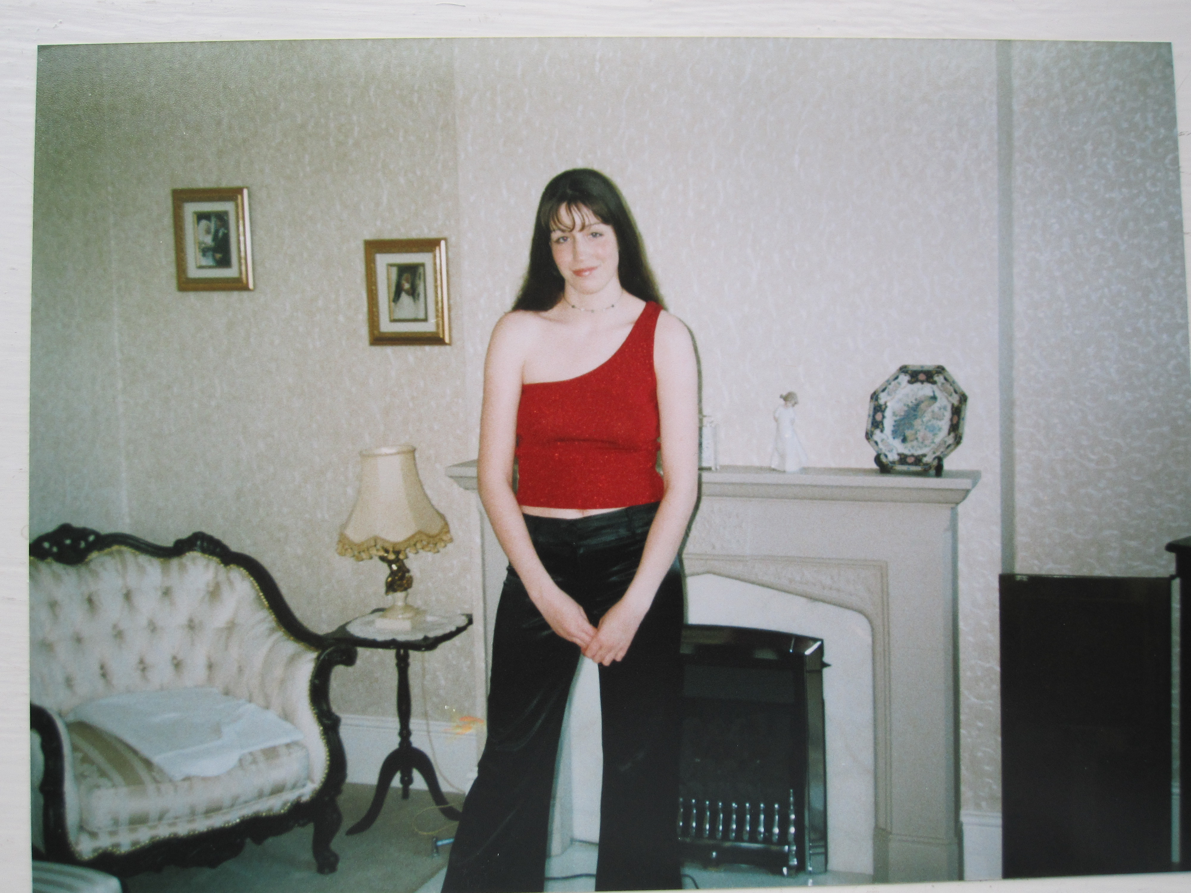
My ‘going out’ mistakes were all Winter ones. This photo is a great example of how black really isn’t slimming. It’s so bad I nearly didn’t include it. The style is all wrong, the colours completely dominate.

This is so bad I nearly didn't include it. The style is all wrong, the colours completely dominate. Interestingly I was at my very lightest here weight-wise and yet I look heavier thanks to the colours and the unflattering style. The hem of the top cuts me in half in the most unflattering way.
Interestingly I was at my very lightest here weight-wise and yet I look heavier thanks to the colours and the unflattering style. The hem of the top cuts me in half in the most unflattering way.

My biggest mistake undoubtedly was black. I’ve always had an aversion to it and looking back it’s easy to see why.

This is truly terrible. At my mother's insistence I wore a darker (Winter) lip to try and balance the black. Ouch.
This is truly terrible. At my mother’s insistence I wore a darker (Winter) lip to try and balance the black. Ouch.

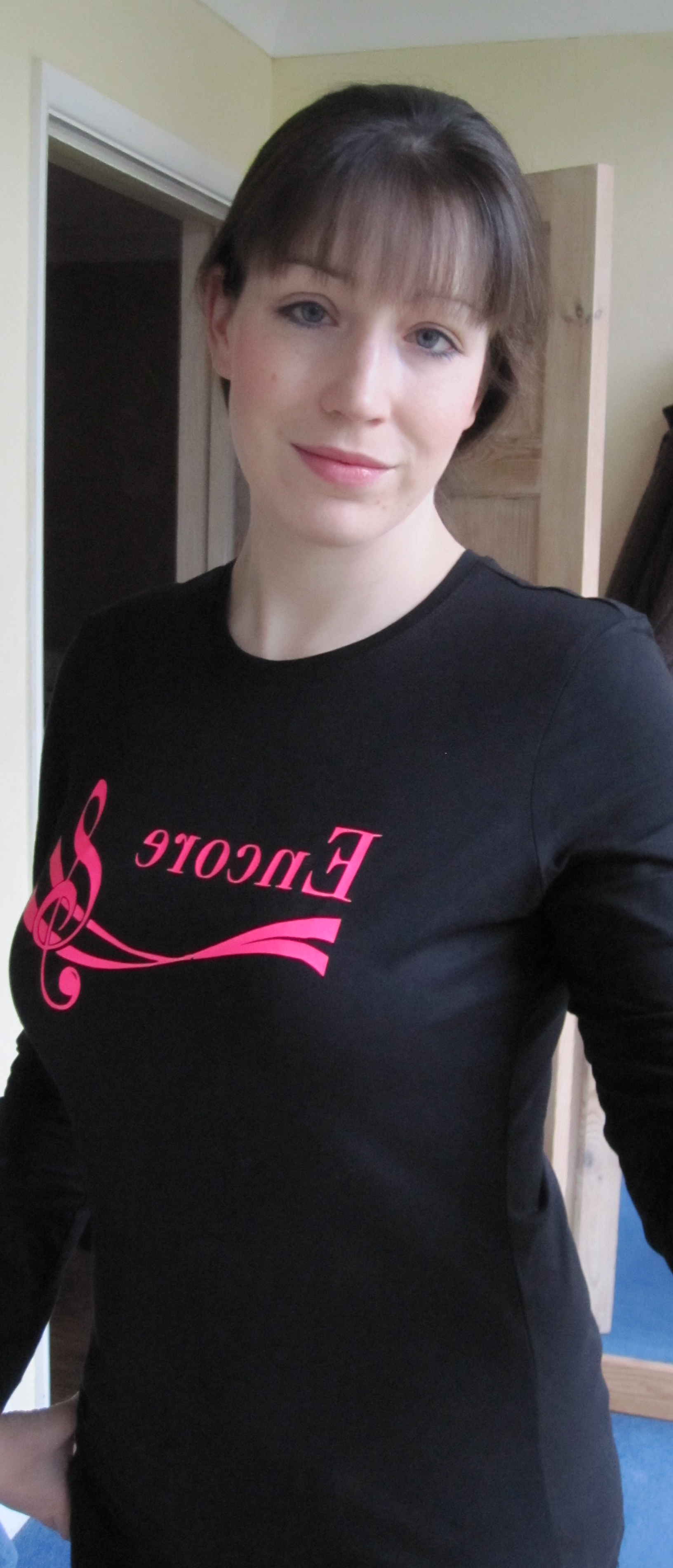
This is an interesting photo. This is post-analysis, but I’d joined a choir and the uniform was black (you can imagine how thrilled I was). Even with a face full of Summer make-up I still look like a ghost.

Choir uniform - black. Universally the most unflattering colour. Only 1 in 4 can pull it off, and even fewer look really good in it.
Choir uniform – black. Universally the most unflattering colour. Only 1 in 4 can pull it off, and even fewer look really good in it.

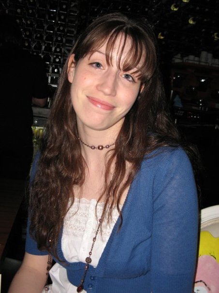
This is an interesting photo because I think it’s a great example of me looking ‘soft’ (pre-analysis, surprisingly). I don’t think I’m wearing any make-up here which is undoubtedly a good thing as I’d always wear Autumn blusher and black mascara. Someone with my deeper colouring can easily get mistaken for a Winter, especially with such cool undertones. This photo is a great example of the softness Summers have and Winters lack.

Summer or Winter? With that softness I could only be a Summer.

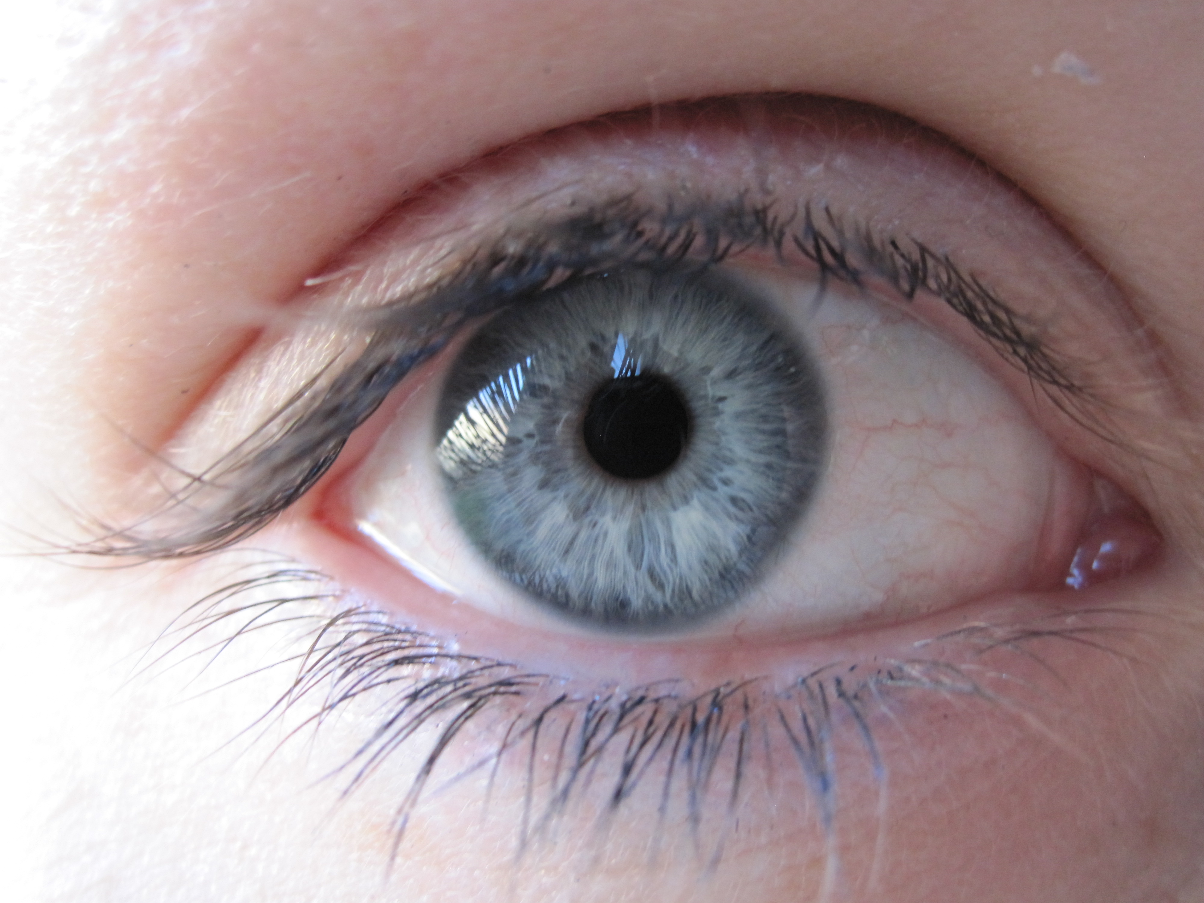
I went through a stage of taking pictures of eyes. I think this is a brilliant example of a Summer eye. Blue-grey, and look at those wavy spokes.

A typical Summer eye.

Back in 2010 I remember returning home from my colour analysis completely buzzing. I walked into my bedroom and it hit me. My entire bedroom was a delightful plethora of Summer colours. I recall being shocked at how good my instincts had been.

Pre-analysis I'd managed to decorate my bedroom in entirely Summer colours. The beautiful wisps of light are where I was experimenting with light painting!
Pre-analysis I’d managed to decorate my bedroom in entirely Summer colours. The beautiful wisps of light are where I was experimenting with light painting!

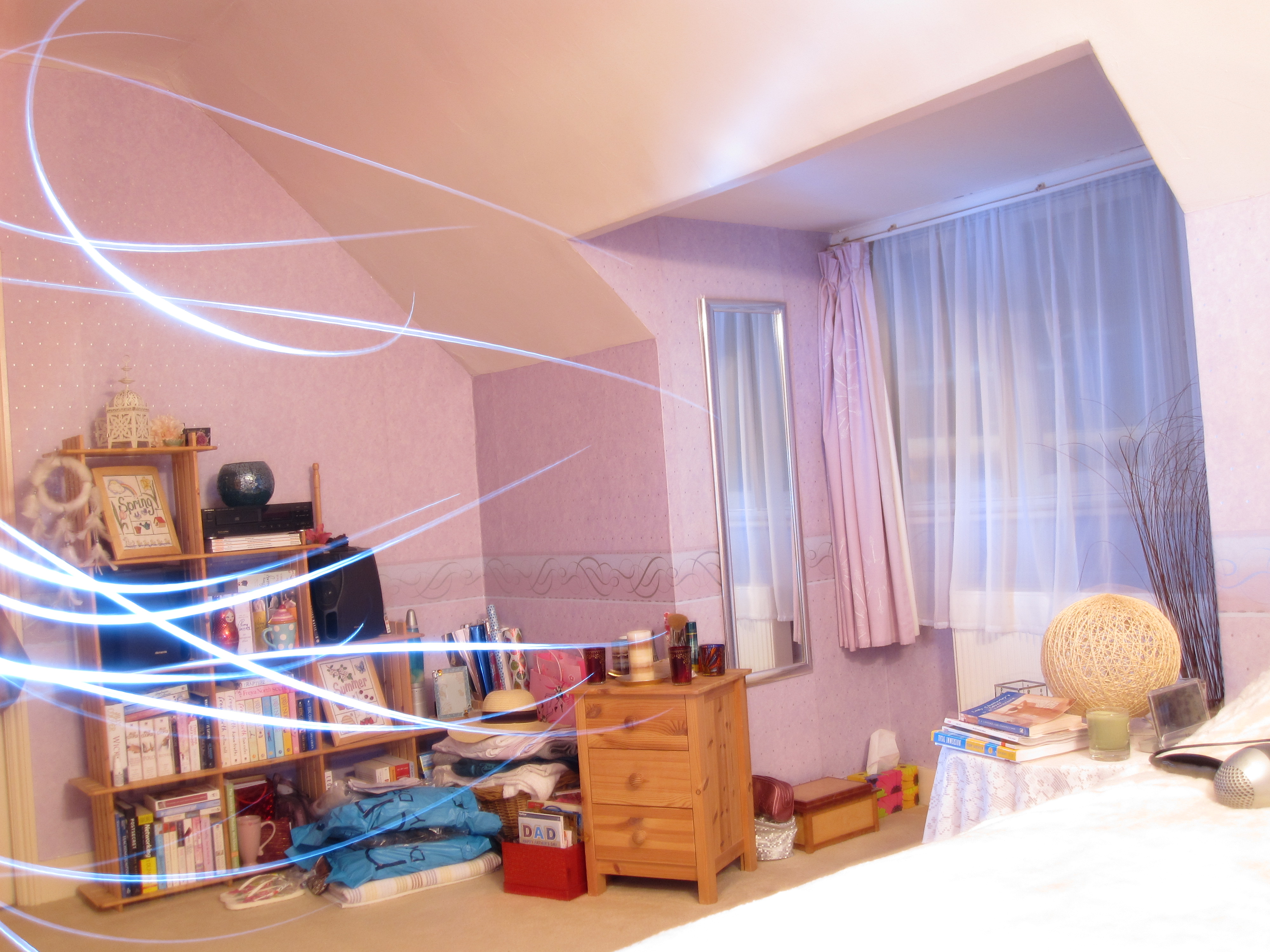
Another bedroom shot. The sunset is so beautiful and there is something a bit ‘Deep Summer’ about the image, actually. In it you’ll find soft dark greys, silvers, lilacs, pink and sand. No black to speak of but some very dark greys.

Another bedroom shot.
‘Deep Summer’ bedroom shot.

This is a post-analysis photo and I’m trying out different lipsticks. I remember feeling rather self conscious in this but actually the depth really sits well with my colouring. I can see that now.

A deep rose lip for a Deep Summer.

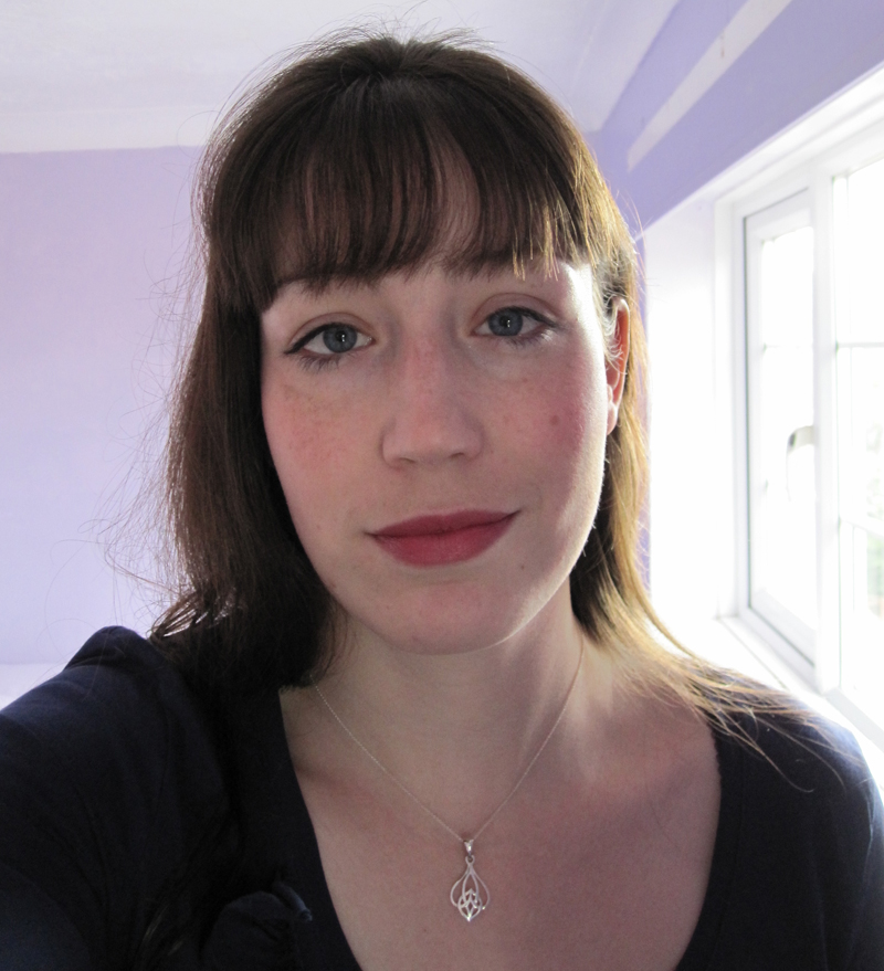
And finally, the photo you’ve all been waiting for (hopefully)…

'In focus' at last.
‘In focus’ at last.

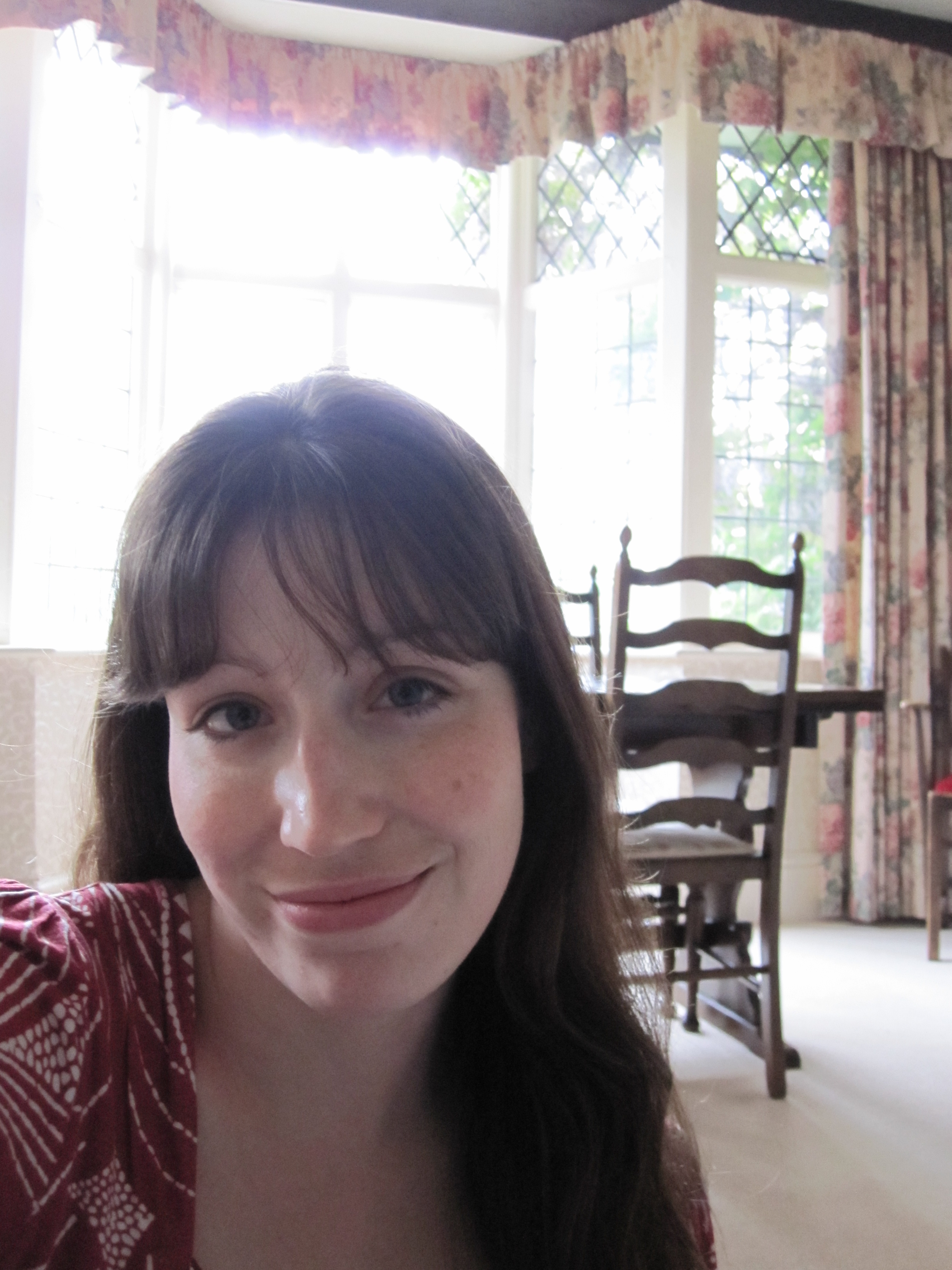
Do you notice the make-up? I don’t think so. What I see is the crisp navy line around the iris. The lipstick and blusher only serve to draw attention to the eyes. My skin is pale but I don’t look like a ghost. The blusher is a natural extension of my own blush colour. The attention is drawn to the eyes. Do you feel your insides relax at last? It’s quite a visceral feeling, I think. The right colours ‘feel’ right in a way that is difficult to describe. I realise, as I re-read this, that I’ve been rushing to get to the bottom of the post.

A Dreamy Summer

I had the intense pleasure of draping a rather clever Summer this afternoon. Even before she was draped this attentive woman had already figured out that bright shiny silver was ‘too blingy’ and yellow gold too yellow. Black mascara, she said, was too domineering (she wears brown). She told me of her fondness for rose gold which is great for Summers and looks particularly good on blondes I think (she’s blonde). All this came out as we were going through the drapes. I was impressed.

The fascinating thing about very cool people is that when you start off with the bright shiny silver drape and the bright shiny gold drape, the bright silver clears the skin beautifully and the gold makes the person look as though they have severe jaundice. The differences are very obvious. She was a very easy person to drape right from the start. Warm colours made her look very sickly, cool so very much better. The Winter drapes were obviously too domineering. In the Summer drapes (especially after we’d put on blusher and lipstick, which looked amazing) all I could think about as I looked at her was a garden filled with Summer flowers: lavender, roses, carnations, wisteria, forget-me-nots, sweet peas, pink astilbe, hydrangeas. If Autumn is the warm, cosy, comforting season of food and spice and crunchy leaves then Summer is the cool tranquil garden overlooking a beautifully-kept Italian lake. Beside the lake sits a weeping willow swaying in the breeze. Summer isn’t a tropical island, that’s Spring. It’s not cosy, that’s Autumn. It’s cool but it’s not dramatic and high contrast like Winter.

Summer has a lot of blues, from baby through to midnight, from a definite blue through to the blue-greens of water: gentle turquoise, cool jade and teal. In the middle of the blues you’ll find cornflower, marine blue and periwinkle. Denim is Summer’s very best friend. Almost all shades suit, from the pale stonewashed denim through to mid/dark blue. Avoid blue/black or anything that’s been given a brown or dusty yellow tint to make it look ‘used’. Summer’s colour combinations are beautiful, reminiscent of a watercolour painting.

The colour descriptions are so pretty: pearl, white sand, cocoa brown (a rose brown rather than, say, bitter chocolate). The colours sky, orchid, wisteria, lilac and clover are beautiful when worn together. Generally speaking, the more colours the better. If two colours look a little odd together, add a third. Try and find a pattern with lots of Summer colours in it. If looking for footwear then a burgundy brown or a lighter rose brown are very useful and can often be found in the shops (in amongst the unsuitable shades of tan, black, bitter chocolate and camel). On the subject of footwear, I bought a “dark tan” Kiwi shoe polish from the local supermarket a while back which is a reddy brown. This came in very useful as I bought a pair of boots that turned out to be the wrong shade of brown (they were a very muted brown/black and didn’t seem to sit well with the rest of my wardrobe). The polish gave them a wonderful burgundy red finish which was exactly what I needed.

Summer isn’t sharp or harsh, it’s soft and circular like the curve in the body of a cello or a tear drop. It’s good to have this in mind when choosing jewellery, especially watches. Circular stones are pretty, as are marquise and pear. This watch is a little on the shiny side (if we’re being picky) but the pink mother-of-pearl face is perfect, as is the shape.

Brushed silver and moonstone would be perfect on this person, mother-of-pearl is also fantastic. Rose gold is a clever choice on blondes. Labradorite is a wonderful gemstone. Its shimmery, ethereal quality make it perfect for a Summer. Brushed silver frames would make excellent glasses, as would rose brown, blue and navy. A silver-grey velvet coat would look stunning, one in blue (ink for those who can carry a little more depth) would be wonderful and a little more practical. Batik fabric can be very useful as the change between the different colours is often gradual and soft.

Make-up colours can be tricky. Rose and rose-amethyst are very pretty lip colours. Foundation has to be very cool, which means that the wrong (too warm) foundation will look orange, a frequent frustration for Summers. Pick a cosmetics company that understand cool/warm undertones, sometimes these are called pink (cool) or yellow (warm) undertones. You will get a better foundation match with them.

In terms of hair, often Summers berate themselves for having mousy hair when the reality is it’s a beautiful medium-brown that isn’t being flattered by the right colours. Whatever you do, don’t let the hairdresser add warmth. They seem to be so keen to do so but you want ash blonde highlights, not honey or caramel. Your natural hair colour will always flatter you so stick with that if you can bear to, especially if your hair is a darker brown.

Avoid fake tan. I know that might be hard to hear, so many seem to love it. The right colours will always give you that healthy glow you so desire and will save you ruining your bed sheets!

For now I shall leave you with this image that, I think, beautifully summarises Summer.

Outfits for an Autumn

I had the pleasure of draping a delightful Autumn yesterday and, as a result, I’m feeling very inspired about the Autumn palette. What’s not to love when you find yourself describing the colours in terms of food and nature? Toffee, butterscotch, apple, coffee, chocolate and caramel. Cinnamon, cumin, olive and turmeric. Conker, peacock, kingfisher and pumpkin, greens in olive, grass, leaf. Such wonderful imagery.

One question that frequently pops up regardless of season is, what colour shoes should I wear if I can’t wear black? A very legitimate question which inspired a Pinterest board, the highlights of which I shall delight you with here.

You can’t go wrong with brown shoes. Brown is Autumn’s version of black. There is something very reassuring about leather shoes I think that really suits the Autumn palette. Pewter (assuming it’s bronze enough), camel, beige, rust, even teal are all great colours for shoes. Gold is fabulous for sandals, flip flops, ballet pumps and evening footwear. Brown is quite easy to find in boots. A pair of brown suede boots would surely be the perfect investment buy for any Autumn (just be sure to purchase them with some waterproofing suede spray).

Brown leather shoes

What a fabulous teal cardigan. It would look great with a rust camisole underneath.

Teal long cardigan

Autumns do have a navy in their palette but it is a warmer navy that can be tricky to find in the shops. As you can see, the navy denim jeans look great with the teal here, so I don’t think the navy need be completely spot on to work. Denim is a perfect fabric for Autumns.

How amazing is this rust dress?

Rust maxi dress from Monsoon

The necklace they’ve picked out to wear with it is spot on too. I love how even the background colour is perfect. The model could well be an Autumn with those brown eyes.

These tan sandals would go very well with the dress. They would also work for a Spring.

Tan sandals with gold hardware

Coral ballet pumps, so very pretty for the summer with a dress:

Coral crochet ballet pumps from new Look

These would also work for Springs I think.

Rose gold is fabulous in jewellery. This rose gold ring with pink sapphires is heavenly.

14K Rose Gold Pink Sapphire Ring from Etsy

Last of the highlights – a brushed gold star necklace. I had to include this because the texture on the star is just perfect.

Estella Bartlett Gold Metal Star Necklace from John Lewis

Here is the rest of the board – enjoy!

Everyone should own a Little RED Dress

According to studies done by A. J. Elliot et al (documented in his Journal of Personality and Social Psychology and his Journal of Experimental Social Psychology), red enhances women’s attractiveness to men, an effect that is apparently universal. This probably doesn’t come as any great surprise when you think about the colour and how it is used in marketing (Special K lady anyone?). It’s certainly a powerful colour, and often a colour that many veer away from for fear it might draw attention to them. Ironically it’s likely to be one of the most flattering colours you could own.

The wonderful thing about red is that every season has a shade that flatters them.

Spring has poppy red, a warm bright red that looks especially striking when worn as a lipstick with a top/dress in a similar colour.

fdsfds
Spring’s warm poppy red

Summer has a cool cherry red that’s a bit more pink and soft in comparison to Winter’s red. A Deep Summer would also look incredible in a deep claret red (burgundy).

Summer’s soft cherry red

Autumn’s red looks like burnt orange and red mixed together to form a warm muted red.

brick-red
Autumn’s brick red

Autumn could also wear a softer version of Spring’s poppy red, which looks more red than the brick.

Winter’s red is cool, dramatic and uncompromising. A Winter can wear true primary red, scarlet, claret or crimson.

Scarlet red tunic

So, have I persuaded you yet? The Dress Spot is a brilliant website if you are looking for a dress in a particular colour. Perfect for finding your own Little Red Dress!