If you’re familiar with colour analysis and the four seasons, you probably immediately associate certain colours with certain seasons. Emerald green? That’ll be Winter. Rust? Must be Autumn. Lavender? Summer of course. Coral? Ah yes, Spring.
Each season has colours that you immediately think of when you think of that season. Even now when I look at my swatches (regardless of system; I actually have a few different Summer swatches) I see colours I’ve overlooked. As a Summer I have a lot of navy and purple and sea green in my wardrobe. I forget about the reds and the dusky pinks and I especially forget about the soft neutral sandy colour, the light rose brown and the duck egg blue. As a Deep Summer especially, it’s easy to overlook the lighter colours which can be so useful especially in patterns.
Here are (in my opinion) some of the ‘forgotten’ colours for each season, and why I think they’re useful.
Winter
The colour that always surprises me for this season when I stumble upon it in my drapes is the colour that Kettlewell Colours call ‘pebble’.
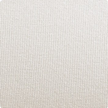
It’s not a cool Winter silver grey as you might expect, but a pale cool stone colour. It’s actually a very interesting Winter neutral and I saw it used well in a jumper that my last Winter client turned up wearing, combined with purple and black. This obviously works well for blouses and shirts too and would be an interesting and less obvious choice for Winter accessories.
Winter’s icy pastels can get overlooked too, the icy pinks, blues and purples. They are useful for creating contrast when worn with the brighter, darker colours. This is Ice Lavender.
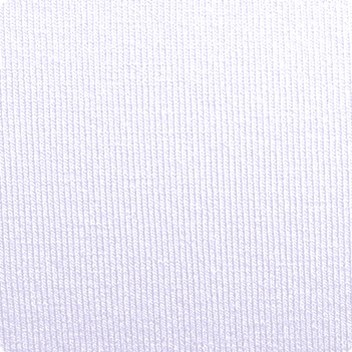
The bolero worn with, say, a camisole in one of the bright cool Winter blues or purples, would look great especially if you were to add black into the mix. I could imagine a black necklace or choker working really well with that.
Summer
Brown is a colour typically associated with Autumn. It’s easy to forget that Summer has a brown too, for which I’m very grateful. I rely on it heavily for boots and handbags because I don’t really want grey or navy which are the other obvious neutrals I could use.

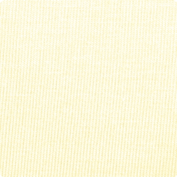
Summer has a very pale, cool yellow. I’ve yet to recommend it to someone as a colour they should buy an investment piece in, but actually it is very interesting and especially brilliant in a pattern.
Autumn
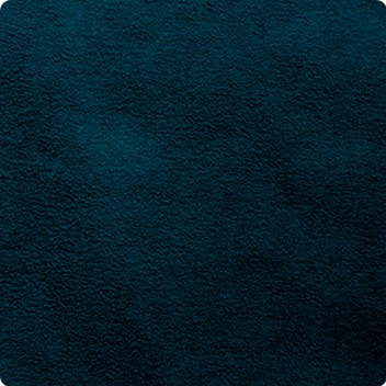
Autumn has a blue, a warm one. Blues aren’t typically associated with Autumn, but they sure are useful particularly for workwear where you want / need to carry a little more authority. This is Rich Navy.
Autumn has a very bright, vibrant orange that you might on first glance assume belongs to Spring but it’s definitely an Autumn colour. It’s like Summer’s primrose yellow in that I’ve never recommended it to someone as a head-to-toe colour but it is useful for accessories and in prints.

Spring
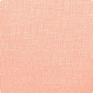
When we think of Spring we usually think of the bright, warm, splashy tropical colours; coral, warm reds, turquoise, warm bright greens such as apple and leaf green. Spring actually has a fair few lighter and more neutral colours such as cream, peach, and warm grey. This is Salmon, a pale peach that isn’t as splashy as Spring’s usual colours.
It’s easy to forget that the bright seasons have colours that aren’t typically ‘bright’ (pastels for Spring, icy pastels for Winter). I like Spring best when neutrals are paired with the bright, splashy colours. Too many brights and it can look a little overdone.
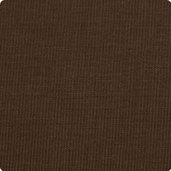
Spring is closely associated with tan but has a very useful chocolate brown too; a very useful neutral for bags, trousers and shoes. This is Chocolate.