The Golden Globes

A friend of mine earlier this month alerted me to the Golden Globe awards and posted a link to an article containing all the red-carpet outfits. She asked me what I thought from a style and colour perspective and I couldn’t resist having a look. These undoubtedly beautiful women have access to the best designers in the business in addition to stylists and make-up artists. Despite this I often find myself thinking that the outfit they eventually decided upon could have suited them better.

I thought Rosie Huntington-Whiteley chose well. She is a woman who knows what colours suit her although I wonder if she’d gone for a soft silver instead of a soft gold whether that would have improved the look even more (perhaps, perhaps not). I imagine rose gold looks great on her. She’s almost certainly a Summer or Autumn who looks best in the softer shades. Notice that she’s a low-contrast woman in a low-contrast outfit, even her nails aren’t a distinct colour. This really works, she doesn’t look naked like some can when they are wearing a nude or nearly-nude shade. What do I mean by low-contrast? I mean that there isn’t a great variation (in terms of colour value) between the colour of her hair, eyes and skin. She has pale skin, light hair and pale green-blue eyes. An example of someone with high-contrast colouring would be Zoey Deschanel with her pale skin, dark hair and bright eyes.

Rosie Huntingdon-Whiteley

I thought Jennifer Lawrence chose well too. I’d have swapped the silver jewellery for gold because she appears to be wearing a warm red (which suits her) but otherwise it works. The dress is quirky, like she is.

Jennifer Lawrence

My favourite might just be Saoirse Ronan whose style I suspect isn’t a million miles from my own and who has an ethereal quality about her. What I like most about her outfit, apart from the harmony, is how different she looks to everyone else. She knows what suits her it would seem, and she’s sticking with it. I imagine there must be a fair bit of pressure on celebrities to wear the latest trends to seem current (remember that Stella McCartney bodycon dress Kate Winslet wore one year?). Saoirse did well to choose this dress.

Saoirse Ronan

Kate Winslet is an interesting one. The colour certainly seems right, it does nice things for her skin. I’ve always suspected she’s a Summer. I’m not completely sure about the style though, I’d like to see her in something with more movement in it.

Kate Winslet

I’m sure Amy Adams is a warm season. She carries that orange well. I’ve seen her look great in coral before now too. Excellent choice.

Amy Adams

Jenna Dewan-Tatum looks great. A great dress for a high-contrast woman. What’s telling about this dress I think is that despite it’s size and pattern my eyes are still drawn to Jenna’s face which tells me that she’s getting it right. She’s probably a Winter with those striking eyes, pale skin and near-black hair, and the cool dress flatters her.

Jenna Dewan-Tatum

I’m not sure about Julianne Moore. I think the dress is too cool for her. Her head looks disconnected from her body and she looks a little washed out. Style-wise I like it for her, but the colour isn’t right.

Julianne Moore

Black on Lady Gaga is too severe. Black is hard to wear at the best of times for most of the population, the velvet only increases black’s harshness as it absorbs the light. With the bleached hair and black eyeliner I don’t feel as though I can see her at all.

Lady Gaga

Olivia Palermo is a stunning woman but sadly this outfit is not. My eye is so confused. The cool fuchsia lipstick clashes with the gold necklace and the colours in the dress. The black eyeliner is demanding in a way eyeliner shouldn’t be.

Olivia Palermo

I love Lily James’s dress but for someone with such striking, contrasting features, it doesn’t work. Her head seems at odds with the rest of her.

Lily James

Another example of someone struggling with black, the high neckline really isn’t helping. Emilia Clarke isn’t a Winter. She looks like I do in black.

Emilia Clarke

I looked at Emmy Rossum for a long time and ended up Googling her before I could figure out what was going wrong. She looks like she could be a Winter but actually I think she’s a warm season, an Autumn who suits the deeper shades of the palette would be my guess. The silver jewellery and black eyeliner are jarring. I don’t like the straight hair or the straight lines of the dress. I nearly didn’t recognise her when I first stumbled on the photo.

Emmy Rossum

Lola Kirke looks a lot like a cool season wearing Autumn’s mustard. Look at the shadows on her face. The lippy suits her but not the dress.

Lola Kirke

Sarah Hay’s choice is a very interesting one. First off, I strongly suspect the dress would have looked better in pale gold than silver (on her). In addition, I find the style of the dress jarring. It’s pretty, delicate. The cleavage looks inappropriate. I suspect it’s a dress that would best suit an Ethereal Ingénue but would need some adjustment so it wasn’t so revealing.

Sarah Hay

Eva Green. Such a striking woman, but not in this dress. She looks positively unwell. The warm lipstick isn’t working and in that nude dress she looks like a floating head. As Vesper Lynd in Casino Royale she was pure Winter perfection.

Eva Green

These truly are all beautiful women, they just haven’t necessarily made the best choices for themselves. Before I had my colours and style done I’d have days where I’d look ill and put on extra make-up to compensate. I had no idea that khaki / black / lime was the culprit, not my health.

If you’re interested in seeing more red-carpet outfits you can find them all here: http://www.popsugar.co.uk/fashion/Golden-Globes-Red-Carpet-Dresses-2016-39742645?stream_view=1#photo-39742589.

The difficulty in explaining colour analysis

I was at a social gathering recently where I was put on the spot by the hostess, who asked me to explain colour analysis and my interest in it to a fellow party-goer and it got me thinking, because even now, still, I find colour analysis overwhelming to explain. It’s something, to my mind, that is relevant to everyone and beneficial to everyone. In addition, it sounds too good to be true. Not only does it sound too good to be true, but if the person I’m talking to is open-minded enough to believe what I’m saying there’s still an excellent chance I will be met with defensiveness, which often happens, and I will hastily add now that I completely understand the reasons for this.

In general, people worry about what other people think of them, and no-one relishes the prospect of being wrong, particularly when it comes to our own bodies and appearance. So often, when I explain what colour analysis is (and I’m not met with a look of incredulity) the next oft-cited phrase I might hear is loaded with insecurity and defensiveness. This is frustrating because it stems from a complete lack of understanding as to what a colour analyst does. We’re not the colour police or Trinny & Susannah, we’re not going to tell you off. We want to give you options, we want to make you happy, we want you to feel good in your own skin. Of course you can still go on wearing black / olive / lilac if it isn’t your best colour or even if it makes you look ill. We don’t judge because actually we truly understand that getting dressed, on a bad day, can be a surprisingly complex thing fraught with worry and there are plenty of reasons why you might choose not to wear your most flattering colours, all perfectly valid. We’re in the business we’re in because we want to help ease that angst, not because we’re smug about ‘getting it right’ and want to impose rules on you. And on the subject of insecurity, I think about how so many people, especially women, get sucked into the hype sold by the cosmetics and beauty industry (myself included) and how so little of these people know that by simply wearing the right colours (and by right I mean those that match your own colours in brightness and temperature) they can almost certainly skip the concealer.

As a colour analyst, what I want most is for you to have options. I want you to know your most flattering colours so that you can choose to wear them, or choose not to. Knowledge is power, knowledge is empowerment. Perhaps the opposite of empowerment is insecurity. Insecurity is a funny thing. Fashion and cosmetics companies play on it to sell us things. Insecurity is fundamentally a type of fear. I’ve yet to meet anyone who doesn’t fear judgement from others on some level (whether it be about how they look, or their competence at work, or their personality). They might admit it, they might not. It’s perfectly natural.

Colour analysis allows us to see you, not your hair, make-up or clothes. When the colours are right we see your bone structure, the shape of your lips, the line around your iris, the shape of your nose, I could go on. I understand that for some this might feel uncomfortable at first. Not everyone wants to be noticed for who they are, to be seen so clearly, but it is certainly beautiful to behold.

When I start to explain colour analysis, I hear a lot of the same comebacks. To those that say, “I already know what colours suit me” I want to reply “But don’t you want to know the formula? Don’t you want to know if there are colours out there that look amazing on you that you don’t already know about?”

To those that say, “I don’t want to be told what colours to wear” I would say “But we’re not, surely what you put on your body is entirely up to you? Aren’t you curious to know if there are some colours out there that really can make you look younger and your skin smoother and your eyes brighter?”

To those that say, “It makes no difference what colours people wear” I would say “But would you buy the first frame you found in the right size for a painting you’d bought? Didn’t think so. You’d pick a frame that looked harmonious with the painting.” We’re no different. We need ‘framing’ too.

terrible-frame
Ack. My eyes are so confused.
bad-frame
Could be better… There’s something a bit uncomfortable about this.
good-frame
I see the picture, not the frame. Just how it should be.

To those that say, “I don’t want to be told I’m doing it all wrong” I would say “I understand. Please, don’t worry. It doesn’t matter. No-one, least of all me, is going to judge you for what you turn up in.” Instead of fearing judgement or getting caught up in whether or not you’re ‘doing it wrong’ I just wish that people would relax, and breathe, and know that people are often so caught up in worrying about what others think of them that they’re not really looking at you at all. So often when someone turns up for an analysis they are fretting about their outfit and I often think how funny it is that they are so busy worrying about their own outfit that they’re not looking at mine and judging whether I’m practising what I preach and whether, based on my appearance, I’m worth the money they’re giving me.

When I’m asked to explain colour analysis and why it’s great, everything I’ve mentioned here runs through my head. It’s overwhelming. I feel a sense of great responsibility to impart what I know about it and why I think it could help someone and I often feel I fail to convey what I wanted to get across. I want to tell them how it changed my life. I want to tell them that now, every day, getting dressed is easy. Buying make-up is easy. I can put as much or as little effort into my outfit as I want and I’ll consistently feel comfortable leaving the house in it. I want to tell them that it wasn’t always this way. I want to tell them about the days when I’d leave the house hoping I wouldn’t bump into anyone I knew. I want to tell them how ugly I felt some days, the shame, the frustration of having a wardrobe full of clothes but nothing I felt I could put on and leave the house in. I want them to know that when I started wearing my colours I started to feel good about looking in the mirror, not anxious or shy. When someone asks me to explain what colour analysis is, perhaps I’ll just point them to this article instead 🙂

My Colour and Style Experiment

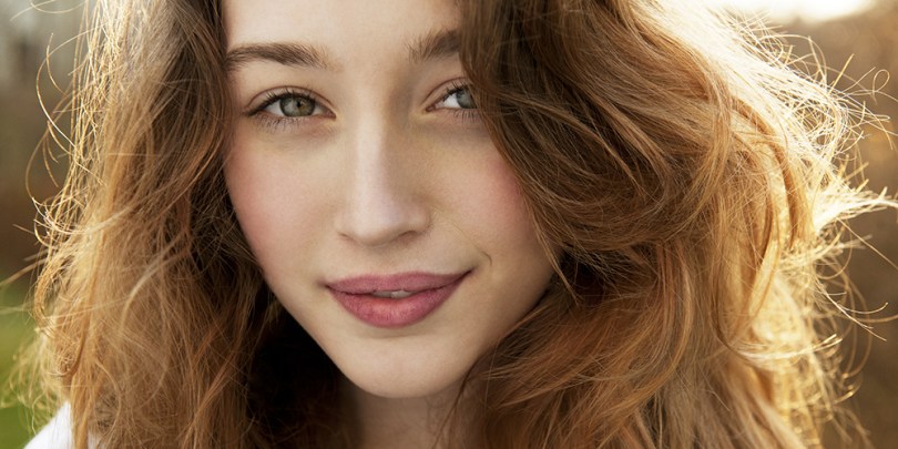
As you may have judged by the title of this post, it’s time for something a little bit different! I’m very excited to be writing about a colour and style experiment I did recently. For one day only I wore something completely different both style and colour-wise, in part to see if anyone noticed, and also to see how I felt.

I wanted my outfit to be believable. In fact, I wanted it to be something I could and would have quite plausibly worn before I had my colours and style done, so it was put together with much thought and with a little help from my style and colour-savvy friends.

Why did I do the experiment?

I had my colours done over 5 years ago and as a result I’m very used to wearing clothes that feel right for me and not really having to think about what I wear. It is completely liberating. It means I can think about clothes as little or as much as I want. It also means I dress very consistently. I dress true to my clothing personality and I always wear colours from the Summer palette (as a Deep Summer this means I wear a lot of navy, purple and sea green). I did this experiment because I wanted to remember how it felt to leave the house feeling insecure about my outfit. I remember frequently leaving the house for work hoping I wouldn’t have to deal with anyone that day because I didn’t feel comfortable in what I was wearing but I didn’t know what else to wear. When I think back to that time the memory of it leaves me feeling quite drained. I had to think about clothes a lot if I wanted to feel vaguely comfortable when leaving the house. I had a wardrobe full of clothes and nothing to wear. I rarely got it right, and it took me a long time to figure out what I was going to wear.

I did the experiment because I wanted to see how the people I interact with every day reacted to me dressing differently. Would they even notice? Generally speaking people don’t comment on my clothes and I think this is because when the clothes are right, people notice the person wearing them. I’ll admit that I was expecting to feel very uncomfortable all day, but I was pretty sure that no-one would notice or comment. Turns out I was quite wrong about that!

How would I describe my style usually?

Zyla’s tagline for his Sunset Summer archetype is ‘elegant bohemian’ and I think that phrase works well to describe me. I’d also describe my style as pretty, casual and a bit ethereal. I have a love of detail in clothes, anything plain is a bit of a turn-off for me. In House of Colour’s system I’m considered an ‘Ingénue Natural’. It’s a young, casual look. Here is my style board on Pinterest, to give you a better idea:

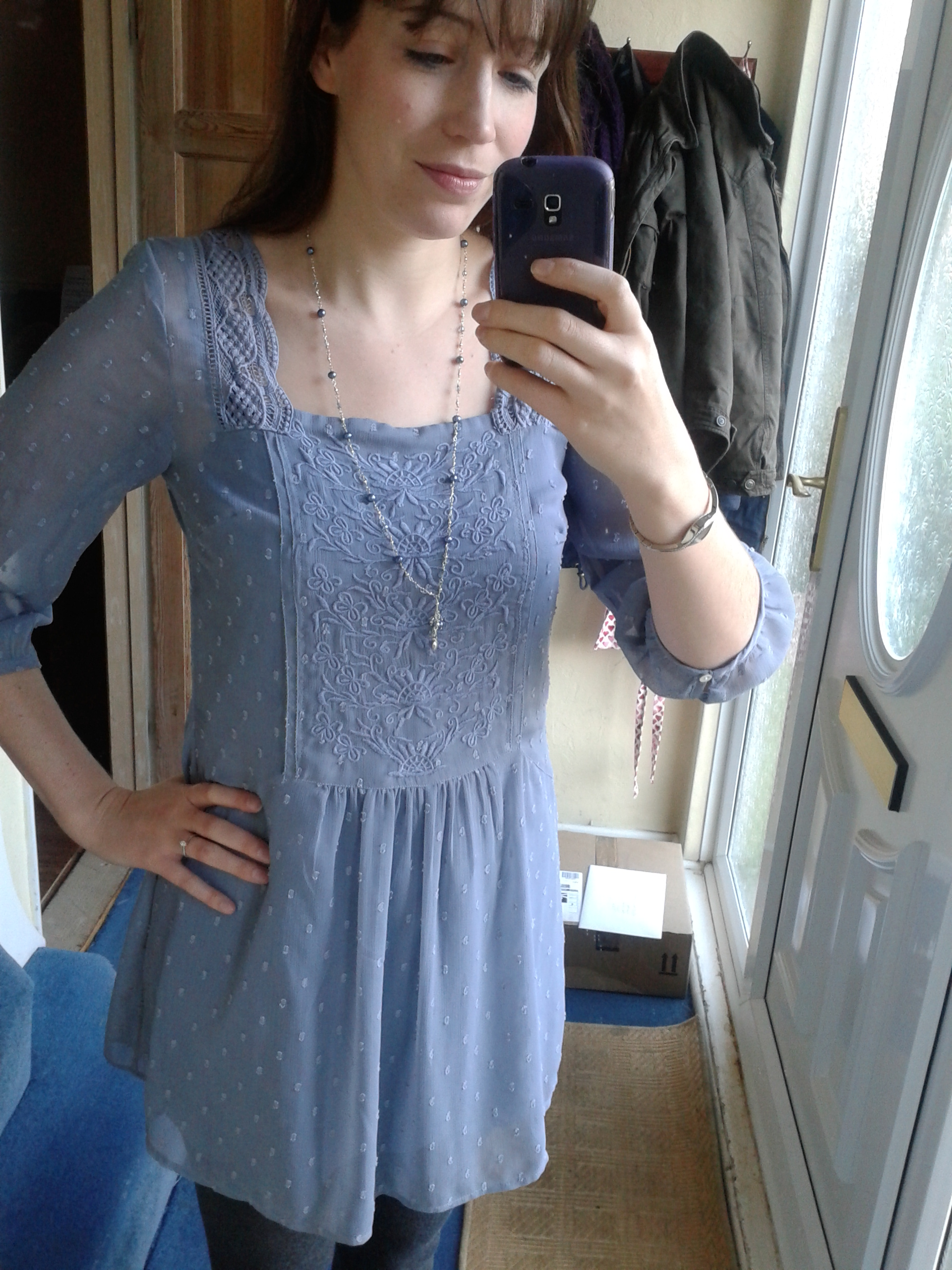
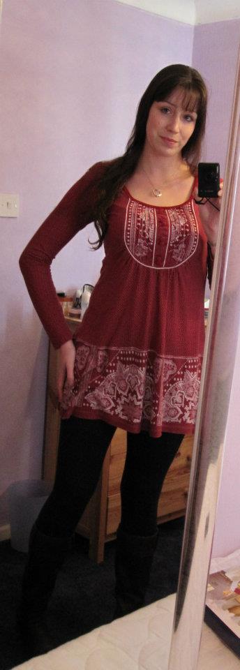
Here are four typical outfits that I wear both for work and during my leisure time. I don’t have a separate work wardrobe as I work behind-the-scenes in a technical capacity and my colleagues dress casually too. We don’t need to wear suits. Apologies for the low-quality nates 😉

typical-2

typical-3

typical-4

typical-1

What I chose to wear on my experiment day, and why

I was thankfully able to borrow clothes from friends so I didn’t have to go out and buy clothes in the wrong style and season! I opted for:

  • Wide leg black trousers
  • Heeled patent black shoes
  • A long jumper top in tan
  • A wooden bead necklace
  • A black patent belt

In terms of make-up I kept it minimal: navy mascara, a Summer blusher and an Autumn lipstick; mismatching on purpose because those who aren’t aware of colour analysis typically don’t manage to wear make-up belonging to the same season. I used to wear black mascara (Winter), a warm brown blusher (Autumn) and a neutral lipstick that, if swatched, would have belonged to Autumn.

I chose the black trousers and black shoes because I used to wear those all the time for work. Admittedly I didn’t used to wear a heel but I chose the shoe style because it’s not me at all, but of course they look great on my Winter Natural Romantic friend!

I chose an Autumn/Spring (crossover) top because warmth makes me look ill, and my past mistakes were Autumn. I wore a lot of khaki which I know now to be one of the worst colours I could have chosen because I have very cool undertones and khaki is a very warm colour.

The outfit

When I first tried the outfit on (in front of my colour and style-savvy friends) they pulled horrified faces. I asked them if it was ‘too much’ and they insisted it wasn’t. It was something I might have worn pre-style/colour analysis. It was also an outfit that someone might very plausibly put together if they didn’t have style and colour knowledge.

I asked them how it felt to look at me. They said I looked ill (that’ll be the warm brown jumper!) and that I looked like I was dressing up, perhaps to perform in a play or similar. In other words, not me at all. Like I was dressing as someone else. Their comments didn’t surprise me at all. I felt incredibly uncomfortable looking in the mirror. I could hardly bear to look at myself.

IMG_3889IMG_3890IMG_3894IMG_3895The belt made me feel very uncomfortable. I think it was very unflattering but it matched the shoes. I think I might have disliked the necklace most of all. I still struggle to explain why. I think it looks faintly ridiculous on me and yet I knew that someone else could wear the same outfit and look much better in it (ideally the trousers and shoes and belt would be brown, to match the Spring/Autumn jumper).

The day of the experiment

Getting dressed on the day I noticed I was unconsciously trying to fight it. I wanted to plait my hair rather than have it in a bun (like I used to) because I hate how the bun looks. I wore all my own make-up bar the Autumn lipstick which I borrowed from a friend. I had wanted to wear black mascara but couldn’t find any. Putting on my Summer blusher was just easier and conveniently clashed with the outfit.

I felt more excited than uncomfortable until I looked in the mirror. I just laughed at myself because the outfit seemed so ridiculous, but then I reminded myself how I felt before I had my colours and style done, and suddenly it didn’t seem very funny any more. I hated looking at myself in the mirror, I literally cringed every time. It really bought back memories, of days when I didn’t like what I was wearing and didn’t have anything else but had to go into work anyway (or call in sick). So I’d go to work and feel uncomfortable all day and hope I didn’t bump into anyone I knew.

I hated the noise of the shoes clip-clopping as I walked into work. I noticed I was having to walk slower. I confessed to my husband in the car on the way in that I was doing an experiment and he said (in relation to the outfit), “I don’t like it, it’s just meh. But it doesn’t look that out of the ordinary. No-one will notice.” I had to remove the shoes for driving. The impracticality of the heels drove me mad.

I hated walking down my corridor into work. I felt like the clip-clopping noise was attracting attention and my husband teased me about it. It made me realise I don’t usually make any noise as I walk because I wear flat shoes or boots.

My two (male) colleagues started commenting before I’d even sat at my desk.

“Oh my God who’s this?”

They just STARED at me, grinning. I couldn’t ignore them so I said “What?” and they replied “Can we have Janine back?”

One of them said “I don’t think I’ve ever seen you in trousers before.” I replied: “You haven’t.” I told them I was surprised that they even noticed what I was wearing.

They wouldn’t let up. Later in the day they said: “We’re suspicious, what’s going on? We’ve been talking about it.” I just smiled at them and they said “How did the interview go?”

I posted some photos of me in the outfit in a private group on Facebook for my friends to see. I didn’t tell them I was doing an experiment. Their reactions were really interesting.

“Wow – chuck the tunics girl!” one said.

“Ooooo very grown up… And omg!! your figure!!” said another.

But when I ‘fessed up they were relieved.

“I was quite surprised when I saw someone as expert in style as you, dressed up as someone else. You look ok. But you don’t feel ok. That’s the point. Innit?”

“I thought it was a bit 1980s”

“I think your awesome figure and the slim fitting top saves it, but I did think very classic and odd you in tan then got distracted by your figure so forgot about the colours.”

I made notes throughout the day:

“I can’t wait until the end of the day when I can take it off! Feel SO self-conscious. Looking in the mirror is SO uncomfortable, excruciating even. Dreading getting up from my desk to get water!”

“In order to get on with work today I’m going to have to try very hard to forget about what I’m wearing. It’s very distracting. I feel weirdly naked. Feels like a thought control experiment.”

“In the kitchen I bumped into someone I knew (female colleague). I noticed how distracted they were by my outfit. It felt awful to be looked up and down.”

“Outfit is tiring. Heels are tiring.”

After lunch I ‘fessed up to a colleague about the experiment, the one who kept asking me what was going on. I felt more comfortable after that but I still avoided getting up for water. When I told my colleague I was 6’ in heels he said to me: “Your legs are 5’11” long.” I thought that it was interesting that the outfit was causing people to notice my figure more. No wonder I felt naked.

My singing teacher gave the best response of the day. Before she’d even said goodbye to her last student she’d asked me if I was okay. As soon as they had left she turned to me and said:

“Really, what’s wrong? Are you okay?”

I assured her I was fine but she persisted.

“On a scale of 1 to 10, where are you?”

“Honestly, about an 8, I’m fine!” I insisted.

I had to tell her about the experiment before we’d even made it to her studio. When I said, “It’s okay, I’ll tell you, it’s fine honest!” she literally recoiled in horror and seemed genuinely worried. “I knew something was up!” she said. I told her about the experiment and she breathed a huge sigh of relief. “You look so stern!”

She’s very astute and sensitive so I’m not in any way surprised she noticed, but I was surprised by the intensity of her reaction. She said to me that I looked drawn, I told her that would be the colour of the jumper I was wearing. She paused, and then said, “Wow. I really think I should get my colours done.” Afterwards she said, “It’s not that the outfit is bad, it’s just that it’s not you at all. You look like you wouldn’t take any sh*t. I don’t like it. It freaks me out.” I thought how ironic it was that I looked intimidating to her when I had felt so self conscious all day. I thought she might actually like my outfit because it was more her style than mine but clearly I was very wrong.

When my friend and fellow student arrived after my lesson she looked me up and down and said, “What’s all this?” I had to laugh and confess as my teacher said “Thank God you’ve noticed!” I told my friend I was wearing the wrong style and colours for an experiment. “Thank God for that!” she said. “I knew something was up when I spotted the necklace!”

I will be very relieved not to be wearing the outfit again but I will admit that it prompted compliments from some which was a change for me because generally speaking I don’t get any at all. People notice me and not the clothes and of course I don’t usually wear anything quite so figure-hugging!

The experiment reiterated to me the importance of dressing for ourselves. There may be some people who prefer the tan and black outfit but I felt so uncomfortable in it and ultimately how you feel is what matters most.

I’m not surprised I felt so uncomfortable but I was surprised by the reactions I got. I would do something similar again but only in the name of fancy dress or another experiment to blog about. It made me feel very, very grateful for the colour and style knowledge that I have. It is amazing just how much of an impact one outfit can have.

Art for all seasons (again)

I discovered Art Finder very recently. As an art lover (albeit with depressingly-limited wall space) this was heaven to my eyes. Inevitably I found art for this post. So here we have ‘Art for every season‘, part 2.

Spring

The bright warm colours feel full of life. The bright blue of the Hyacinths is close to Spring’s warm cornflower blue.

I love not only the colours but how vibrant and splashy the Kingfisher looks. It’s reminiscent of Spring’s energy. If the four seasons mapped to the four elements, Spring would be air.

Summer

I love the wet look of this painting, how the colours blend into each other. If the four seasons mapped to the four elements, Summer would be water.

Perfect Summer colours, and the reflection on the water just blows me away.

Autumn

I love this so very very much for Autumn. The metallic finish, the texture, the redhead, the muted colours. Everything about it is perfect.

Such rich, golden colours. You get a real sense of warmth from this. If the four seasons mapped to the four elements, Autumn would be fire or earth (I can’t decide which!).

Winter

Perhaps a little obvious being black and white, but the sharpness of the lines and shapes is important too.

The electric blue is such a typically-associated Winter colour. You get a real sense of coolness looking at it. The diamonds on the dress lend welcome contrast.

Lipstick finishes for every season

A few weeks ago I ordered some free lipstick samples from Jane Fardon cosmetics. They are a colour analysis company who sell their own brand of cosmetics and I was very keen to give them a go. I’m a Deep Summer so I ordered Mulberry, Burgundy, Sweet Pea and Pink Jasmine to try.

I tried Sweet Pea first and whilst there was no doubt it was perfect colour-wise, something was off. Even my husband commented on it. “It’s very shiny…” he said (he doesn’t usually notice whether I’m wearing lipstick or not). He was right. All the lipsticks had come through frosted (a metallic shine). The lipstick just didn’t sit right on my face. And it made me think about a fantastic article I read a while back on 12 Blueprints about skin finishes for the different seasons. I am convinced that lipstick finish relates to the skin finishes. It certainly explains why the frosted lipstick looked so off on me. It explains why Autumns always look so good in the slightly matte, heavily pigmented House of Colour lipsticks that they try after their analysis session. It explains why my Spring friend doesn’t look quite right in a matte lipstick (gloss is much better) and why the frosted fuschia lipstick looked better on my Winter friend than the very similar colour in a less exciting finish.

So here’s my theory. The lipstick you wear has to correspond to your skin finish, and your skin finish is dependent on your season. Now it is important that I mention here that not everyone suits lipstick (even in the correct colours), or at least not everyone can wear it in the traditional way. It absolutely depends on your clothing personality too. A Natural will likely look better with a lip stain whereas a Romantic will look best in a more polished, made-up look (lipstick and a lip liner). I’m a Natural Ingénue and every time I go to the make-up counter I look like I’ve raided my Mum’s make-up bag (especially if I’ve asked for a smokey eye). A Natural doesn’t suit the made-up look, and an Ingénue benefits from being enhanced but not overdone, which essentially means less is more on me and so it will be for other types too. Everyone benefits from looking believable, but believable means different things on different clothing personalities and seasons.

Firstly, I need to tell you a little about the different lipstick finishes available. Although they are often marketed under a different name, essentially you’ll find lipsticks come in the following finishes: matte, satin (creamy with a slight shine), frosted (metallic), gloss (similar finish to lipgloss but not as shiny) or shimmer (not to be confused with gloss although the two finishes are often combined). Shimmer lipsticks contain very fine particles of glitter. And there is of course lip gloss, which has a high shine and when applied liberally can look very very shiny indeed. Lip stains are useful and tend to look like felt tip pens. Lip stain (as long as it is a stain and not a gloss) can work for everyone because they are a stain so can look like a real lip (although beware of them going patchy). On some style types / seasons it will look very understated and natural, on others it’ll be all they need. Some will need Vaseline or gloss over the top for shine for the best finish (Springs I’m looking at you).

Spring

Spring skin is most beautiful when it’s smooth and shiny, like a jelly bean or a satin ribbon. Think dewy, smooth, shiny, moist. Pressed powder is far too heavy. BB cream or a tinted moisturiser works well for Springs. Foundation is often too heavy and opaque as is any kind of finishing powder. Highlighter works so well on Springs. Bronzer belongs to Autumn. Dewy and shiny is not the same as glittery, metallic or bronze. So when looking for lipsticks, anything smooth and shiny works well, which includes lip gloss. The exact level of gloss you can handle is related to where you sit in the Spring palette. Light Springs tend to be more peaches and cream. Not as glossy. Warm Springs that sit in the middle of their palette can handle more shine, the Bright Springs the most. Vaseline over a lipstick could work too if it was applied liberally enough (useful if you’ve got a lipstick that’s the right colour for you but the finish isn’t quite right).

Summer

For Summer skin, think smooth, silky and dry, like a brushed cotton sheet. Glossy, frosty, slick and metallic don’t work. As Christine so beautifully said, “Summer skin’s way of handling light is the diffusion of moonlight”. Very cool, very soft. Summer looks so good in brushed silver. (Slightly off-topic but John Greed do an excellent range of brushed silver necklaces like this wildflower one which I own, it positively glows against my Summer skin, I highly recommend). Summer’s softness is feathery. Pressed and translucent powder works so well here. Traditional foundation works too, as do mineral foundations. BB cream and tinted moisturiser will likely be too dewy without powder on top. In terms of lipsticks, I think Summers can wear subtle shimmer well (very fine glitter). Reminiscent of moonlight. Matte lipsticks may or may not be too matte (and they can sometimes be drying) but blusher dabbed on the lips with a finger is perfection. Lip stains work too (they look like felt tips), just be careful the colour isn’t too intense. Vaseline as a lip balm works but keep it to a bare minimum. I do wear Vaseline all the time but I have to be careful not to go overboard. Gloss turns to gloop in a hearbeat on Summer skin so avoid that at all costs. I find my creamy lipsticks look best with some blusher dabbed on top. Frosted, needless to say, does not work. It’s too cold even in the correct colour.

Autumn

Autumn skin has an overall matte look. Think velvet, suede, even leather. Texture. Matte. Not dewy or sparkly. Autumns look so good in velvet, you couldn’t go wrong with a moss green velvet scarf. Autumns benefit most from contouring (lowlights in the form of a blusher, or bronzer), as opposed to highlighting. Texture in metallics sit so well with Autumn (think hammered bronze). Freckles are divine (texture). The texture of the skin when combined with warm colours makes sense in bronzer. Creamy works here, as does a matte finish in a lipstick. Shimmer, in small quantities, can work. Unsurprisingly frosted lipsticks and lip gloss are just too much. Traditional foundation can work but you really don’t want to cover up the texture of the skin too much. Keep it real, not artificial.

Winter

For Winter’s skin finish, think red shiny apple, think black vinyl. A frosted lipstick on a Winter will look entirely normal in the same way the bright, very cool colours of Winter don’t look bright and very cool, they just look normal because they balance the wearer. Winter needs contrast and this should be reflected in make-up. Black eye liner or a bright blush on pale skin. Just be careful with colour, you don’t need or want too much. I suspect foiling (adding a little water to an eye shadow to intensify it) would work very well indeed on a Winter but I’ve yet to see that in real life. In terms of lipstick finish, frosted would work as well as a gloss. Ultra matte too. A frosted fuchsia lipstick on a Winter looks normal (even if the wearer can’t see it at first because they’re not used to wearing lipstick). I find it is the Winters that struggle most with their make-up recommendations. They often ask for something more muted but the Summer lipsticks turn their faces ashen. Starting with sheer cosmetics helps to ease the transition, but don’t compromise on colour.

I’ve yet to see a nude lip work on a Winter. Rita Ora is a great example of a Winter who is rarely seen without her red lipstick.

rita-ora

What works here? The red lipstick. The black falsies. The platinum-blonde hair. What doesn’t? The yellow blonde hairline. The highlights and the bronzer. A flatter skin finish would work so much better.

Extremes work with Winter. Very matte or high shine lip finishes. They are the most versatile in terms of lip finish, I think.

Time for a wardrobe clear out!

This morning I suddenly found myself having a wardrobe clear out. I’d decided it was time to deal with the hand washing pile languishing at the bottom of my laundry basket and somehow I ended up sorting through all my clothes and accessories. This does happen periodically; I open my wardrobe and am overcome with a desire to clear it out. Several items had been bugging me every time I opened the doors of my wardrobe and I decided enough was enough this morning.

Whilst sorting through my clothes I found a jacket I’d forgotten about (just in time for Spring – perfect!) and a gorgeous little faux fur bag, hardly used. These were my rewards for my clear out, and you’ll have them hiding somewhere too! The other reward is a feeling of satisfaction when you open your wardrobe. Everything is in there, ready to wear, no clutter, nothing making you feel bad, everything fits, nothing that needs fixing. Having said all that, I’m certainly not going to tell you that you absolutely must clear out your wardrobe (not at all – no-one’s going to die if you don’t!) but it is satisfying and I can certainly recommend it for if and when the mood takes you.

When you decide to embark on your clear out, do ensure you look everywhere for your clothes/accessories/underwear. Look in your wardrobe, under the bed, in drawers, in the dirty laundry basket, in wash baskets, on the washing line, ironing pile, and don’t forget to check the tumble dryer. Leave no stone unturned. Don’t forget scarves, shoes, underwear, coats, even socks! If you’ve got socks that are uncomfortable or ancient and you avoid wearing them then they’re just taking up valuable space!

You’ll need to evaluate each item in turn as you go through all your clothes. This sounds as though it could be a lengthy process but it really needn’t be at all (my clear out took 1.5 hours including texting my friends pictures of stuff I thought they’d like). The most important thing to note is that immediate thought or feeling when you very first look at something you own.

What’s your immediate feeling when you look at the item?

  • Excitement? “Oooh! I haven’t worn that in absolutely ages… I really like it though!”, “I love that – I wear it all the time!”, “Oooh I’d forgotten I had that!” Hang on to these items. You might not have worn them in a while simply because you’d forgotten you had them.
  • Annoyance? “Oh no, that’s the scarf that moults on me…”, “The sleeves keep riding up on that, drives me mad…” Get rid of anything that makes you feel annoyed or irritable.
  • Depressed? “I can’t fit into that any more…”, “I’ll get into it one day…”  Get rid, or at the very least put it out of sight! Your wardrobe should make you feel inspired when you look inside, not depressed.
  • Guilty? “It’s still got the tags on but I haven’t worn it and I’m not sure about it now…” Return it if you can, charity shop if you can’t (or give to a friend).
  • Sentimental? “Aunt Sally made that for me…” Store anything of sentimental value (that you won’t wear) in the loft.
  • Irritated? “Argh, it needs fixing and I just don’t have the time…” Okay, time to be realistic now. Either add it to your to do list to do within the next week, or decide to take it to a professional to fix. If you can’t bring yourself to do either then it’s probably because you don’t love it enough in the first place.
  • Bored? “It’s OK I guess…”, “I suppose I quite like it, but it’s a pain because it’s dry clean/hand wash only…”, “Hmmm. It’ll do…” Get rid! “That’ll do” won’t do at all!
  • Weary? “I love it but it’s looking rather worn out now…”, “I’ve had this ages and I loved it, but I think it might have shrunk…” It is hard to part with items we love but are past their best. Time to let go and recycle these.
  • On edge? “I love how it looks but it’s a bit itchy..”, “I love them but they’re about half a size too small…” What you have in your wardrobe MUST be comfortable. This is probably single-handedly THE most important thing when considering whether to keep something or not. It HAS to be comfortable. If it’s not, it simply won’t get worn. On that cold Winter’s morning when you get out of the bath and just want something warm and soft to wear, you’ll not be able to bring yourself to reach for something that’s in any way uncomfortable or itchy.

If you find yourself struggling, ask yourself this: When did you last wear it? Can’t remember? Over a year ago? Time to give it a new home.

Bit scared about getting rid of everything you’ve cleared out? Perfectly understandable, especially if there’s a lot of it. Put those black bin bags full of clothes in the spare room or loft. If you find you need the clothes you still have access to them.

Hangers! Don’t forget to sort these out too. You don’t want your wardrobe full of empty hangers, have 3 or 4 in there but put the others somewhere else (I have a drawer in the bottom of my wardrobe for my spares). I realised I was getting irritated at the vast number of hangers clashing around in there and falling off the rail when I tried to get my clothes out. Put them away somewhere you can get to them when you need them.

So, what to do with all the clothes you no longer want? Give them away to a charity shop or to family and friends. Worn out clothes should be recycled.

Okay, so your wardrobe is certainly looking a bit emptier after that clear out… Now what? Don’t panic if you now have gaps. It’s time to go shopping and it doesn’t have to be expensive. Write a list of clothes you need, but don’t worry if you don’t end up finding something you really love to fill a gap. And you have to really love it which means that patience is key. You can start off with the cheaper shops like Matalan and Primark. Charity shops are great, if you’re feeling nervous take a friend with you. You’ll be surprised at how much new or nearly new clothes end up there. Swishing parties are great! Encourage your friends to have a clear out too. You could even swap clothes if you’re similar sizes.

I had my colours done back in 2010 and today was a momentous occasion for me. After writing a post about my own colour journey (and seeing just how bad black really is on me!) I finally got rid of that little black dress I’d been hanging on to in case I needed it. Making that decision and then texting my Winter friend felt so good! 😀

What is a ‘clothing personality’ and why is it important?

I had my colours analysed back in 2010 and not long afterwards I went back to House of Colour for a Style Day. On the Style Day, amongst many other things, we talked about our ‘clothing personalities’ which are a key part of knowing what clothing suits you and why. What is a clothing personality you might ask? I will start by saying that personal style is about what suits you, it’s not about what’s in fashion. Your clothing personality explains why an outfit (even in the right colours) that looks great on someone else might look frumpy/at odds/like a costume on you. Personal style is about dressing to reflect what’s on the inside and knowing your clothing personality will help enable you to do this. Of course, two people who have the same clothing personality won’t necessarily dress the same, personal taste and personality comes into it too, but there will be similarities and the overall look (e.g. youthful or sexy or dramatic) will be the same. A clothing personality is designed to be a guide and an inspiration so that you are able to refine your clothing choices.

House of Colour aren’t unique in educating people about clothing personalities. There are several systems and most usually cover a version of the following style types:

  • Dramatic (statement dressing, think Victoria Beckham),
  • Natural (a much more relaxed and casual look, bohemian or sporty, think Elle MacPherson),
  • Gamine (young, boyish and fun, think Carey Mulligan),
  • Ingénue (youthful, feminine, elegant and pretty, think of Emmy Rossum when she was in Phantom of the Opera),
  • Romantic (sexy, grown-up, think Marilyn Monroe),
  • Classic (timeless, smart, think Kate Middleton).

David Kibbe came up with 13 ‘image identities’ in his 1987 book “Metamorphosis” but he doesn’t include a type for Ingénue. I was diagnosed by House of Colour as a ‘Natural Ingénue’ and this feels perfect for me so I decided not to research that system very heavily.

This brings me neatly on to David Zyla. I recently read Zyla’s book ‘Color Your Style‘ (which can be purchased on Amazon) and I really do like his approach to clothing personalities. He calls them ‘archetypes’ and so far I’ve been able to find my archetype very easily. I suspect knowing I’m a ‘Natural Ingénue’ in another system helped (considerably) but his descriptions are thorough and I do think that someone who knows their season would be able to identify with one of the archetypes (there are 6 per season). It’s also a very fun read. Zyla appears to have a lot of fans – a quick search on Pinterest reveals lots of different boards for each of the archetypes created by people who’ve read the book. I found these immensely inspiring after I was able to pinpoint my archetype and my own personal style board grew quickly as a result. I did find Zyla’s clothing recommendations in his book excellent.

The only real downside of the book is that if you’ve not had a colour analysis (that’s not a plug I promise!) you’ll find it impossible to figure out your season from the information given in the book, and you need to know what your season is in order to identify your archetype. This isn’t a fault with the book I should add – no book can tell you what season you are. It is impossible (of course) to know how your skin reacts to colour by reading a book, and this is a crucial part of identifying what season you are.

I have two Zyla-inspired Pinterest boards. The first shows my ‘true colours’ according to Zyla: (to find out what the different colours mean you can look at Zyla’s website)

I have to say, although finding these colours sounds simple I’m of the opinion you need a colour analysis before you can figure out exactly whether, say, peach is your more flattering version of pink, etc. My essence colour is in fact a fairly substantial mid-pink (a rose). The idea is that all of your ‘true colours’ flatter you, and a pale pink isn’t going to flatter someone (i.e. me!) if depth of colouring is important, for example.

Some clever person made an image for all the different archetypes and I’ve pinned them here:

You will need to read about the archetypes in the book to figure out which one you are, but the images are certainly interesting to look at and it’s nice to have them all there at a glance. If you buy the paperback version you can share it with your friends 🙂

My own colour journey

I have to confess to feeling rather shy writing a blog post essentially about myself and my own colour journey. Unfortunately (or fortunately 😉 ) I have a great many photos at my disposal and a great many mistakes to delight you with, as well as photos post-analysis which demonstrate (I hope) what one looks like ‘in focus’.

I’m very much of the belief that everyone is naturally beautiful. Chances are if someone is considered ‘more beautiful’ then it’s because they are honouring the colouring already present in them in their clothes and make-up, and they will naturally glow as a result. Someone in the wrong colours can look ill and jaundiced. Their otherwise invisible acne scars might take centre stage. Their skin might look doughy and their features lack definition. Put someone in their wrong colours and they will never look their best.

Looking through my old photos two things really struck me. Firstly, that I don’t often seem to pose in a sensible fashion, always preferring to pull a silly face probably to hide my discomfort at being in front of a camera. Secondly, the colours I seemed to wear almost exclusively were: baby blue, pale pink, lilac, off-white and grey. What’s interesting is that these are all Summer colours but were far too light to give any real impact, as my natural colouring is really rather deep. I didn’t look ill or jaundiced but the magic didn’t quite happen in the lighter Summer colours. My occasional non-compliant mistakes consisted of khaki and brown borrowed from Autumn.

Brown. Not awful, but I certainly don’t shine in it. Interestingly my partner really likes me in brown… He’s an Autumn 😉

Not awful, but it certainly doesn't make me glow.
Not awful, but it certainly doesn’t make me glow and the white shoes seem like a very odd choice. My attention is drawn down towards them.

Interestingly when I used to go horse riding I wore navy jodhpurs and even went as far as to replace my traditional black velvet hat cover with a navy one. I was clearly onto something.

A surprising aytpical choice for riding - navy jodhpurs and a navy hat cover. I could see even back then that black so close to my face wasn't doing me any favours.
A surprising aytpical choice for riding – navy jodhpurs and a navy hat cover. I could see even then that black so close to my face was unkind.

Pre-analysis, there were a few happy accidents where I got my colours spot on. My school uniform was a burgundy sweatshirt, one of my very best colours (lucky me for having such a flattering school uniform). Sadly I don’t have a decent photo of me in my school uniform to show you, but here are my other ‘happy accidents’.

Everything here is right for a Summer especially the blue cardigan and even the wavy hair.
Everything here is right for a Summer especially the blue cardigan, even the wavy hair.

I say ‘happy accidents’ but actually I’m completely wrong about that. They are far from accidents. These so-called happy accidents are actually an excellent example of how we can sometimes choose the right colours for ourselves, instinctively, if only the choices are out there in the shops.

Burgundy red dress - possibly a little on the shiny side but the colour is spot on.
Burgundy red dress – possibly a little on the shiny side but the colour is spot on.

My ‘going out’ mistakes were all Winter ones. This photo is a great example of how black really isn’t slimming. It’s so bad I nearly didn’t include it. The style is all wrong, the colours completely dominate.

This is so bad I nearly didn't include it. The style is all wrong, the colours completely dominate. Interestingly I was at my very lightest here weight-wise and yet I look heavier thanks to the colours and the unflattering style. The hem of the top cuts me in half in the most unflattering way.
Interestingly I was at my very lightest here weight-wise and yet I look heavier thanks to the colours and the unflattering style. The hem of the top cuts me in half in the most unflattering way.

My biggest mistake undoubtedly was black. I’ve always had an aversion to it and looking back it’s easy to see why.

This is truly terrible. At my mother's insistence I wore a darker (Winter) lip to try and balance the black. Ouch.
This is truly terrible. At my mother’s insistence I wore a darker (Winter) lip to try and balance the black. Ouch.

This is an interesting photo. This is post-analysis, but I’d joined a choir and the uniform was black (you can imagine how thrilled I was). Even with a face full of Summer make-up I still look like a ghost.

Choir uniform - black. Universally the most unflattering colour. Only 1 in 4 can pull it off, and even fewer look really good in it.
Choir uniform – black. Universally the most unflattering colour. Only 1 in 4 can pull it off, and even fewer look really good in it.

This is an interesting photo because I think it’s a great example of me looking ‘soft’ (pre-analysis, surprisingly). I don’t think I’m wearing any make-up here which is undoubtedly a good thing as I’d always wear Autumn blusher and black mascara. Someone with my deeper colouring can easily get mistaken for a Winter, especially with such cool undertones. This photo is a great example of the softness Summers have and Winters lack.

Summer or Winter? With that softness I could only be a Summer.

I went through a stage of taking pictures of eyes. I think this is a brilliant example of a Summer eye. Blue-grey, and look at those wavy spokes.

A typical Summer eye.

Back in 2010 I remember returning home from my colour analysis completely buzzing. I walked into my bedroom and it hit me. My entire bedroom was a delightful plethora of Summer colours. I recall being shocked at how good my instincts had been.

Pre-analysis I'd managed to decorate my bedroom in entirely Summer colours. The beautiful wisps of light are where I was experimenting with light painting!
Pre-analysis I’d managed to decorate my bedroom in entirely Summer colours. The beautiful wisps of light are where I was experimenting with light painting!

Another bedroom shot. The sunset is so beautiful and there is something a bit ‘Deep Summer’ about the image, actually. In it you’ll find soft dark greys, silvers, lilacs, pink and sand. No black to speak of but some very dark greys.

Another bedroom shot.
‘Deep Summer’ bedroom shot.

This is a post-analysis photo and I’m trying out different lipsticks. I remember feeling rather self conscious in this but actually the depth really sits well with my colouring. I can see that now.

A deep rose lip for a Deep Summer.

And finally, the photo you’ve all been waiting for (hopefully)…

'In focus' at last.
‘In focus’ at last.

Do you notice the make-up? I don’t think so. What I see is the crisp navy line around the iris. The lipstick and blusher only serve to draw attention to the eyes. My skin is pale but I don’t look like a ghost. The blusher is a natural extension of my own blush colour. The attention is drawn to the eyes. Do you feel your insides relax at last? It’s quite a visceral feeling, I think. The right colours ‘feel’ right in a way that is difficult to describe. I realise, as I re-read this, that I’ve been rushing to get to the bottom of the post.

A Dreamy Summer

I had the intense pleasure of draping a rather clever Summer this afternoon. Even before she was draped this attentive woman had already figured out that bright shiny silver was ‘too blingy’ and yellow gold too yellow. Black mascara, she said, was too domineering (she wears brown). She told me of her fondness for rose gold which is great for Summers and looks particularly good on blondes I think (she’s blonde). All this came out as we were going through the drapes. I was impressed.

The fascinating thing about very cool people is that when you start off with the bright shiny silver drape and the bright shiny gold drape, the bright silver clears the skin beautifully and the gold makes the person look as though they have severe jaundice. The differences are very obvious. She was a very easy person to drape right from the start. Warm colours made her look very sickly, cool so very much better. The Winter drapes were obviously too domineering. In the Summer drapes (especially after we’d put on blusher and lipstick, which looked amazing) all I could think about as I looked at her was a garden filled with Summer flowers: lavender, roses, carnations, wisteria, forget-me-nots, sweet peas, pink astilbe, hydrangeas. If Autumn is the warm, cosy, comforting season of food and spice and crunchy leaves then Summer is the cool tranquil garden overlooking a beautifully-kept Italian lake. Beside the lake sits a weeping willow swaying in the breeze. Summer isn’t a tropical island, that’s Spring. It’s not cosy, that’s Autumn. It’s cool but it’s not dramatic and high contrast like Winter.

Summer has a lot of blues, from baby through to midnight, from a definite blue through to the blue-greens of water: gentle turquoise, cool jade and teal. In the middle of the blues you’ll find cornflower, marine blue and periwinkle. Denim is Summer’s very best friend. Almost all shades suit, from the pale stonewashed denim through to mid/dark blue. Avoid blue/black or anything that’s been given a brown or dusty yellow tint to make it look ‘used’. Summer’s colour combinations are beautiful, reminiscent of a watercolour painting.

The colour descriptions are so pretty: pearl, white sand, cocoa brown (a rose brown rather than, say, bitter chocolate). The colours sky, orchid, wisteria, lilac and clover are beautiful when worn together. Generally speaking, the more colours the better. If two colours look a little odd together, add a third. Try and find a pattern with lots of Summer colours in it. If looking for footwear then a burgundy brown or a lighter rose brown are very useful and can often be found in the shops (in amongst the unsuitable shades of tan, black, bitter chocolate and camel). On the subject of footwear, I bought a “dark tan” Kiwi shoe polish from the local supermarket a while back which is a reddy brown. This came in very useful as I bought a pair of boots that turned out to be the wrong shade of brown (they were a very muted brown/black and didn’t seem to sit well with the rest of my wardrobe). The polish gave them a wonderful burgundy red finish which was exactly what I needed.

Summer isn’t sharp or harsh, it’s soft and circular like the curve in the body of a cello or a tear drop. It’s good to have this in mind when choosing jewellery, especially watches. Circular stones are pretty, as are marquise and pear. This watch is a little on the shiny side (if we’re being picky) but the pink mother-of-pearl face is perfect, as is the shape.

Brushed silver and moonstone would be perfect on this person, mother-of-pearl is also fantastic. Rose gold is a clever choice on blondes. Labradorite is a wonderful gemstone. Its shimmery, ethereal quality make it perfect for a Summer. Brushed silver frames would make excellent glasses, as would rose brown, blue and navy. A silver-grey velvet coat would look stunning, one in blue (ink for those who can carry a little more depth) would be wonderful and a little more practical. Batik fabric can be very useful as the change between the different colours is often gradual and soft.

Make-up colours can be tricky. Rose and rose-amethyst are very pretty lip colours. Foundation has to be very cool, which means that the wrong (too warm) foundation will look orange, a frequent frustration for Summers. Pick a cosmetics company that understand cool/warm undertones, sometimes these are called pink (cool) or yellow (warm) undertones. You will get a better foundation match with them.

In terms of hair, often Summers berate themselves for having mousy hair when the reality is it’s a beautiful medium-brown that isn’t being flattered by the right colours. Whatever you do, don’t let the hairdresser add warmth. They seem to be so keen to do so but you want ash blonde highlights, not honey or caramel. Your natural hair colour will always flatter you so stick with that if you can bear to, especially if your hair is a darker brown.

Avoid fake tan. I know that might be hard to hear, so many seem to love it. The right colours will always give you that healthy glow you so desire and will save you ruining your bed sheets!

For now I shall leave you with this image that, I think, beautifully summarises Summer.

Outfits for an Autumn

I had the pleasure of draping a delightful Autumn yesterday and, as a result, I’m feeling very inspired about the Autumn palette. What’s not to love when you find yourself describing the colours in terms of food and nature? Toffee, butterscotch, apple, coffee, chocolate and caramel. Cinnamon, cumin, olive and turmeric. Conker, peacock, kingfisher and pumpkin, greens in olive, grass, leaf. Such wonderful imagery.

One question that frequently pops up regardless of season is, what colour shoes should I wear if I can’t wear black? A very legitimate question which inspired a Pinterest board, the highlights of which I shall delight you with here.

You can’t go wrong with brown shoes. Brown is Autumn’s version of black. There is something very reassuring about leather shoes I think that really suits the Autumn palette. Pewter (assuming it’s bronze enough), camel, beige, rust, even teal are all great colours for shoes. Gold is fabulous for sandals, flip flops, ballet pumps and evening footwear. Brown is quite easy to find in boots. A pair of brown suede boots would surely be the perfect investment buy for any Autumn (just be sure to purchase them with some waterproofing suede spray).

Brown leather shoes

What a fabulous teal cardigan. It would look great with a rust camisole underneath.

Teal long cardigan

Autumns do have a navy in their palette but it is a warmer navy that can be tricky to find in the shops. As you can see, the navy denim jeans look great with the teal here, so I don’t think the navy need be completely spot on to work. Denim is a perfect fabric for Autumns.

How amazing is this rust dress?

Rust maxi dress from Monsoon

The necklace they’ve picked out to wear with it is spot on too. I love how even the background colour is perfect. The model could well be an Autumn with those brown eyes.

These tan sandals would go very well with the dress. They would also work for a Spring.

Tan sandals with gold hardware

Coral ballet pumps, so very pretty for the summer with a dress:

Coral crochet ballet pumps from new Look

These would also work for Springs I think.

Rose gold is fabulous in jewellery. This rose gold ring with pink sapphires is heavenly.

14K Rose Gold Pink Sapphire Ring from Etsy

Last of the highlights – a brushed gold star necklace. I had to include this because the texture on the star is just perfect.

Estella Bartlett Gold Metal Star Necklace from John Lewis

Here is the rest of the board – enjoy!