A Winter and a Summer :)

Photography: Carla Watkins I had the pleasure of draping two friends a couple of weekends ago, one of whom is a photographer, hence the brilliant photography! (Thank you Carla!) After an exciting morning we discovered that one was a glorious Winter and the other a super-pretty Summer. I see them both regularly and actually it’s hard (for me […]

Art for all seasons (again)

I discovered Art Finder very recently. As an art lover (albeit with depressingly-limited wall space) this was heaven to my eyes. Inevitably I found art for this post. So here we have ‘Art for every season‘, part 2.

Spring

The bright warm colours feel full of life. The bright blue of the Hyacinths is close to Spring’s warm cornflower blue.

I love not only the colours but how vibrant and splashy the Kingfisher looks. It’s reminiscent of Spring’s energy. If the four seasons mapped to the four elements, Spring would be air.

Summer

I love the wet look of this painting, how the colours blend into each other. If the four seasons mapped to the four elements, Summer would be water.

Perfect Summer colours, and the reflection on the water just blows me away.

Autumn

I love this so very very much for Autumn. The metallic finish, the texture, the redhead, the muted colours. Everything about it is perfect.

Such rich, golden colours. You get a real sense of warmth from this. If the four seasons mapped to the four elements, Autumn would be fire or earth (I can’t decide which!).

Winter

Perhaps a little obvious being black and white, but the sharpness of the lines and shapes is important too.

The electric blue is such a typically-associated Winter colour. You get a real sense of coolness looking at it. The diamonds on the dress lend welcome contrast.

Lipstick finishes for every season

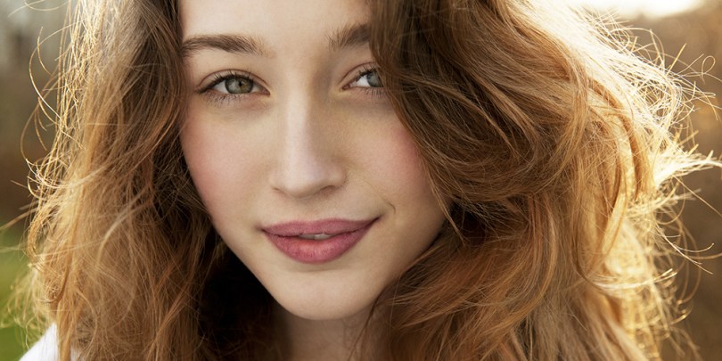
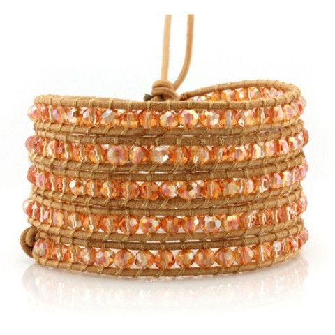
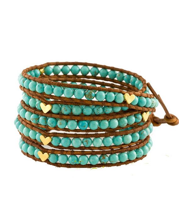
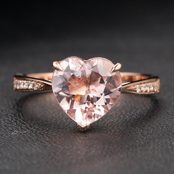
A few weeks ago I ordered some free lipstick samples from Jane Fardon cosmetics. They are a colour analysis company who sell their own brand of cosmetics and I was very keen to give them a go. I’m a Deep Summer so I ordered Mulberry, Burgundy, Sweet Pea and Pink Jasmine to try.

I tried Sweet Pea first and whilst there was no doubt it was perfect colour-wise, something was off. Even my husband commented on it. “It’s very shiny…” he said (he doesn’t usually notice whether I’m wearing lipstick or not). He was right. All the lipsticks had come through frosted (a metallic shine). The lipstick just didn’t sit right on my face. And it made me think about a fantastic article I read a while back on 12 Blueprints about skin finishes for the different seasons. I am convinced that lipstick finish relates to the skin finishes. It certainly explains why the frosted lipstick looked so off on me. It explains why Autumns always look so good in the slightly matte, heavily pigmented House of Colour lipsticks that they try after their analysis session. It explains why my Spring friend doesn’t look quite right in a matte lipstick (gloss is much better) and why the frosted fuschia lipstick looked better on my Winter friend than the very similar colour in a less exciting finish.

So here’s my theory. The lipstick you wear has to correspond to your skin finish, and your skin finish is dependent on your season. Now it is important that I mention here that not everyone suits lipstick (even in the correct colours), or at least not everyone can wear it in the traditional way. It absolutely depends on your clothing personality too. A Natural will likely look better with a lip stain whereas a Romantic will look best in a more polished, made-up look (lipstick and a lip liner). I’m a Natural Ingénue and every time I go to the make-up counter I look like I’ve raided my Mum’s make-up bag (especially if I’ve asked for a smokey eye). A Natural doesn’t suit the made-up look, and an Ingénue benefits from being enhanced but not overdone, which essentially means less is more on me and so it will be for other types too. Everyone benefits from looking believable, but believable means different things on different clothing personalities and seasons.

Firstly, I need to tell you a little about the different lipstick finishes available. Although they are often marketed under a different name, essentially you’ll find lipsticks come in the following finishes: matte, satin (creamy with a slight shine), frosted (metallic), gloss (similar finish to lipgloss but not as shiny) or shimmer (not to be confused with gloss although the two finishes are often combined). Shimmer lipsticks contain very fine particles of glitter. And there is of course lip gloss, which has a high shine and when applied liberally can look very very shiny indeed. Lip stains are useful and tend to look like felt tip pens. Lip stain (as long as it is a stain and not a gloss) can work for everyone because they are a stain so can look like a real lip (although beware of them going patchy). On some style types / seasons it will look very understated and natural, on others it’ll be all they need. Some will need Vaseline or gloss over the top for shine for the best finish (Springs I’m looking at you).

Spring

Spring skin is most beautiful when it’s smooth and shiny, like a jelly bean or a satin ribbon. Think dewy, smooth, shiny, moist. Pressed powder is far too heavy. BB cream or a tinted moisturiser works well for Springs. Foundation is often too heavy and opaque as is any kind of finishing powder. Highlighter works so well on Springs. Bronzer belongs to Autumn. Dewy and shiny is not the same as glittery, metallic or bronze. So when looking for lipsticks, anything smooth and shiny works well, which includes lip gloss. The exact level of gloss you can handle is related to where you sit in the Spring palette. Light Springs tend to be more peaches and cream. Not as glossy. Warm Springs that sit in the middle of their palette can handle more shine, the Bright Springs the most. Vaseline over a lipstick could work too if it was applied liberally enough (useful if you’ve got a lipstick that’s the right colour for you but the finish isn’t quite right).

Summer

For Summer skin, think smooth, silky and dry, like a brushed cotton sheet. Glossy, frosty, slick and metallic don’t work. As Christine so beautifully said, “Summer skin’s way of handling light is the diffusion of moonlight”. Very cool, very soft. Summer looks so good in brushed silver. (Slightly off-topic but John Greed do an excellent range of brushed silver necklaces like this wildflower one which I own, it positively glows against my Summer skin, I highly recommend). Summer’s softness is feathery. Pressed and translucent powder works so well here. Traditional foundation works too, as do mineral foundations. BB cream and tinted moisturiser will likely be too dewy without powder on top. In terms of lipsticks, I think Summers can wear subtle shimmer well (very fine glitter). Reminiscent of moonlight. Matte lipsticks may or may not be too matte (and they can sometimes be drying) but blusher dabbed on the lips with a finger is perfection. Lip stains work too (they look like felt tips), just be careful the colour isn’t too intense. Vaseline as a lip balm works but keep it to a bare minimum. I do wear Vaseline all the time but I have to be careful not to go overboard. Gloss turns to gloop in a hearbeat on Summer skin so avoid that at all costs. I find my creamy lipsticks look best with some blusher dabbed on top. Frosted, needless to say, does not work. It’s too cold even in the correct colour.

Autumn

Autumn skin has an overall matte look. Think velvet, suede, even leather. Texture. Matte. Not dewy or sparkly. Autumns look so good in velvet, you couldn’t go wrong with a moss green velvet scarf. Autumns benefit most from contouring (lowlights in the form of a blusher, or bronzer), as opposed to highlighting. Texture in metallics sit so well with Autumn (think hammered bronze). Freckles are divine (texture). The texture of the skin when combined with warm colours makes sense in bronzer. Creamy works here, as does a matte finish in a lipstick. Shimmer, in small quantities, can work. Unsurprisingly frosted lipsticks and lip gloss are just too much. Traditional foundation can work but you really don’t want to cover up the texture of the skin too much. Keep it real, not artificial.

Winter

For Winter’s skin finish, think red shiny apple, think black vinyl. A frosted lipstick on a Winter will look entirely normal in the same way the bright, very cool colours of Winter don’t look bright and very cool, they just look normal because they balance the wearer. Winter needs contrast and this should be reflected in make-up. Black eye liner or a bright blush on pale skin. Just be careful with colour, you don’t need or want too much. I suspect foiling (adding a little water to an eye shadow to intensify it) would work very well indeed on a Winter but I’ve yet to see that in real life. In terms of lipstick finish, frosted would work as well as a gloss. Ultra matte too. A frosted fuchsia lipstick on a Winter looks normal (even if the wearer can’t see it at first because they’re not used to wearing lipstick). I find it is the Winters that struggle most with their make-up recommendations. They often ask for something more muted but the Summer lipsticks turn their faces ashen. Starting with sheer cosmetics helps to ease the transition, but don’t compromise on colour.

I’ve yet to see a nude lip work on a Winter. Rita Ora is a great example of a Winter who is rarely seen without her red lipstick.

rita-ora

What works here? The red lipstick. The black falsies. The platinum-blonde hair. What doesn’t? The yellow blonde hairline. The highlights and the bronzer. A flatter skin finish would work so much better.

Extremes work with Winter. Very matte or high shine lip finishes. They are the most versatile in terms of lip finish, I think.

Art for every season

I happened to be browsing Pinterest today and I spotted a watercolour painting that was perfectly Summer which inspired this short blog post.

Summer

This is the painting that inspired this post. I love this, it’s Summer perfection. There is something about watercolour paintings in general I think that really suits the way the Summer colours go together. Even the brown of the coffee is a compliant rose brown.

Autumn

The solid texture of this combined with the colours is what makes Autumn spring to mind when I look at this. When searching for images I also spotted ‘The Golden Forest’ by Klimt. He uses a lot of Autumn colours in his work.

Spring

There is an innocence about this that I think really suits the Spring palette. It’s also youthful and fun.

Winter

This is perfect Winter: the contrast of the black and white, the bright colours and the drama.

It was a struggle to pick just one piece of art for each season so I suspect they’ll be more blog posts like this in future! 🙂

Wrap bracelets for every season

I have to confess I’m a little obsessed with wrap bracelets at the moment, I got this one for my birthday:

dcc51aec48667fd9bbe561575c54f3fd

Sadly it’s out of stock now, but it is perfect for a Summer. The silver grey against my skin is low contrast and it goes with literally everything in my wardrobe.

Autumn

When it comes to wrap bracelets, Autumns are spoilt for choice especially on Etsy. The gold marbling on the beads is just perfection.

0e16782ac898ee4d17bb8d0f3d8cad38

I love this one especially because the texture on the beads is really beautiful and very fitting for an Autumn:

eded6e7a7ebbae0beb1dd19f8471e7b6

Victoria Emerson have a fabulous Autumn wrap bracelet too.

87694db16773a3a24199a2eeeee94fa1

If I was being super fussy I’d say the first two are better choices because the Victoria Emerson one has silver hardware 😉

Summer

This is a lovely low-contrast grey bracelet for a Summer.

573eafe8c27a30191386cd2fca8ca571

This purple is perfect and I especially love the iridescent beads.

d00787d958dff8a15c56f60d7bd97fb9

A very pretty soft pink bracelet:

1bc4ba6851f2343483a484f55d204476

Spring

The shiny gold hearts are great for Springs especially paired with the turquoise beads and tan cord.

9f60ae6a38d484a40bc43b0ef7116256

Gold hardware and warm green leather, what’s not to love?

81dd28a7636bff31bfa36e5a6a446e8d

Not technically a wrap bracelet but the colours are too perfect not to include it:

1b37ade427b1075fd0cbd60fef6b1521

Winter

A lovely charcoal grey for a Winter, would probably suit a Deep Summer too.

d63644b1a3c2be6257945ccc727e6677

Black with bright blue beads, a great combination:

5a08cfa800db345139fe231923aca811

Black again with a bit of bling this time.

eb89b1a8570657a67afd471993ceeb37

I struggled to find Spring and Winter wrap bracelets actually, Autumn was by the far the easiest to find. In terms of style type, these would be an obvious choice for a Natural which might explain the plethora of natural rich earthy Autumn colours 🙂

Everyone should own a Little RED Dress

According to studies done by A. J. Elliot et al (documented in his Journal of Personality and Social Psychology and his Journal of Experimental Social Psychology), red enhances women’s attractiveness to men, an effect that is apparently universal. This probably doesn’t come as any great surprise when you think about the colour and how it is used in marketing (Special K lady anyone?). It’s certainly a powerful colour, and often a colour that many veer away from for fear it might draw attention to them. Ironically it’s likely to be one of the most flattering colours you could own.

The wonderful thing about red is that every season has a shade that flatters them.

Spring has poppy red, a warm bright red that looks especially striking when worn as a lipstick with a top/dress in a similar colour.

fdsfds
Spring’s warm poppy red

Summer has a cool cherry red that’s a bit more pink and soft in comparison to Winter’s red. A Deep Summer would also look incredible in a deep claret red (burgundy).

Summer’s soft cherry red

Autumn’s red looks like burnt orange and red mixed together to form a warm muted red.

brick-red
Autumn’s brick red

Autumn could also wear a softer version of Spring’s poppy red, which looks more red than the brick.

Winter’s red is cool, dramatic and uncompromising. A Winter can wear true primary red, scarlet, claret or crimson.

Scarlet red tunic

So, have I persuaded you yet? The Dress Spot is a brilliant website if you are looking for a dress in a particular colour. Perfect for finding your own Little Red Dress!

Profile of a Deep Dark Winter

I had the good fortune recently of draping someone who turned out to be a Winter. The clue was right at the start of the draping when I held up the silver metallic drape under her chin and her skin cleared instantly. It was stunning and dramatic. The white cape I put on her right at the start didn’t make her look ill. I’d met her on numerous occasions previously and she’d often be dressed in black. I had noticed that it didn’t drain her like it did me (a Deep Summer). I also noticed that her surroundings were decorated in Winter colours and the majority of the nail varnishes she owned were in Winter colours. I had also noticed on previous occasions her very cool skin and the contrast between her skin and hair. Despite all this I endeavoured not to jump to conclusions. It was no surprise when my client turned out to be a Dark Winter. The deeper, darkest cool colours looked best on her. That’s not to say the other colours within the Winter palette won’t prove to be useful, but the real wow moment came when deep fuschia, plum, ink, burgundy, deep red and dark emerald green were under her chin. Striking colours for a striking woman with a quiet steely confidence and cheekbones to die for.

Dark Winter. Cool, deep, dark and deliciously dramatic in its own understated way.

I feel strongly that we sense what colours are in us, even if we can’t see them without a personal colour analysis. This client was no exception. After my own PCA I went home to discover my entire bedroom was decorated in compliant colours right down to my bedlinen (even though the contents of my wardrobe wasn’t so). A friend of mine who has yet to be analysed said to me, “I’m scared you’ll tell me I can’t wear [fuchsia] pink.” I’m pretty confident, given her love of that colour, that it’ll be one of her best (or something very very similar to it. A recent Autumn I draped loves burgundy. Rust, which is very similar, was one of her very best colours). Most people don’t know what colours make them look their very best, but they tend to know what makes them look really bad. Sometimes they think they know what colours they can’t wear. I say “think” because I didn’t think I could wear pink until I was shown the right shade.

I find that when we’re going through all the drapes of a particular season (once we’ve established what season is the right one) for some it feels as though we are splitting hairs. For others there is a much more profound difference and that was evident here. The brighter colours in the Winter palette were rather demanding, in fact surprisingly so, which made me doubt my diagnosis for a moment until I saw how the Summer drapes made her look as though she had a layer of dust on her face.

If you believe that personality and our own colouring are linked, then the Dark Winter is considered to be tenacious, honest and authoritative. A Dark Winter will favour logic and purpose. Industrious is another word you could use to describe them.

I see similarities between my own best colours (I’m a Summer who suits the deepest colours in the palette) and the Dark Winter palette. Depth and coolness in colour is important here, and there are overlaps. I was wearing a deep teal velvet coat that day and the colour did not go unnoticed by my client. I’m confident the coat would have looked fabulous on her too. Velvet is very good at increasing colour intensity which is important for a Dark Winter.

Winter is a high contrast season. Combining colours similar in value (e.g. monochromatic, not to be confused with monochrome) won’t give the same impact as colours that are vastly different. Winter’s icy pastels (as opposed to Summer’s softer pastels that remind me of a watercolour painting) combined with the almost-but-not-quite black of eggplant, spruce or dark garnet will look most stunning and create the visual impact Winter needs. High shine metals are perfect for Winter (reminiscent of the sharp gleam of ice). Rhodium mirror-shine plating (that is often used to give white gold its shine) was made for Winter.

The overall impression, when dressing, should be crisp, clean and sharp. Winter is not just cool (like Summer’s refreshing glade) but bitter, icy cold. Snow so white it looks blue. Even holly isn’t soft but sharp and the berries are shiny. Defined edges only serve to enhance the look when the colours are compliant. The look should be timeless, elegant, of a quiet luxury. Jeans, if worn should be blue/black, not stonewashed denim.

By way of comparison, a Winter who looks best in the brightest colours in their palette gives quite a different impression from the Dark Winter, as demonstrated brilliantly here: 

Splashy, cool and bright colours

A ‘Bright Winter’ is typically higher contrast to look at than other Winters.

I love this image, I couldn’t resist adding it here, at the end. It’s just Winter perfection. Possibly Bright Winter given the high level of contrast present between skin/eyes and skin/hair but could easily be Dark Winter too. Certainly the burgundy scarf is Dark Winter’s. Stunning.

Jewellery for Autumns and Winters

Autumn

Autumn looks best in antiqued, warm earthy metals. Texture is important too. Brushed gold will look better than a light, bright yellow shiny gold (which will look better on a Spring).

Rose gold is beautiful too, and Morganite makes a stunning peachy alternative to a traditional diamond if you happen to be looking for an engagement ring. It is considerably cheaper too.

Heart Shaped Morganite 14K Rose Gold Engagement Ring, Etsy from £196.80
Heart-shaped Morganite 14K Rose Gold Engagement Ring, Etsy from £196.80

This coin necklace from Stella & Dot is also perfect. Note the satin finish and antique feel.

Rio single strand coin necklace, £51 in the sale, Stella & Dot

Peridot is a wonderful gemstone for Autumns.

9ct Gold Peridot Figure of Eight Drop Earrings, £39.99 H Samuel

Brass, especially if it is antiqued, is fabulous. Interestingly, Summers can also get away with antiqued brass as it isn’t as yellow as some of the warmer metals.

Bronze Antique Skeleton Key Long Necklace. around £11 from Etsy

Copper is nothing short of perfection. No other season can handle such gorgeous rich warmth. The texture is stunning on this necklace too.

Copper Fringe Necklace, around £32 from Etsy.

I have to confess I’ve been lusting after this beautiful vintage ring myself for a while but have resisted what with it being gold (and me being a Summer). I’m hoping I can convince my lovely Autumn friend she needs it 😉

Antique Art Nouveau Lady Moon Ring 14K approximately £228, Etsy
Antique Art Nouveau Lady Moon Ring 14K approximately £228 from Etsy

Winter

Platinum and mirror shine rhodium-plating were made for Winters. Your typical platinum or white gold engagement ring (rhodium-plated of course) with a big sparkly diamond will look completely at home on the hand of a Winter.

The Tiffany Setting engagement ring, 1ct from £8,525

Some Winters who lean warm might be able to handle gold but this is risky. Silver-coloured metals will always look wonderful, the shinier the better.

0.65ct Natural Pear Cut Purple Amethyst Pendant Necklace 14k White Gold, approximately £131 from Etsy

For Winters, diamonds truly are a girl’s best friend. As are most bright, cool, saturated gemstones 😉

Oval Ruby and Diamond Cocktail Ring in 14K White Gold, £295.20 from Etsy

With regards to gemstones, Winters truly are spoilt for choice. Most are cool and bright, such as tanzanite, emerald, ruby, sapphire and amethyst.

Princess-Cut Emerald Stackable Ring For Women 14k White Gold, around £433 from Etsy
Princess-cut Emerald Stackable Ring 14k White Gold, around £433 from Etsy

AAA tanzanite, which has the distinctive dark blue hue, is quite expensive so you might be better off going for a synthetic version. The lighter, more common lilac version is still pretty though, and reminiscent of your icy pastels.

D'Yach 14k White Gold Tanzanite Stud Earrings, £126.49
D’Yach 14k White Gold Tanzanite Stud Earrings, £126.49 from Overstock.com

Skin undertones and overtones

There seems to be a lot of (very understandable) confusion around skin undertones and overtones. If you’ve had your colours analysed you’ll know that your undertone determines what season you are and yet your undertone is invisible. If you are an Autumn or Spring it can be said you have warm undertones; conversely if you are a Summer or Winter it can be said you have cool undertones. Colour analysis is not about overtones. If it were, women who wear the same foundation would be the same Season.

People often think undertone is skin colour – it’s not. Your undertone is invisible. Your overtone however, is not invisible. It’s the visible colour of your skin. When purchasing foundation both overtone and undertone are important. Some companies have finally cottoned on to undertones. Cosmetics companies who understand undertones and overtones are much more likely to have a foundation shade that matches your skin. Shopping for foundation becomes a lot easier. Your overtone might look yellow, or pink, brown or peachy. It might be described as sand, beige, ivory, biscuit or ebony. All common foundation names. Your undertone might be described by cosmetics companies as ‘pink’ or ‘rose’ if it is cool and ‘yellow’ or ‘golden’ if it is warm.

There is also such a thing as a false overtone. This is the colour your skin can appear to turn when you are wearing the wrong colour. When I wear khaki I look jaundiced. A Winter wearing the wrong colour might look ruddy in the face.

What influences your undertone? There is no definitive answer to this, but it is generally considered that the following are factors:

  • Oxygenated (red) or non-oxygenated (blue) blood vessels that run under the surface of the skin.
  • Melanin (which also influences hair and eye colour). The more melanin in the skin, the darker the skin tone.
  • Skin thickness. This varies by Season and influences how much colour shows through.
  • Carotene, which gives skin a yellow hue.

The only way to find out whether you have cool or warm undertones is by having your colours analysed in person. Some people offer online colour analysis where you send them a series of photos. I love the idea of it, but unfortunately it’s often inaccurate. It’s impossible to simply look at someone and tell what season they are (although I’m often asked to do this! 😉 ). During an in-person colour analysis session it’s important that you see the way the colours change your skin, in real time, in front of the mirror. Watching your skin react and your face change is all part of the (deeply exciting) process.