Time for a wardrobe clear out!

This morning I suddenly found myself having a wardrobe clear out. I’d decided it was time to deal with the hand washing pile languishing at the bottom of my laundry basket and somehow I ended up sorting through all my clothes and accessories. This does happen periodically; I open my wardrobe and am overcome with a desire to clear it out. Several items had been bugging me every time I opened the doors of my wardrobe and I decided enough was enough this morning.

Whilst sorting through my clothes I found a jacket I’d forgotten about (just in time for Spring – perfect!) and a gorgeous little faux fur bag, hardly used. These were my rewards for my clear out, and you’ll have them hiding somewhere too! The other reward is a feeling of satisfaction when you open your wardrobe. Everything is in there, ready to wear, no clutter, nothing making you feel bad, everything fits, nothing that needs fixing. Having said all that, I’m certainly not going to tell you that you absolutely must clear out your wardrobe (not at all – no-one’s going to die if you don’t!) but it is satisfying and I can certainly recommend it for if and when the mood takes you.

When you decide to embark on your clear out, do ensure you look everywhere for your clothes/accessories/underwear. Look in your wardrobe, under the bed, in drawers, in the dirty laundry basket, in wash baskets, on the washing line, ironing pile, and don’t forget to check the tumble dryer. Leave no stone unturned. Don’t forget scarves, shoes, underwear, coats, even socks! If you’ve got socks that are uncomfortable or ancient and you avoid wearing them then they’re just taking up valuable space!

You’ll need to evaluate each item in turn as you go through all your clothes. This sounds as though it could be a lengthy process but it really needn’t be at all (my clear out took 1.5 hours including texting my friends pictures of stuff I thought they’d like). The most important thing to note is that immediate thought or feeling when you very first look at something you own.

What’s your immediate feeling when you look at the item?

  • Excitement? “Oooh! I haven’t worn that in absolutely ages… I really like it though!”, “I love that – I wear it all the time!”, “Oooh I’d forgotten I had that!” Hang on to these items. You might not have worn them in a while simply because you’d forgotten you had them.
  • Annoyance? “Oh no, that’s the scarf that moults on me…”, “The sleeves keep riding up on that, drives me mad…” Get rid of anything that makes you feel annoyed or irritable.
  • Depressed? “I can’t fit into that any more…”, “I’ll get into it one day…”  Get rid, or at the very least put it out of sight! Your wardrobe should make you feel inspired when you look inside, not depressed.
  • Guilty? “It’s still got the tags on but I haven’t worn it and I’m not sure about it now…” Return it if you can, charity shop if you can’t (or give to a friend).
  • Sentimental? “Aunt Sally made that for me…” Store anything of sentimental value (that you won’t wear) in the loft.
  • Irritated? “Argh, it needs fixing and I just don’t have the time…” Okay, time to be realistic now. Either add it to your to do list to do within the next week, or decide to take it to a professional to fix. If you can’t bring yourself to do either then it’s probably because you don’t love it enough in the first place.
  • Bored? “It’s OK I guess…”, “I suppose I quite like it, but it’s a pain because it’s dry clean/hand wash only…”, “Hmmm. It’ll do…” Get rid! “That’ll do” won’t do at all!
  • Weary? “I love it but it’s looking rather worn out now…”, “I’ve had this ages and I loved it, but I think it might have shrunk…” It is hard to part with items we love but are past their best. Time to let go and recycle these.
  • On edge? “I love how it looks but it’s a bit itchy..”, “I love them but they’re about half a size too small…” What you have in your wardrobe MUST be comfortable. This is probably single-handedly THE most important thing when considering whether to keep something or not. It HAS to be comfortable. If it’s not, it simply won’t get worn. On that cold Winter’s morning when you get out of the bath and just want something warm and soft to wear, you’ll not be able to bring yourself to reach for something that’s in any way uncomfortable or itchy.

If you find yourself struggling, ask yourself this: When did you last wear it? Can’t remember? Over a year ago? Time to give it a new home.

Bit scared about getting rid of everything you’ve cleared out? Perfectly understandable, especially if there’s a lot of it. Put those black bin bags full of clothes in the spare room or loft. If you find you need the clothes you still have access to them.

Hangers! Don’t forget to sort these out too. You don’t want your wardrobe full of empty hangers, have 3 or 4 in there but put the others somewhere else (I have a drawer in the bottom of my wardrobe for my spares). I realised I was getting irritated at the vast number of hangers clashing around in there and falling off the rail when I tried to get my clothes out. Put them away somewhere you can get to them when you need them.

So, what to do with all the clothes you no longer want? Give them away to a charity shop or to family and friends. Worn out clothes should be recycled.

Okay, so your wardrobe is certainly looking a bit emptier after that clear out… Now what? Don’t panic if you now have gaps. It’s time to go shopping and it doesn’t have to be expensive. Write a list of clothes you need, but don’t worry if you don’t end up finding something you really love to fill a gap. And you have to really love it which means that patience is key. You can start off with the cheaper shops like Matalan and Primark. Charity shops are great, if you’re feeling nervous take a friend with you. You’ll be surprised at how much new or nearly new clothes end up there. Swishing parties are great! Encourage your friends to have a clear out too. You could even swap clothes if you’re similar sizes.

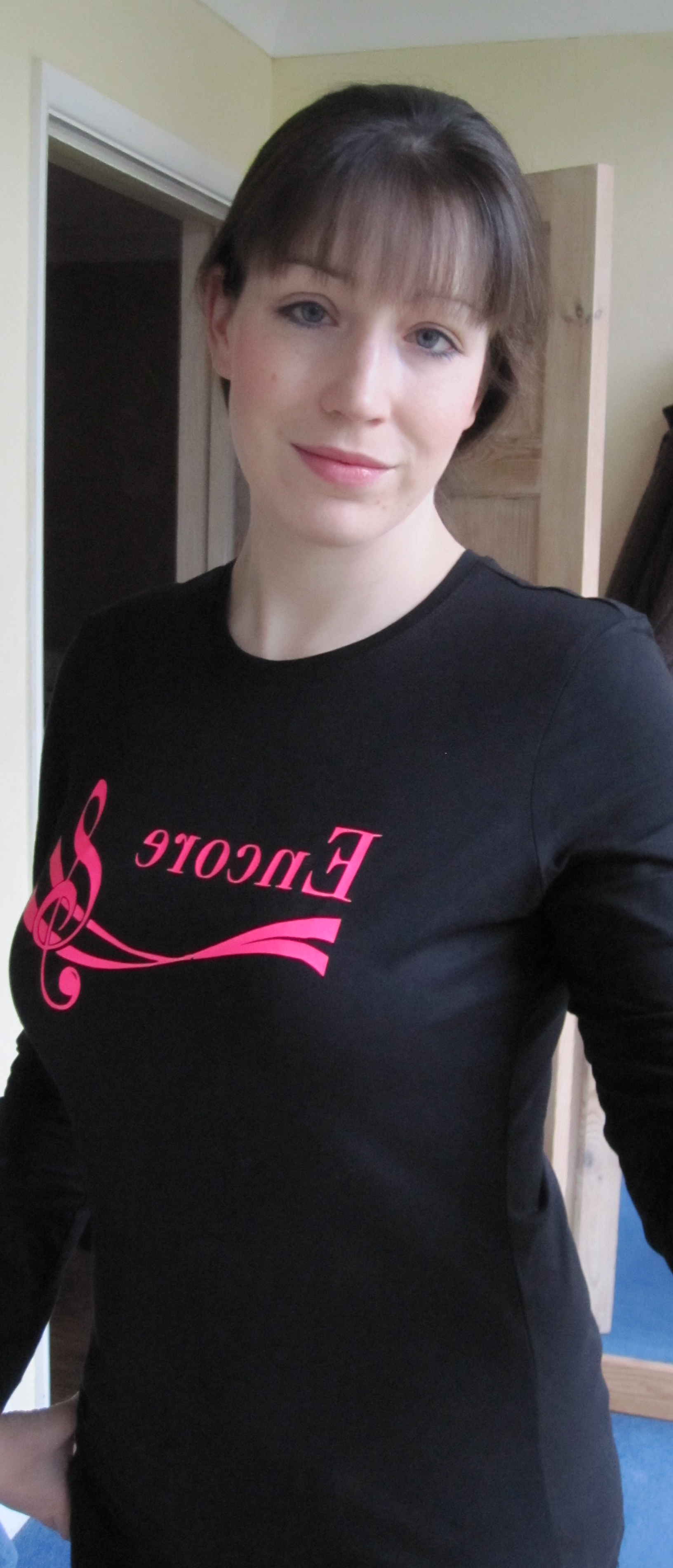
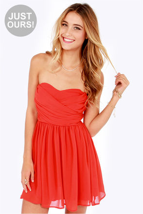
I had my colours done back in 2010 and today was a momentous occasion for me. After writing a post about my own colour journey (and seeing just how bad black really is on me!) I finally got rid of that little black dress I’d been hanging on to in case I needed it. Making that decision and then texting my Winter friend felt so good! 😀

What is a ‘clothing personality’ and why is it important?

I had my colours analysed back in 2010 and not long afterwards I went back to House of Colour for a Style Day. On the Style Day, amongst many other things, we talked about our ‘clothing personalities’ which are a key part of knowing what clothing suits you and why. What is a clothing personality you might ask? I will start by saying that personal style is about what suits you, it’s not about what’s in fashion. Your clothing personality explains why an outfit (even in the right colours) that looks great on someone else might look frumpy/at odds/like a costume on you. Personal style is about dressing to reflect what’s on the inside and knowing your clothing personality will help enable you to do this. Of course, two people who have the same clothing personality won’t necessarily dress the same, personal taste and personality comes into it too, but there will be similarities and the overall look (e.g. youthful or sexy or dramatic) will be the same. A clothing personality is designed to be a guide and an inspiration so that you are able to refine your clothing choices.

House of Colour aren’t unique in educating people about clothing personalities. There are several systems and most usually cover a version of the following style types:

  • Dramatic (statement dressing, think Victoria Beckham),
  • Natural (a much more relaxed and casual look, bohemian or sporty, think Elle MacPherson),
  • Gamine (young, boyish and fun, think Carey Mulligan),
  • Ingénue (youthful, feminine, elegant and pretty, think of Emmy Rossum when she was in Phantom of the Opera),
  • Romantic (sexy, grown-up, think Marilyn Monroe),
  • Classic (timeless, smart, think Kate Middleton).

David Kibbe came up with 13 ‘image identities’ in his 1987 book “Metamorphosis” but he doesn’t include a type for Ingénue. I was diagnosed by House of Colour as a ‘Natural Ingénue’ and this feels perfect for me so I decided not to research that system very heavily.

This brings me neatly on to David Zyla. I recently read Zyla’s book ‘Color Your Style‘ (which can be purchased on Amazon) and I really do like his approach to clothing personalities. He calls them ‘archetypes’ and so far I’ve been able to find my archetype very easily. I suspect knowing I’m a ‘Natural Ingénue’ in another system helped (considerably) but his descriptions are thorough and I do think that someone who knows their season would be able to identify with one of the archetypes (there are 6 per season). It’s also a very fun read. Zyla appears to have a lot of fans – a quick search on Pinterest reveals lots of different boards for each of the archetypes created by people who’ve read the book. I found these immensely inspiring after I was able to pinpoint my archetype and my own personal style board grew quickly as a result. I did find Zyla’s clothing recommendations in his book excellent.

The only real downside of the book is that if you’ve not had a colour analysis (that’s not a plug I promise!) you’ll find it impossible to figure out your season from the information given in the book, and you need to know what your season is in order to identify your archetype. This isn’t a fault with the book I should add – no book can tell you what season you are. It is impossible (of course) to know how your skin reacts to colour by reading a book, and this is a crucial part of identifying what season you are.

I have two Zyla-inspired Pinterest boards. The first shows my ‘true colours’ according to Zyla: (to find out what the different colours mean you can look at Zyla’s website)

I have to say, although finding these colours sounds simple I’m of the opinion you need a colour analysis before you can figure out exactly whether, say, peach is your more flattering version of pink, etc. My essence colour is in fact a fairly substantial mid-pink (a rose). The idea is that all of your ‘true colours’ flatter you, and a pale pink isn’t going to flatter someone (i.e. me!) if depth of colouring is important, for example.

Some clever person made an image for all the different archetypes and I’ve pinned them here:

You will need to read about the archetypes in the book to figure out which one you are, but the images are certainly interesting to look at and it’s nice to have them all there at a glance. If you buy the paperback version you can share it with your friends 🙂

My own colour journey

I have to confess to feeling rather shy writing a blog post essentially about myself and my own colour journey. Unfortunately (or fortunately 😉 ) I have a great many photos at my disposal and a great many mistakes to delight you with, as well as photos post-analysis which demonstrate (I hope) what one looks like ‘in focus’.

I’m very much of the belief that everyone is naturally beautiful. Chances are if someone is considered ‘more beautiful’ then it’s because they are honouring the colouring already present in them in their clothes and make-up, and they will naturally glow as a result. Someone in the wrong colours can look ill and jaundiced. Their otherwise invisible acne scars might take centre stage. Their skin might look doughy and their features lack definition. Put someone in their wrong colours and they will never look their best.

Looking through my old photos two things really struck me. Firstly, that I don’t often seem to pose in a sensible fashion, always preferring to pull a silly face probably to hide my discomfort at being in front of a camera. Secondly, the colours I seemed to wear almost exclusively were: baby blue, pale pink, lilac, off-white and grey. What’s interesting is that these are all Summer colours but were far too light to give any real impact, as my natural colouring is really rather deep. I didn’t look ill or jaundiced but the magic didn’t quite happen in the lighter Summer colours. My occasional non-compliant mistakes consisted of khaki and brown borrowed from Autumn.

Brown. Not awful, but I certainly don’t shine in it. Interestingly my partner really likes me in brown… He’s an Autumn 😉

Not awful, but it certainly doesn't make me glow.
Not awful, but it certainly doesn’t make me glow and the white shoes seem like a very odd choice. My attention is drawn down towards them.

Interestingly when I used to go horse riding I wore navy jodhpurs and even went as far as to replace my traditional black velvet hat cover with a navy one. I was clearly onto something.

A surprising aytpical choice for riding - navy jodhpurs and a navy hat cover. I could see even back then that black so close to my face wasn't doing me any favours.
A surprising aytpical choice for riding – navy jodhpurs and a navy hat cover. I could see even then that black so close to my face was unkind.

Pre-analysis, there were a few happy accidents where I got my colours spot on. My school uniform was a burgundy sweatshirt, one of my very best colours (lucky me for having such a flattering school uniform). Sadly I don’t have a decent photo of me in my school uniform to show you, but here are my other ‘happy accidents’.

Everything here is right for a Summer especially the blue cardigan and even the wavy hair.
Everything here is right for a Summer especially the blue cardigan, even the wavy hair.

I say ‘happy accidents’ but actually I’m completely wrong about that. They are far from accidents. These so-called happy accidents are actually an excellent example of how we can sometimes choose the right colours for ourselves, instinctively, if only the choices are out there in the shops.

Burgundy red dress - possibly a little on the shiny side but the colour is spot on.
Burgundy red dress – possibly a little on the shiny side but the colour is spot on.

My ‘going out’ mistakes were all Winter ones. This photo is a great example of how black really isn’t slimming. It’s so bad I nearly didn’t include it. The style is all wrong, the colours completely dominate.

This is so bad I nearly didn't include it. The style is all wrong, the colours completely dominate. Interestingly I was at my very lightest here weight-wise and yet I look heavier thanks to the colours and the unflattering style. The hem of the top cuts me in half in the most unflattering way.
Interestingly I was at my very lightest here weight-wise and yet I look heavier thanks to the colours and the unflattering style. The hem of the top cuts me in half in the most unflattering way.

My biggest mistake undoubtedly was black. I’ve always had an aversion to it and looking back it’s easy to see why.

This is truly terrible. At my mother's insistence I wore a darker (Winter) lip to try and balance the black. Ouch.
This is truly terrible. At my mother’s insistence I wore a darker (Winter) lip to try and balance the black. Ouch.

This is an interesting photo. This is post-analysis, but I’d joined a choir and the uniform was black (you can imagine how thrilled I was). Even with a face full of Summer make-up I still look like a ghost.

Choir uniform - black. Universally the most unflattering colour. Only 1 in 4 can pull it off, and even fewer look really good in it.
Choir uniform – black. Universally the most unflattering colour. Only 1 in 4 can pull it off, and even fewer look really good in it.

This is an interesting photo because I think it’s a great example of me looking ‘soft’ (pre-analysis, surprisingly). I don’t think I’m wearing any make-up here which is undoubtedly a good thing as I’d always wear Autumn blusher and black mascara. Someone with my deeper colouring can easily get mistaken for a Winter, especially with such cool undertones. This photo is a great example of the softness Summers have and Winters lack.

Summer or Winter? With that softness I could only be a Summer.

I went through a stage of taking pictures of eyes. I think this is a brilliant example of a Summer eye. Blue-grey, and look at those wavy spokes.

A typical Summer eye.

Back in 2010 I remember returning home from my colour analysis completely buzzing. I walked into my bedroom and it hit me. My entire bedroom was a delightful plethora of Summer colours. I recall being shocked at how good my instincts had been.

Pre-analysis I'd managed to decorate my bedroom in entirely Summer colours. The beautiful wisps of light are where I was experimenting with light painting!
Pre-analysis I’d managed to decorate my bedroom in entirely Summer colours. The beautiful wisps of light are where I was experimenting with light painting!

Another bedroom shot. The sunset is so beautiful and there is something a bit ‘Deep Summer’ about the image, actually. In it you’ll find soft dark greys, silvers, lilacs, pink and sand. No black to speak of but some very dark greys.

Another bedroom shot.
‘Deep Summer’ bedroom shot.

This is a post-analysis photo and I’m trying out different lipsticks. I remember feeling rather self conscious in this but actually the depth really sits well with my colouring. I can see that now.

A deep rose lip for a Deep Summer.

And finally, the photo you’ve all been waiting for (hopefully)…

'In focus' at last.
‘In focus’ at last.

Do you notice the make-up? I don’t think so. What I see is the crisp navy line around the iris. The lipstick and blusher only serve to draw attention to the eyes. My skin is pale but I don’t look like a ghost. The blusher is a natural extension of my own blush colour. The attention is drawn to the eyes. Do you feel your insides relax at last? It’s quite a visceral feeling, I think. The right colours ‘feel’ right in a way that is difficult to describe. I realise, as I re-read this, that I’ve been rushing to get to the bottom of the post.

A Dreamy Summer

I had the intense pleasure of draping a rather clever Summer this afternoon. Even before she was draped this attentive woman had already figured out that bright shiny silver was ‘too blingy’ and yellow gold too yellow. Black mascara, she said, was too domineering (she wears brown). She told me of her fondness for rose gold which is great for Summers and looks particularly good on blondes I think (she’s blonde). All this came out as we were going through the drapes. I was impressed.

The fascinating thing about very cool people is that when you start off with the bright shiny silver drape and the bright shiny gold drape, the bright silver clears the skin beautifully and the gold makes the person look as though they have severe jaundice. The differences are very obvious. She was a very easy person to drape right from the start. Warm colours made her look very sickly, cool so very much better. The Winter drapes were obviously too domineering. In the Summer drapes (especially after we’d put on blusher and lipstick, which looked amazing) all I could think about as I looked at her was a garden filled with Summer flowers: lavender, roses, carnations, wisteria, forget-me-nots, sweet peas, pink astilbe, hydrangeas. If Autumn is the warm, cosy, comforting season of food and spice and crunchy leaves then Summer is the cool tranquil garden overlooking a beautifully-kept Italian lake. Beside the lake sits a weeping willow swaying in the breeze. Summer isn’t a tropical island, that’s Spring. It’s not cosy, that’s Autumn. It’s cool but it’s not dramatic and high contrast like Winter.

Summer has a lot of blues, from baby through to midnight, from a definite blue through to the blue-greens of water: gentle turquoise, cool jade and teal. In the middle of the blues you’ll find cornflower, marine blue and periwinkle. Denim is Summer’s very best friend. Almost all shades suit, from the pale stonewashed denim through to mid/dark blue. Avoid blue/black or anything that’s been given a brown or dusty yellow tint to make it look ‘used’. Summer’s colour combinations are beautiful, reminiscent of a watercolour painting.

The colour descriptions are so pretty: pearl, white sand, cocoa brown (a rose brown rather than, say, bitter chocolate). The colours sky, orchid, wisteria, lilac and clover are beautiful when worn together. Generally speaking, the more colours the better. If two colours look a little odd together, add a third. Try and find a pattern with lots of Summer colours in it. If looking for footwear then a burgundy brown or a lighter rose brown are very useful and can often be found in the shops (in amongst the unsuitable shades of tan, black, bitter chocolate and camel). On the subject of footwear, I bought a “dark tan” Kiwi shoe polish from the local supermarket a while back which is a reddy brown. This came in very useful as I bought a pair of boots that turned out to be the wrong shade of brown (they were a very muted brown/black and didn’t seem to sit well with the rest of my wardrobe). The polish gave them a wonderful burgundy red finish which was exactly what I needed.

Summer isn’t sharp or harsh, it’s soft and circular like the curve in the body of a cello or a tear drop. It’s good to have this in mind when choosing jewellery, especially watches. Circular stones are pretty, as are marquise and pear. This watch is a little on the shiny side (if we’re being picky) but the pink mother-of-pearl face is perfect, as is the shape.

Brushed silver and moonstone would be perfect on this person, mother-of-pearl is also fantastic. Rose gold is a clever choice on blondes. Labradorite is a wonderful gemstone. Its shimmery, ethereal quality make it perfect for a Summer. Brushed silver frames would make excellent glasses, as would rose brown, blue and navy. A silver-grey velvet coat would look stunning, one in blue (ink for those who can carry a little more depth) would be wonderful and a little more practical. Batik fabric can be very useful as the change between the different colours is often gradual and soft.

Make-up colours can be tricky. Rose and rose-amethyst are very pretty lip colours. Foundation has to be very cool, which means that the wrong (too warm) foundation will look orange, a frequent frustration for Summers. Pick a cosmetics company that understand cool/warm undertones, sometimes these are called pink (cool) or yellow (warm) undertones. You will get a better foundation match with them.

In terms of hair, often Summers berate themselves for having mousy hair when the reality is it’s a beautiful medium-brown that isn’t being flattered by the right colours. Whatever you do, don’t let the hairdresser add warmth. They seem to be so keen to do so but you want ash blonde highlights, not honey or caramel. Your natural hair colour will always flatter you so stick with that if you can bear to, especially if your hair is a darker brown.

Avoid fake tan. I know that might be hard to hear, so many seem to love it. The right colours will always give you that healthy glow you so desire and will save you ruining your bed sheets!

For now I shall leave you with this image that, I think, beautifully summarises Summer.

Outfits for an Autumn

I had the pleasure of draping a delightful Autumn yesterday and, as a result, I’m feeling very inspired about the Autumn palette. What’s not to love when you find yourself describing the colours in terms of food and nature? Toffee, butterscotch, apple, coffee, chocolate and caramel. Cinnamon, cumin, olive and turmeric. Conker, peacock, kingfisher and pumpkin, greens in olive, grass, leaf. Such wonderful imagery.

One question that frequently pops up regardless of season is, what colour shoes should I wear if I can’t wear black? A very legitimate question which inspired a Pinterest board, the highlights of which I shall delight you with here.

You can’t go wrong with brown shoes. Brown is Autumn’s version of black. There is something very reassuring about leather shoes I think that really suits the Autumn palette. Pewter (assuming it’s bronze enough), camel, beige, rust, even teal are all great colours for shoes. Gold is fabulous for sandals, flip flops, ballet pumps and evening footwear. Brown is quite easy to find in boots. A pair of brown suede boots would surely be the perfect investment buy for any Autumn (just be sure to purchase them with some waterproofing suede spray).

Brown leather shoes

What a fabulous teal cardigan. It would look great with a rust camisole underneath.

Teal long cardigan

Autumns do have a navy in their palette but it is a warmer navy that can be tricky to find in the shops. As you can see, the navy denim jeans look great with the teal here, so I don’t think the navy need be completely spot on to work. Denim is a perfect fabric for Autumns.

How amazing is this rust dress?

Rust maxi dress from Monsoon

The necklace they’ve picked out to wear with it is spot on too. I love how even the background colour is perfect. The model could well be an Autumn with those brown eyes.

These tan sandals would go very well with the dress. They would also work for a Spring.

Tan sandals with gold hardware

Coral ballet pumps, so very pretty for the summer with a dress:

Coral crochet ballet pumps from new Look

These would also work for Springs I think.

Rose gold is fabulous in jewellery. This rose gold ring with pink sapphires is heavenly.

14K Rose Gold Pink Sapphire Ring from Etsy

Last of the highlights – a brushed gold star necklace. I had to include this because the texture on the star is just perfect.

Estella Bartlett Gold Metal Star Necklace from John Lewis

Here is the rest of the board – enjoy!

Everyone should own a Little RED Dress

According to studies done by A. J. Elliot et al (documented in his Journal of Personality and Social Psychology and his Journal of Experimental Social Psychology), red enhances women’s attractiveness to men, an effect that is apparently universal. This probably doesn’t come as any great surprise when you think about the colour and how it is used in marketing (Special K lady anyone?). It’s certainly a powerful colour, and often a colour that many veer away from for fear it might draw attention to them. Ironically it’s likely to be one of the most flattering colours you could own.

The wonderful thing about red is that every season has a shade that flatters them.

Spring has poppy red, a warm bright red that looks especially striking when worn as a lipstick with a top/dress in a similar colour.

fdsfds
Spring’s warm poppy red

Summer has a cool cherry red that’s a bit more pink and soft in comparison to Winter’s red. A Deep Summer would also look incredible in a deep claret red (burgundy).

Summer’s soft cherry red

Autumn’s red looks like burnt orange and red mixed together to form a warm muted red.

brick-red
Autumn’s brick red

Autumn could also wear a softer version of Spring’s poppy red, which looks more red than the brick.

Winter’s red is cool, dramatic and uncompromising. A Winter can wear true primary red, scarlet, claret or crimson.

Scarlet red tunic

So, have I persuaded you yet? The Dress Spot is a brilliant website if you are looking for a dress in a particular colour. Perfect for finding your own Little Red Dress!

Profile of a Deep Dark Winter

I had the good fortune recently of draping someone who turned out to be a Winter. The clue was right at the start of the draping when I held up the silver metallic drape under her chin and her skin cleared instantly. It was stunning and dramatic. The white cape I put on her right at the start didn’t make her look ill. I’d met her on numerous occasions previously and she’d often be dressed in black. I had noticed that it didn’t drain her like it did me (a Deep Summer). I also noticed that her surroundings were decorated in Winter colours and the majority of the nail varnishes she owned were in Winter colours. I had also noticed on previous occasions her very cool skin and the contrast between her skin and hair. Despite all this I endeavoured not to jump to conclusions. It was no surprise when my client turned out to be a Dark Winter. The deeper, darkest cool colours looked best on her. That’s not to say the other colours within the Winter palette won’t prove to be useful, but the real wow moment came when deep fuschia, plum, ink, burgundy, deep red and dark emerald green were under her chin. Striking colours for a striking woman with a quiet steely confidence and cheekbones to die for.

Dark Winter. Cool, deep, dark and deliciously dramatic in its own understated way.

I feel strongly that we sense what colours are in us, even if we can’t see them without a personal colour analysis. This client was no exception. After my own PCA I went home to discover my entire bedroom was decorated in compliant colours right down to my bedlinen (even though the contents of my wardrobe wasn’t so). A friend of mine who has yet to be analysed said to me, “I’m scared you’ll tell me I can’t wear [fuchsia] pink.” I’m pretty confident, given her love of that colour, that it’ll be one of her best (or something very very similar to it. A recent Autumn I draped loves burgundy. Rust, which is very similar, was one of her very best colours). Most people don’t know what colours make them look their very best, but they tend to know what makes them look really bad. Sometimes they think they know what colours they can’t wear. I say “think” because I didn’t think I could wear pink until I was shown the right shade.

I find that when we’re going through all the drapes of a particular season (once we’ve established what season is the right one) for some it feels as though we are splitting hairs. For others there is a much more profound difference and that was evident here. The brighter colours in the Winter palette were rather demanding, in fact surprisingly so, which made me doubt my diagnosis for a moment until I saw how the Summer drapes made her look as though she had a layer of dust on her face.

If you believe that personality and our own colouring are linked, then the Dark Winter is considered to be tenacious, honest and authoritative. A Dark Winter will favour logic and purpose. Industrious is another word you could use to describe them.

I see similarities between my own best colours (I’m a Summer who suits the deepest colours in the palette) and the Dark Winter palette. Depth and coolness in colour is important here, and there are overlaps. I was wearing a deep teal velvet coat that day and the colour did not go unnoticed by my client. I’m confident the coat would have looked fabulous on her too. Velvet is very good at increasing colour intensity which is important for a Dark Winter.

Winter is a high contrast season. Combining colours similar in value (e.g. monochromatic, not to be confused with monochrome) won’t give the same impact as colours that are vastly different. Winter’s icy pastels (as opposed to Summer’s softer pastels that remind me of a watercolour painting) combined with the almost-but-not-quite black of eggplant, spruce or dark garnet will look most stunning and create the visual impact Winter needs. High shine metals are perfect for Winter (reminiscent of the sharp gleam of ice). Rhodium mirror-shine plating (that is often used to give white gold its shine) was made for Winter.

The overall impression, when dressing, should be crisp, clean and sharp. Winter is not just cool (like Summer’s refreshing glade) but bitter, icy cold. Snow so white it looks blue. Even holly isn’t soft but sharp and the berries are shiny. Defined edges only serve to enhance the look when the colours are compliant. The look should be timeless, elegant, of a quiet luxury. Jeans, if worn should be blue/black, not stonewashed denim.

By way of comparison, a Winter who looks best in the brightest colours in their palette gives quite a different impression from the Dark Winter, as demonstrated brilliantly here: 

Splashy, cool and bright colours

A ‘Bright Winter’ is typically higher contrast to look at than other Winters.

I love this image, I couldn’t resist adding it here, at the end. It’s just Winter perfection. Possibly Bright Winter given the high level of contrast present between skin/eyes and skin/hair but could easily be Dark Winter too. Certainly the burgundy scarf is Dark Winter’s. Stunning.

Skin undertones and overtones

There seems to be a lot of (very understandable) confusion around skin undertones and overtones. If you’ve had your colours analysed you’ll know that your undertone determines what season you are and yet your undertone is invisible. If you are an Autumn or Spring it can be said you have warm undertones; conversely if you are a Summer or Winter it can be said you have cool undertones. Colour analysis is not about overtones. If it were, women who wear the same foundation would be the same Season.

People often think undertone is skin colour – it’s not. Your undertone is invisible. Your overtone however, is not invisible. It’s the visible colour of your skin. When purchasing foundation both overtone and undertone are important. Some companies have finally cottoned on to undertones. Cosmetics companies who understand undertones and overtones are much more likely to have a foundation shade that matches your skin. Shopping for foundation becomes a lot easier. Your overtone might look yellow, or pink, brown or peachy. It might be described as sand, beige, ivory, biscuit or ebony. All common foundation names. Your undertone might be described by cosmetics companies as ‘pink’ or ‘rose’ if it is cool and ‘yellow’ or ‘golden’ if it is warm.

There is also such a thing as a false overtone. This is the colour your skin can appear to turn when you are wearing the wrong colour. When I wear khaki I look jaundiced. A Winter wearing the wrong colour might look ruddy in the face.

What influences your undertone? There is no definitive answer to this, but it is generally considered that the following are factors:

  • Oxygenated (red) or non-oxygenated (blue) blood vessels that run under the surface of the skin.
  • Melanin (which also influences hair and eye colour). The more melanin in the skin, the darker the skin tone.
  • Skin thickness. This varies by Season and influences how much colour shows through.
  • Carotene, which gives skin a yellow hue.

The only way to find out whether you have cool or warm undertones is by having your colours analysed in person. Some people offer online colour analysis where you send them a series of photos. I love the idea of it, but unfortunately it’s often inaccurate. It’s impossible to simply look at someone and tell what season they are (although I’m often asked to do this! 😉 ). During an in-person colour analysis session it’s important that you see the way the colours change your skin, in real time, in front of the mirror. Watching your skin react and your face change is all part of the (deeply exciting) process.

An Autumn Celebrity – Birdy

It’s quite unusual for me to venture an opinion on a celebrity’s season. However, I will make an exception for Birdy. She is getting it so, so right.

I watched a video of her on YouTube today and she is perfectly in focus, which is so rare for someone in the spotlight. I couldn’t tear my eyes away. I think she’s even wearing brown mascara, clever thing. I notice her eyes and the line around her iris. She often wears Autumn coloured clothes. She is utterly hypnotic. Her make-up is Autumn perfection.

birdy-2

Photos can be airbrushed easily enough if someone is wearing the wrong colour (the image still won’t look right though). Videos are much harder:

She does seem to be drawn to Autumn colours. Look at how rich her hair looks in this gorgeous rust jacket. Her skin glows. Her blusher is a warm coral and looks completely perfect on her skin. It brings to life her delicate cheekbones. No black fake eyelashes trying to steal the show.

birdy-autumn

I love how even on her first album she’s wearing a rust jumper and peach skirt. Only her black boots stand out as not quite fitting the picture. My attention is drawn down to them. It’s funny how black does that. Even in small quantities on the wrong person it’s so demanding.

Birdy's first album cover

I do sometimes see Birdy in black, and wearing black mascara too. Look how it is stealing the limelight here:

birdy-black-mascara

Let’s finish on a high though. Her single Wings is beautiful if you haven’t already heard it, and apart from her black trousers and boots, she’s Autumn perfection.

What to expect at your colour analysis session

Colour analysis is not about limiting options, but about opening your eyes to all the colours you can wear. Sometimes, prior to a draping, a client will worry that the process will limit the colours they ‘should’ wear, but the opposite is always true; afterwards, they express surprise at the wide range of colours that look great on them. Before I had my colours done, I believed I couldn’t wear pink. Afterwards, I realised I had just been looking at the wrong pink! In fact, I had so many shades of pink that looked good on me, from a cool dusty rose which really seemed to bring my skin to life, to a raspberry pink which looked especially good if I wore it in both my lipstick and a scarf.

Image: Kettlewell Colours

In our session, I will start by covering the basics of colour theory and answering any questions you might have. After our introductory chat, we will begin the draping itself. We will establish which season you fall into, and this can take anywhere from 45-90 minutes; I like to allow 2-3 hours for a draping as a minimum. Once we’ve ascertained your season, we’ll go through every drape I have for that season and fine tune. Whilst all colours in your season will look good on you, some will really make you shine and my favourite part of the process is finding the colours that are your very, very best. 

After we’ve done this, and I’ve given you your new colour swatch, we can discuss make-up, hair colour, etc. I encourage clients to bring along their make-up or any clothes they might have questions about.

Image: DesignSeeds.com

What you need to know before your draping

  • Your face will need to be free of make-up and fake tan.
  • If you’ve dyed or bleached your hair, I will ask that you wear my (very fetching) white head scarf during the draping.
  • If there isn’t enough natural light I won’t hazard a guess at your season (God forbid!). I’ll return another day or, if possible, find us another location.
  • You will need to be sat in front of a mirror so you can see what I see as I drape you. If you don’t have one, just let me know and I can bring mine.
  • I will bring make-up along with me for you to try (if you would like to) once we know your season.
  • If you usually wear glasses, please wear contact lenses if at all possible.
  • Come with an open mind. I absolutely understand that if you’ve been wearing black all your life you might feel uncomfortable at first being diagnosed as a Spring/Summer/Autumn. But, rest assured, you will receive compliments galore as you wear your new colours!
  • I’m always happy to drape children (and partners) but do bear in mind they need to be willing and able to sit for up to an hour.
  • We both need to be able to concentrate, so a space free of distractions for the session is important.
  • Bring a camera/smartphone if you want. I am more than happy to take pictures of you looking amazing in your best colours!

Once we are done, you will leave with a little swatch book that you can take shopping with you. (If you wear scarves, these are a great place to start!)

What does it cost? I charge £80 for a colour analysis session which includes the swatch book. If you are a considerable distance from me I may need to add on extra for petrol or travel costs. I do group discounts; the cost reduces to £70 each for two or more. Depending on the time of year I can typically fit no more than 3-4 sessions in a day.

Where will it take place? Wherever you like, although most clients prefer I come to them. I can come to your home or even your workplace just so long as we have a quiet room with excellent natural light. If you’d like to come to me this can be arranged too, just let me know.

How long will it take? Please allow at least 2-3 hours. I like for us to have plenty of time for chatting, questions and for playing with make-up afterwards.

What should I wear? Anything you like apart from hoodies or polo neck jumpers. You will be wearing a thick white cotton cape during the draping process, so be sure to factor that extra layer in.

Can I bring a friend? Yes! Absolutely. The more the merrier. It’ll be magical for them to watch.

Can you help me shop? Of course! If you’d like to hire me as a personal shopper just let me know and we can talk about costs, logistics etc.

Can you help me sort out my wardrobe? I would be delighted to! I offer a wardrobe review and decluttering service, just ask.

Is there a reason why I shouldn’t be analysed? If you are taking medication that changes the colour of your skin. If you feel unwell (we’ll reschedule). If you have a very deep tan, fake tan, or are sun burnt (we’ll need to wait until this has faded).

Will I need to throw away my entire wardrobe if I’ve been buying the wrong colours? No, not if you don’t want to! Some people have the motivation and means to do that, but generally speaking I recommend that clients go through their wardrobe and swatch their clothes. Compliant clothes go on the right, non-compliant on the left. As you wear out the clothes on the left, you can replace them with compliant ones. You don’t need to start big, either. Scarves, lipstick and nail varnish are a great way of introducing your new colours without breaking the bank.

How do I book? Just contact me via e-mail: janine@inlovewithcolour.com.