A Dreamy Summer

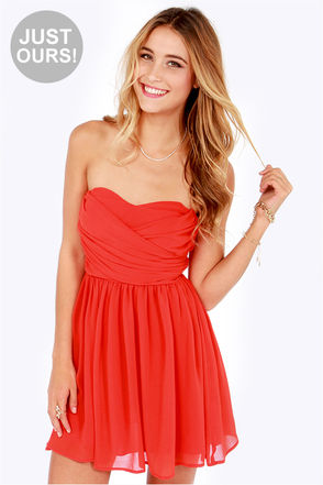
I had the intense pleasure of draping a rather clever Summer this afternoon. Even before she was draped this attentive woman had already figured out that bright shiny silver was ‘too blingy’ and yellow gold too yellow. Black mascara, she said, was too domineering (she wears brown). She told me of her fondness for rose gold which is great for Summers and looks particularly good on blondes I think (she’s blonde). All this came out as we were going through the drapes. I was impressed.

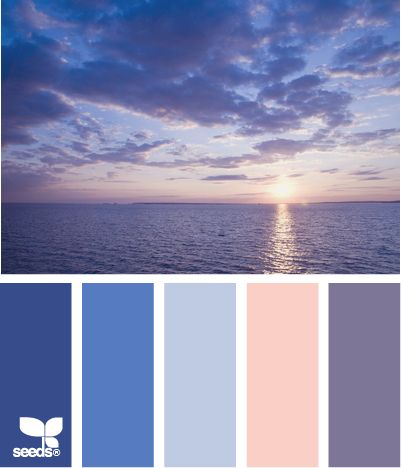
The fascinating thing about very cool people is that when you start off with the bright shiny silver drape and the bright shiny gold drape, the bright silver clears the skin beautifully and the gold makes the person look as though they have severe jaundice. The differences are very obvious. She was a very easy person to drape right from the start. Warm colours made her look very sickly, cool so very much better. The Winter drapes were obviously too domineering. In the Summer drapes (especially after we’d put on blusher and lipstick, which looked amazing) all I could think about as I looked at her was a garden filled with Summer flowers: lavender, roses, carnations, wisteria, forget-me-nots, sweet peas, pink astilbe, hydrangeas. If Autumn is the warm, cosy, comforting season of food and spice and crunchy leaves then Summer is the cool tranquil garden overlooking a beautifully-kept Italian lake. Beside the lake sits a weeping willow swaying in the breeze. Summer isn’t a tropical island, that’s Spring. It’s not cosy, that’s Autumn. It’s cool but it’s not dramatic and high contrast like Winter.

Summer has a lot of blues, from baby through to midnight, from a definite blue through to the blue-greens of water: gentle turquoise, cool jade and teal. In the middle of the blues you’ll find cornflower, marine blue and periwinkle. Denim is Summer’s very best friend. Almost all shades suit, from the pale stonewashed denim through to mid/dark blue. Avoid blue/black or anything that’s been given a brown or dusty yellow tint to make it look ‘used’. Summer’s colour combinations are beautiful, reminiscent of a watercolour painting.

The colour descriptions are so pretty: pearl, white sand, cocoa brown (a rose brown rather than, say, bitter chocolate). The colours sky, orchid, wisteria, lilac and clover are beautiful when worn together. Generally speaking, the more colours the better. If two colours look a little odd together, add a third. Try and find a pattern with lots of Summer colours in it. If looking for footwear then a burgundy brown or a lighter rose brown are very useful and can often be found in the shops (in amongst the unsuitable shades of tan, black, bitter chocolate and camel). On the subject of footwear, I bought a “dark tan” Kiwi shoe polish from the local supermarket a while back which is a reddy brown. This came in very useful as I bought a pair of boots that turned out to be the wrong shade of brown (they were a very muted brown/black and didn’t seem to sit well with the rest of my wardrobe). The polish gave them a wonderful burgundy red finish which was exactly what I needed.

Summer isn’t sharp or harsh, it’s soft and circular like the curve in the body of a cello or a tear drop. It’s good to have this in mind when choosing jewellery, especially watches. Circular stones are pretty, as are marquise and pear. This watch is a little on the shiny side (if we’re being picky) but the pink mother-of-pearl face is perfect, as is the shape.

Brushed silver and moonstone would be perfect on this person, mother-of-pearl is also fantastic. Rose gold is a clever choice on blondes. Labradorite is a wonderful gemstone. Its shimmery, ethereal quality make it perfect for a Summer. Brushed silver frames would make excellent glasses, as would rose brown, blue and navy. A silver-grey velvet coat would look stunning, one in blue (ink for those who can carry a little more depth) would be wonderful and a little more practical. Batik fabric can be very useful as the change between the different colours is often gradual and soft.

Make-up colours can be tricky. Rose and rose-amethyst are very pretty lip colours. Foundation has to be very cool, which means that the wrong (too warm) foundation will look orange, a frequent frustration for Summers. Pick a cosmetics company that understand cool/warm undertones, sometimes these are called pink (cool) or yellow (warm) undertones. You will get a better foundation match with them.

In terms of hair, often Summers berate themselves for having mousy hair when the reality is it’s a beautiful medium-brown that isn’t being flattered by the right colours. Whatever you do, don’t let the hairdresser add warmth. They seem to be so keen to do so but you want ash blonde highlights, not honey or caramel. Your natural hair colour will always flatter you so stick with that if you can bear to, especially if your hair is a darker brown.

Avoid fake tan. I know that might be hard to hear, so many seem to love it. The right colours will always give you that healthy glow you so desire and will save you ruining your bed sheets!

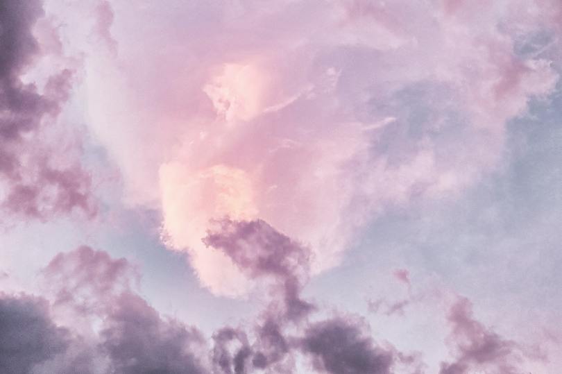
For now I shall leave you with this image that, I think, beautifully summarises Summer.

Everyone should own a Little RED Dress

According to studies done by A. J. Elliot et al (documented in his Journal of Personality and Social Psychology and his Journal of Experimental Social Psychology), red enhances women’s attractiveness to men, an effect that is apparently universal. This probably doesn’t come as any great surprise when you think about the colour and how it is used in marketing (Special K lady anyone?). It’s certainly a powerful colour, and often a colour that many veer away from for fear it might draw attention to them. Ironically it’s likely to be one of the most flattering colours you could own.

The wonderful thing about red is that every season has a shade that flatters them.

Spring has poppy red, a warm bright red that looks especially striking when worn as a lipstick with a top/dress in a similar colour.

fdsfds
Spring’s warm poppy red

Summer has a cool cherry red that’s a bit more pink and soft in comparison to Winter’s red. A Deep Summer would also look incredible in a deep claret red (burgundy).

Summer’s soft cherry red

Autumn’s red looks like burnt orange and red mixed together to form a warm muted red.

brick-red
Autumn’s brick red

Autumn could also wear a softer version of Spring’s poppy red, which looks more red than the brick.

Winter’s red is cool, dramatic and uncompromising. A Winter can wear true primary red, scarlet, claret or crimson.

Scarlet red tunic

So, have I persuaded you yet? The Dress Spot is a brilliant website if you are looking for a dress in a particular colour. Perfect for finding your own Little Red Dress!

Jewellery for Springs and Summers

Spring

Spring looks best in bright, shiny, gold-coloured metal. Think of pure sunshine.

Alice by Temperley Design Collaboration: WONDERLAND CHARM NECKLACE, Stella & Dot
Alice by Temperley Design Collaboration:
Wonderland Charm Necklace, Stella & Dot, £67.50 in the sale

Brushed gold shouldn’t be ruled out, but it needs to be sunshine yellow, not antique or copper.

Springs that look better in the cooler colours of their palette can also wear silver but keep it shiny and in no way tarnished.

Rose gold can look very pretty on a Spring. Again, keep the shine. Mixed metals can be really magical too.

original_set-of-three-mixed-metal-rings
Set of three mixed metal rings
by Lisa Angel, Not On The High Street, £19 for the set

Turquoise stones and sparkle are fabulous. Go for transparent rather than opaque stones if possible (I’m being rather fussy here, but we are going for the maximum wow factor).

Raina Earrings (in turquoise) by Stella & Dot
Raina earrings in turquoise by Stella & Dot, £16 in the sale

Avoid anything too muted or bronzed and especially avoid the antiqued look. Copper and antique bronze will likely be too muted and deep.

Harry Potter Time Turner  necklace 18k yellow gold-plated
Harry Potter Time Turner necklace 18k yellow gold-plated, approximately £1 from Etsy

For the price I suspect this lovely necklace wouldn’t last very long, but it is a great example of a Spring necklace. Bright yellow gold, high shine, and the necklace has some movement too.

Summer

Summer glows in matte, silver-coloured metal. This brushed silver necklace on Not On The High Street is a brilliant example of brushed silver making the skin glow. I suspect she’s a Summer with those ash brown eyebrows and platinum blonde hair (albeit from a bottle). It’s a shame her make-up is so distracting. The black eye liner and warm red lippy aren’t right for her. The necklace and her skin, however, remind me of moonlit milk. Perfection.

Luisa Coin Necklace In Gold Or Silver by BLOOM BOUTIQUE
Luisa Coin Necklace (in gold or silver)
by Bloom Boutique, £24

This feather necklace is pretty and smaller-scale. Brushed silver again. The soft flowing lines are very befitting.

Silver Feather Necklace by Lily Charmed
Silver Feather Necklace
by Lily Charmed, £32

The texture of these rings is beautiful, as is the pattern in the stones and the satin finish. Labradorite is a beautiful and unusual choice, spot-on for a Summer.

r144lb_mimi_stackable_band_1_1_5
Mimi Stackable Band Rings by Stella & Dot, £40

Moonstone is another beautiful and unusual gemstone. It’s misty and gentle in its appearance and has a wonderful shimmer when the light hits it.

Moonstone stud earrings sterling silver, £22, Etsy

This antique-effect silver filigree moon necklace is very pretty too.

Antique filigree sliver crescent moon necklace, £12.50 from Etsy

Summers can usually get away with rose gold if they so wish, and a very pale light yellow gold as long as it isn’t very yellow at all. Shiny silver is fine, but a more matte, satin finish will always have the edge.

Perhaps rather surprisingly, Summers can wear antiqued bronze particularly if found on a compliant coat in the form of buttons. The bronze isn’t too warm and is muted, making it an interesting alternative to silver and it looks great with brown leather.

Summer Ingénue Natural

I couldn’t resist having a little play on Polyvore this morning. I have already ordered the dress from John Lewis. I am currently trying to persuade myself I don’t need (another) scarf for £49. In terms of colour, this is obviously an outfit fit for a Summer. In terms of style I believe this would be Soft Natural in Kibbe, Ingénue Natural in House of Colour’s system and Sunset Summer (elegant bohemian) according to Zyla. There is a lot of movement in this outfit, it isn’t neat so wouldn’t be suitable for Gamines, it’s too soft for Dramatics. It’s probably a bit young for a Romantic, not really sexy or grown-up enough. I’m off to Tesco now to buy myself some grey tights 🙂

Skin undertones and overtones

There seems to be a lot of (very understandable) confusion around skin undertones and overtones. If you’ve had your colours analysed you’ll know that your undertone determines what season you are and yet your undertone is invisible. If you are an Autumn or Spring it can be said you have warm undertones; conversely if you are a Summer or Winter it can be said you have cool undertones. Colour analysis is not about overtones. If it were, women who wear the same foundation would be the same Season.

People often think undertone is skin colour – it’s not. Your undertone is invisible. Your overtone however, is not invisible. It’s the visible colour of your skin. When purchasing foundation both overtone and undertone are important. Some companies have finally cottoned on to undertones. Cosmetics companies who understand undertones and overtones are much more likely to have a foundation shade that matches your skin. Shopping for foundation becomes a lot easier. Your overtone might look yellow, or pink, brown or peachy. It might be described as sand, beige, ivory, biscuit or ebony. All common foundation names. Your undertone might be described by cosmetics companies as ‘pink’ or ‘rose’ if it is cool and ‘yellow’ or ‘golden’ if it is warm.

There is also such a thing as a false overtone. This is the colour your skin can appear to turn when you are wearing the wrong colour. When I wear khaki I look jaundiced. A Winter wearing the wrong colour might look ruddy in the face.

What influences your undertone? There is no definitive answer to this, but it is generally considered that the following are factors:

  • Oxygenated (red) or non-oxygenated (blue) blood vessels that run under the surface of the skin.
  • Melanin (which also influences hair and eye colour). The more melanin in the skin, the darker the skin tone.
  • Skin thickness. This varies by Season and influences how much colour shows through.
  • Carotene, which gives skin a yellow hue.

The only way to find out whether you have cool or warm undertones is by having your colours analysed in person. Some people offer online colour analysis where you send them a series of photos. I love the idea of it, but unfortunately it’s often inaccurate. It’s impossible to simply look at someone and tell what season they are (although I’m often asked to do this! 😉 ). During an in-person colour analysis session it’s important that you see the way the colours change your skin, in real time, in front of the mirror. Watching your skin react and your face change is all part of the (deeply exciting) process.

What to expect at your colour analysis session

Colour analysis is not about limiting options, but about opening your eyes to all the colours you can wear. Sometimes, prior to a draping, a client will worry that the process will limit the colours they ‘should’ wear, but the opposite is always true; afterwards, they express surprise at the wide range of colours that look great on them. Before I had my colours done, I believed I couldn’t wear pink. Afterwards, I realised I had just been looking at the wrong pink! In fact, I had so many shades of pink that looked good on me, from a cool dusty rose which really seemed to bring my skin to life, to a raspberry pink which looked especially good if I wore it in both my lipstick and a scarf.

Image: Kettlewell Colours

In our session, I will start by covering the basics of colour theory and answering any questions you might have. After our introductory chat, we will begin the draping itself. We will establish which season you fall into, and this can take anywhere from 45-90 minutes; I like to allow 2-3 hours for a draping as a minimum. Once we’ve ascertained your season, we’ll go through every drape I have for that season and fine tune. Whilst all colours in your season will look good on you, some will really make you shine and my favourite part of the process is finding the colours that are your very, very best. 

After we’ve done this, and I’ve given you your new colour swatch, we can discuss make-up, hair colour, etc. I encourage clients to bring along their make-up or any clothes they might have questions about.

Image: DesignSeeds.com

What you need to know before your draping

  • Your face will need to be free of make-up and fake tan.
  • If you’ve dyed or bleached your hair, I will ask that you wear my (very fetching) white head scarf during the draping.
  • If there isn’t enough natural light I won’t hazard a guess at your season (God forbid!). I’ll return another day or, if possible, find us another location.
  • You will need to be sat in front of a mirror so you can see what I see as I drape you. If you don’t have one, just let me know and I can bring mine.
  • I will bring make-up along with me for you to try (if you would like to) once we know your season.
  • If you usually wear glasses, please wear contact lenses if at all possible.
  • Come with an open mind. I absolutely understand that if you’ve been wearing black all your life you might feel uncomfortable at first being diagnosed as a Spring/Summer/Autumn. But, rest assured, you will receive compliments galore as you wear your new colours!
  • I’m always happy to drape children (and partners) but do bear in mind they need to be willing and able to sit for up to an hour.
  • We both need to be able to concentrate, so a space free of distractions for the session is important.
  • Bring a camera/smartphone if you want. I am more than happy to take pictures of you looking amazing in your best colours!

Once we are done, you will leave with a little swatch book that you can take shopping with you. (If you wear scarves, these are a great place to start!)

What does it cost? I charge £80 for a colour analysis session which includes the swatch book. If you are a considerable distance from me I may need to add on extra for petrol or travel costs. I do group discounts; the cost reduces to £70 each for two or more. Depending on the time of year I can typically fit no more than 3-4 sessions in a day.

Where will it take place? Wherever you like, although most clients prefer I come to them. I can come to your home or even your workplace just so long as we have a quiet room with excellent natural light. If you’d like to come to me this can be arranged too, just let me know.

How long will it take? Please allow at least 2-3 hours. I like for us to have plenty of time for chatting, questions and for playing with make-up afterwards.

What should I wear? Anything you like apart from hoodies or polo neck jumpers. You will be wearing a thick white cotton cape during the draping process, so be sure to factor that extra layer in.

Can I bring a friend? Yes! Absolutely. The more the merrier. It’ll be magical for them to watch.

Can you help me shop? Of course! If you’d like to hire me as a personal shopper just let me know and we can talk about costs, logistics etc.

Can you help me sort out my wardrobe? I would be delighted to! I offer a wardrobe review and decluttering service, just ask.

Is there a reason why I shouldn’t be analysed? If you are taking medication that changes the colour of your skin. If you feel unwell (we’ll reschedule). If you have a very deep tan, fake tan, or are sun burnt (we’ll need to wait until this has faded).

Will I need to throw away my entire wardrobe if I’ve been buying the wrong colours? No, not if you don’t want to! Some people have the motivation and means to do that, but generally speaking I recommend that clients go through their wardrobe and swatch their clothes. Compliant clothes go on the right, non-compliant on the left. As you wear out the clothes on the left, you can replace them with compliant ones. You don’t need to start big, either. Scarves, lipstick and nail varnish are a great way of introducing your new colours without breaking the bank.

How do I book? Just contact me via e-mail: janine@inlovewithcolour.com.

Make-up for Summers #1

I thought I’d share with you some of my favourite make-up finds for Summers. PLEASE NOTE: If you can’t see the images in this post, then you may need to click on the title to see the post in full (and to see the embedded pins from Pinterest).

Swapping black mascara for navy is, in my opinion, one of the most important changes a newly-diagnosed Summer can make. No7 do a great mascara in the perfect navy (beware – some companies will label electric blue as navy, only Winters can pull that look off). I stock up on this every time it goes on special offer. It doesn’t clump, it adds plenty of volume and it doesn’t irritate my eyes. This mascara can do no wrong as far as I’m concerned.

I absolutely love House of Colour’s eye pencils. Navy and Lagoon are spectacular on a Summer.

I’ve had this MUA eye shadow for a while (shade number 7). It was given to me by a friend when she was having a clear out. I absolutely adore it. I do find greens can be hard to find, as they are often too saturated for a Summer. It sits on the face really well and goes on very smoothly. I can’t believe it’s only £1.

Another eye shadow that I love is this one from The Body Shop:

I think it would be suitable for Winters too due to the darker side. The wonderful thing about this eyeshadow is that it mixes really well so you can go very dark (perfect for Winters) or very light. It’s a very delicate silver, reminds me of brushed silver and therefore perfect for a Summer. Really beautiful. You can of course mix the two, too! Just be careful you don’t go too dark.

House of Colour do some fabulous Summer lipsticks. They can be a bit dry though, so I’d always recommend putting some Vaseline on first before applying them. Cherry is a grrrreat Summer red. It does amazing things to one’s eyes.

MAC lipsticks are lovely. They are very creamy. I heartily recommend Syrup and Plumful.

Syrup is a very natural lip colour on a Summer and perfect for every day.

I couldn’t live without my House of Colour blusher (B37 Clover), I use it every single day. I chucked my old one away only yesterday as it had finally run out and I worked out it had lasted me over three-and-a-half years!! Cost per wear? 0.007p!

Do you have any Summer make-up recommendations?